UAD abstracts the colors of Chinese calligraphy to create Shuyang art gallery
For this project in Shuyang, China, UAD has used architecture to encapsulate the area’s long-held tradition of calligraphy. The recent intervention, measuring an expansive 112,752 ft2 (10,475 m2), is designed to house a new calligraphy art gallery for Shuyang, which is known as the birthplace of the traditional Chinese brush writing.
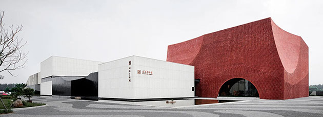
The concept abstracts the three fundamental colors of Chinese calligraphy – black, white and red – from the brush-pen, rice-paper and seal to create a pure spatial experience with pure colors. The architectural reinterpretation of calligraphy also extends to the layout, as the controlled size of the building and contrast in materials refers to the light and heavy calligraphic style of Zheng Banqiao.
The largest exhibition hall along the street has the red-brick façade, like a condensed seal printed on an elegant scroll of ink and wash. The way of cutting the corners of the volume also strengthens the character of the building, forming a timeless appeal. The material used is yixing clay brick, and it is applied to create three different wall patterns on different parts of the elevation.
The ink volume is cut and painted with dark grey fluorocarbon paint. At the bottom of the body, the rounded corners are processed to show the sense of gravity in calligraphy. The white volume uses prefabricated concrete hanging board, and the surface is treated with vertical chisel, such as rice-paper, which forms a pleasing contrast to the smooth and fine ink surface. The bottom of the body is overhanging to show a floating state, reflecting the spirit of detachment in calligraphy.
The tranquil water in the entrance is positioned as a buffer from the noise of the outside world, and visitors are introduced into the gallery by a bridge on the surface of the water. The continuous transition of space intends to make the visitors compose the mind quickly before entering the exhibition hall.
All the exhibition halls are open space without columns, which can be arranged freely according to the exhibition needs. A glass corridor connects the exhibition halls in order to facilitate continuous exhibition. In the middle of the red bricked exhibition hall, there are light wells through three floors, which create bright and transparent indoor space. The spatial relationship is controlled by the idea of ‘sparse enough to run horse, dense enough with no needle’. Meaning it is closed to keep a narrow lane of only 2 meters wide. Both sides are pure black and white, making people feel to walk among books. The space then turns to an open courtyard to create an open space effect.
The paved road and roofed courtyards are inspired by the abstract pattern of the ink spreading. Through the different grayscale changes of the granite in the paving, an ink painting is formed.
Source: Designboom
 UAD abstracts the colors of Chinese calligraphy to create Shuyang art gallery
Calligraphy is a kind of music not for the ears, but for the eyes.
(V. Lazursky)


