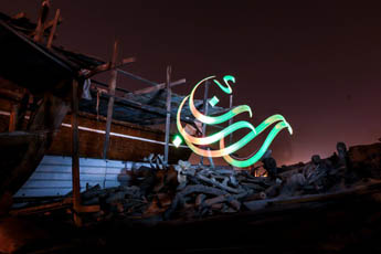
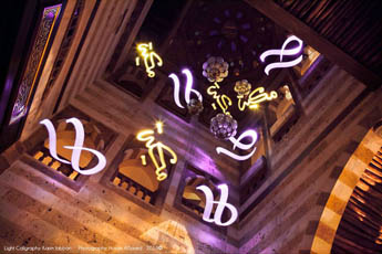
A calligrapher writes with light to keep tradition alive
Equipped with a light and a camera, Karim Jabbari hopes his work can serve as a link between conservative traditional calligraphy and our augmented reality.
Ten-year-old Jabbari, lonely and missing his father, looked for other ways to fill his time. What he found was his father’s trove of 400-year-old religious texts, inherited from an ancestor who had been a renowned scholar of Islam. The books were written in an old form of North African calligraphy known as Maghrebi script. “It’s an art form that speaks to your soul, even if you don’t understand the message,” he says. “I saw the effort of these people spending so much time, writing a thousand pages by hand. I saw the long nights; I saw my father, his smile.”
Before long, he was obsessed, copying what he saw in the books over and over until the arcs and lines settled into his muscles. That obsession only grew once he left his hometown of Kasserine to go to boarding school, and his new skill attracted friends—the one thing he’d never had.
Today, Jabbari, now 42, is a full-time artist based in Canada and the U.S., using murals, graffiti, and specialized technology to bring traditional Arabic calligraphy to an international audience. He worries that a craft that prizes meditative concentration and lengthy training will be lost in an era so focused on agility and speed. His work, he hopes, can serve as a kind of bridge, “a link between conservative traditional calligraphy and our augmented reality.”
Calligraphy—and calligraphers—have resisted new technologies for centuries. For starters, Arabic and its sibling, Persian, used non-Latin alphabets that made them difficult to adapt for use in printing technology developed in the West, says Behrooz Parhami, an engineer who has studied how Arabic and Persian scripts have evolved alongside technology. Physical typefaces built for Persian and Arabic’s connected letters are more fragile, prone to chipping and cracking. And if they aren’t perfectly made, white spaces appear between letters that shouldn’t be there.
The scripts also included letters with elements stacked on top of neighboring letters, which was impossible to recreate using the separate blocks of moveable type. And they varied in height and width much more than Latin characters, meaning that the common printing practice of adjusting typefaces to make letters about the same size would render words illegible. That “would be disastrous,” Parhami says. “It would be very difficult to read.”
Source: PBS Online
Calligraphy — the written beauty of feelings.


