History of German Calligraphy
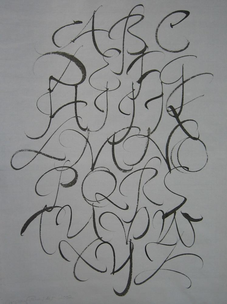
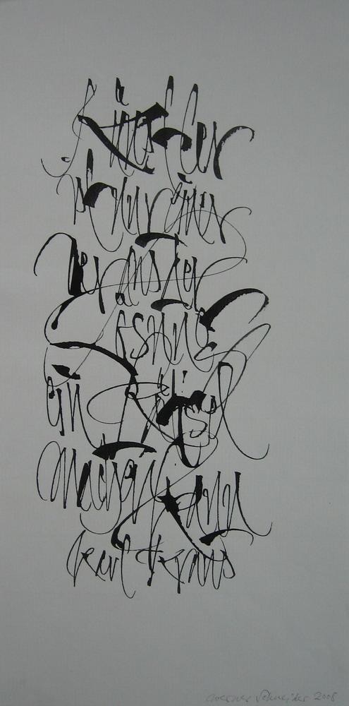
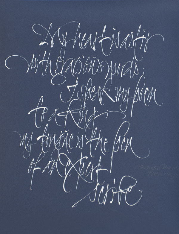
Werner Schneider is a calligrapher, part of a distinctive German tradition that emerged at the end of the 19th century and which includes E.R. Weiss, Rudolf Koch, F.H. Ernst Schneidler and Hermann Zapf among many others. Schriftkunst (letterart) literally means “writing art”, but in practice it encompasses a range of activities involving letterforms: handwriting, script, calligraphy, drawn lettering and type design.
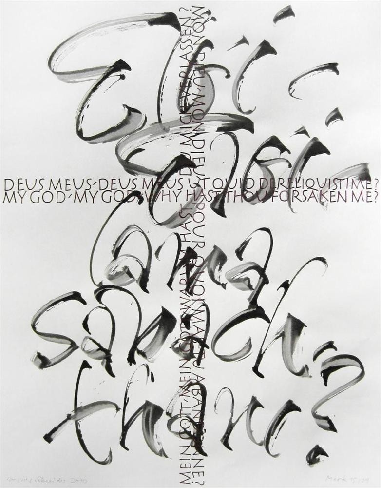
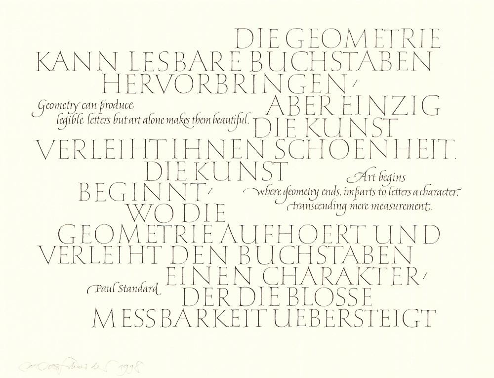
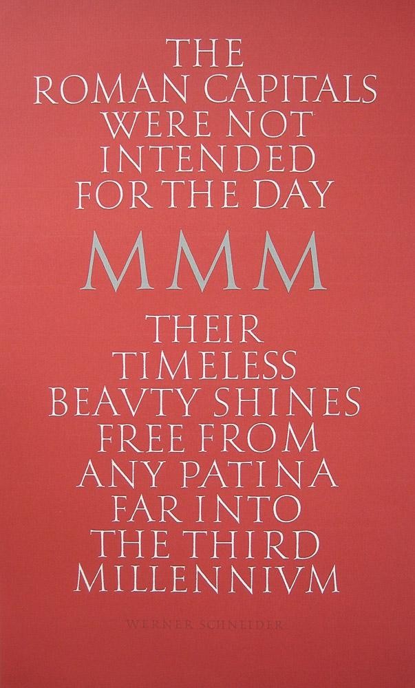
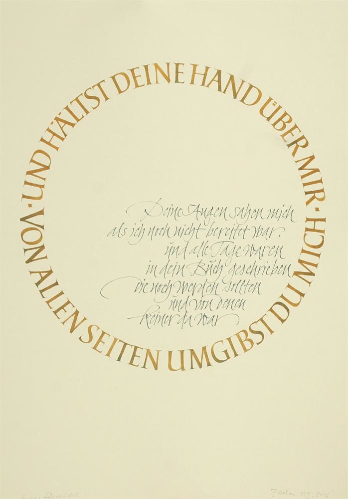
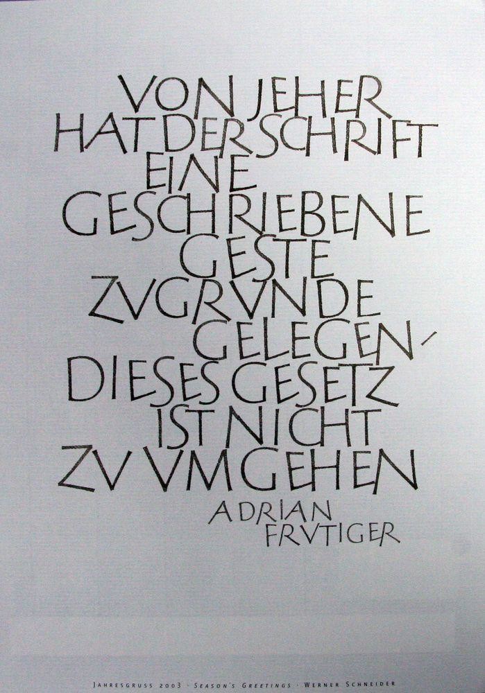
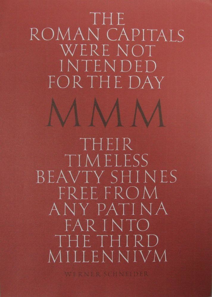
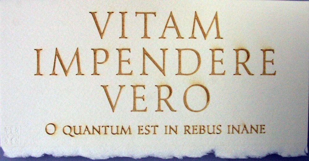
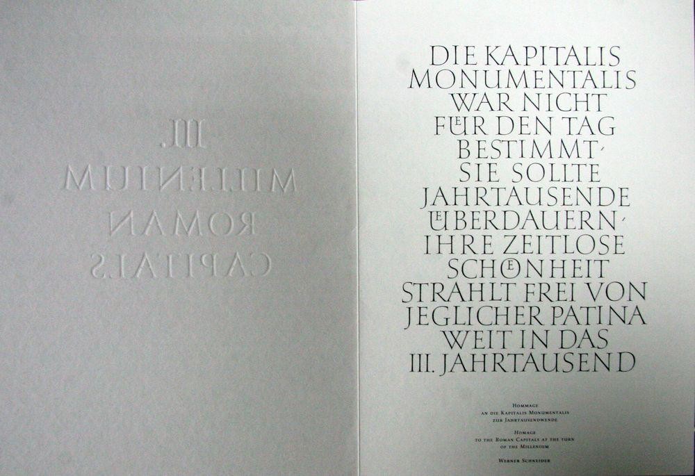
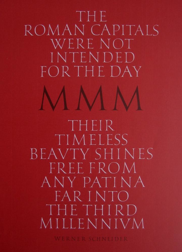
Schneider believes that as we approach the third millennium there is an increasing need for a greater consciousness of the eternal beauty of the Roman monumental letter and a recognition of the deleterious effects of geometrically-based letterforms.“Refined forms, above all others Roman capitals, have been my best teacher,” he has said. “Looking at the inscription on the Trajan Column awakens in me again and again a strong aesthetic feeling and fills me with a sense of deep respect. These nearly perfect forms and their qualities could not be improved upon during the 2000 years of their existence.” The Roman monumental capitals stand in stark contrast to geometric letters – both those proposed by the modernist design movement of this century and those recently created in response to perceived requirements of computers. Schneider is harshly critical of the latter: “I respect the ideas of the German-Bauhaus, but the Bauhaus is to be blamed for its failure in the field of lettering. A purely constructed approach to letterforms leads to inhuman results. Bayer‘s Universal typeface ignores all the laws that have influence on the perceptual function of the human eye. The introduction of electronic techniques has created a new situation. Technicians have tampered with letterforms and forced them into a corset of equal widths.
Considerable visual damage has been the consequence of such brutal handling. All mathematical or geometric approaches to lettering lead to a loss of visual quality. Given the hectic times in which we live and our enthusiasm for an unending string of technological achievements and their unlimited possibilities we run the risk of losing our understanding of fundamental visual laws.”
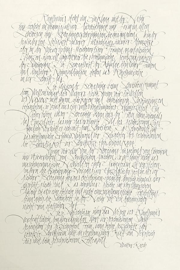
Like Adrian Frutiger as a worldwide type-designer, one of his heroes, Schneider sees salvation in the written letter, “the best basis for the study of all letterforms”, since it provides training for both the eye and the hand. “For an understanding of form there is only this sequence: writing and drawing as a means of sensitizing the eye, followed by work on the computer”, concludes Schneider. In his opinion, the study of letterforms is as critical a component of our civilization as the study of any artwork in our museums.
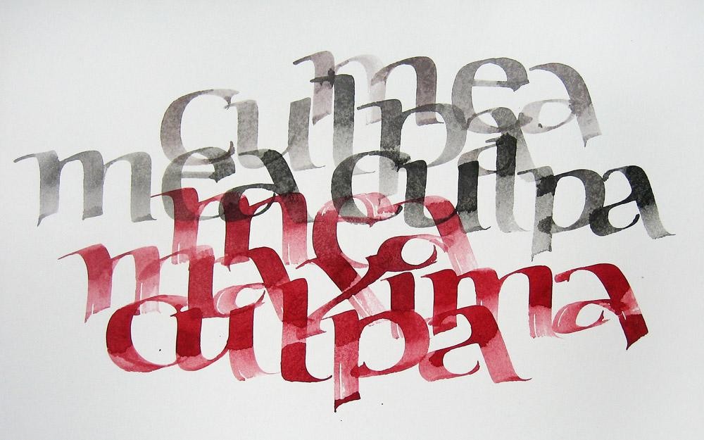
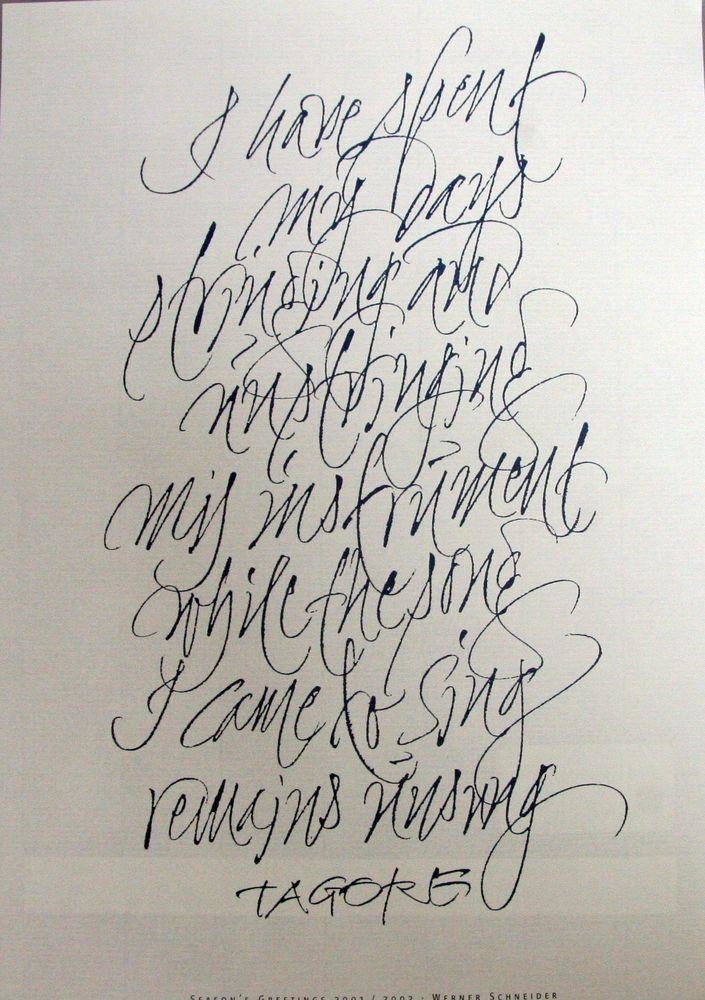
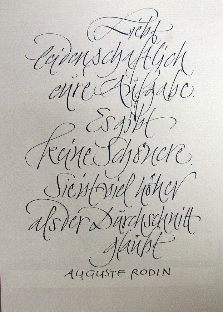
Werner Schneider‘s own work is emblematic of the high standards that can be achieved in letterform design today. His work is a reminder of the timeless quality and value of Roman capitals, as well as the other scripts that constitute our Western alphabetical heritage. Yet, at the same time, his work also shows how important it is to keep the tradition alive not simply by copying the past, but by imbuing it with a new modern spirit. And this can only be accomplished by deeply understanding these letters–absorbing them into our fingers and muscles, as Schneider has done in his long career. Only then can we create new interpretations that will in turn be the classics for the future. And only then can we have the confidence to challenge the standards of the past through new explorations of tools and the scripts that reside within each of us. Scripts present the personal aspect of calligraphy while Roman capitals and other historic hands represent the communal aspect of this art.
Together they remind us that the art of letters is unique in its role as both personal expression and cultural communication; and that quality of our letters is a reflection of our civilization.
Paul Shaw, New York.