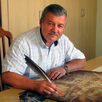
On Writing and Calligraphy
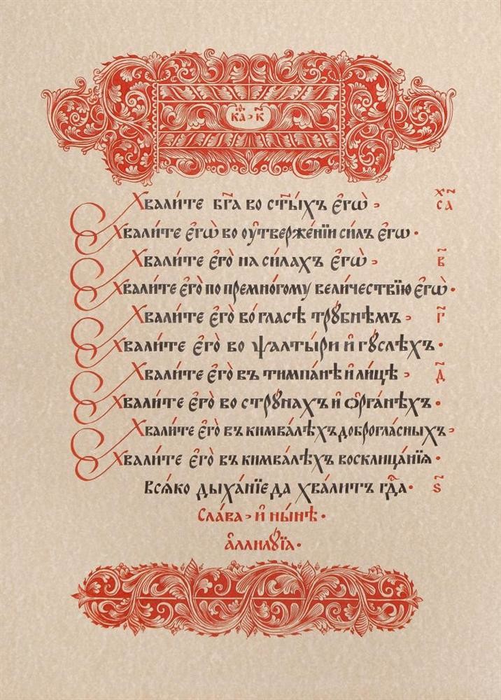
Stylistically impeccable writing using a thin pen is called calligraphy. The word ‘calligraphy’ is derived from Greek words of каllos, beauty, and grapfien, to write. The big letters of this type of writing are not normally written but are drawn using a thin pen, brush and drawing devices. There is a multitude of types of calligraphic writing. Ordinary calligraphic writing has two weights (with thick main strokes and thin connective strokes).
Calligraphic art was very much appreciated in old ages. The old school paid much attention to calligraphic training as a person with beautiful handwriting was able to work as a record clerk. It is in high antiquity that writing art schools and directions took shape, with their particular requirements to a written text which pertained not only to a master’s technique, talents and professionalism but also to his morals. Hence are the religious and moral requirements made to a calligrapher master, for instance, in the Orient. An extract from the Treatise on Calligraphers and Artists that was written by master kazi-Akhmed in the 16th century may serve as an example:
Oh thee who want to become an expert at writing,
Become a person pleasant to people and a friend,
Arrange the world of writing by your stay,
So that the entire world knew you,
You should forget about quietness and sleep,
And this should be done from your youth,
You should rub your head to the paper, like a calem,
You should have no rest from this work day and night,
You should give up all of your desires,
Forget the passion of moneymaking and greediness,
You should also fight the lusts of the flesh,
Cut the neck to bad passions,
So that you knew what a small holy war is,
What the approach to the great is.
What you think impossible for yourself -
you should not hurt anybody with that.
Beware, I told you, don’t hurt your soul,
Because the verity turns away from the one who hurts the soul.
Make satisfaction and obedience your permanent occupation,
Don’t be impure for an hour,
Always deem it necessary to back off
Lie, lust and slander,
Retire from envy and envious people,
Because a hundred misfortunes for the body occur from envy;
Don’t practice intrigues and roguery,
Don’t select bad features;
Everybody who cleared from imposture, roguery and hypocrisy
Became a master in writing.
English writing was the most common type of calligraphic art in the 18th century. Russian writing created on its basis is considered one of the most beautiful types of calligraphic writing. Great slope of lettering is typical of old samples of calligraphic art; for slope of lettering of the English writing is equal to 54°. However, versions without slope (direct) or with left-side slope are also common.
Together with calligraphic art, linear and ornamental decorations, flourishes, were developed and became common. Typographic calligraphic fonts were created on the basis of manual calligraphic examples.
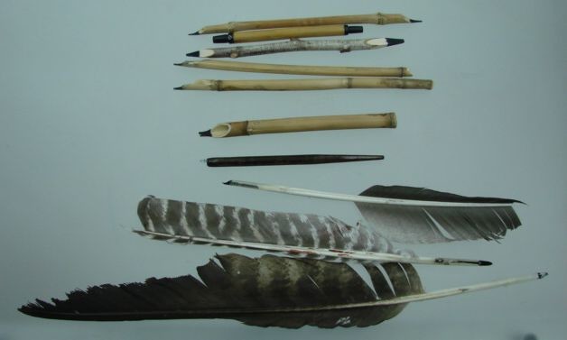
It takes paper, pencil, ink and a fountain pen to acquire the skills of and to practice calligraphy. According to kazi-Ahmed: “…good equipment is necessary for the kingdom of writing…”. (Goose, eagle, swan etc.) quills have been used for writing since high antiquity. There were special manuals for sharpening quills, and a special machine for sharpening and splitting of quills was invented early in the 19th century. Different methods were recommended in Russia in the 18th century for the acquiring of skills in writing with quills and in developing beautiful handwriting, up to the binding of a quill to fingers using a string, the use of pins etc. A lot of attention was paid to the hand position and the posture of the pupil at the desk. It was recommended that right-handers would use quills from the left wing, and left-handers, quills from the right wing. As was noted in the ABC Book of Russian Calligraphy in the French Manner (1789), for writing, it is better to use “the second, third and fourth quill from the edge; quills from the right wing are not so suitable”.
If we follow this recommendation, the quill end is directed to the right and does not obstruct letters at work. Many masters advise that quills from wild birds be used for font work because they are much more durable and elastic. But for want of quills of wild birds, we can successfully use quills of big domestic birds – geese and turkey. Besides, there are a great number of materials from which a pen can be made. It may be a plain stick, reed, cane and bamboo. There exists a series of manuals that describe the methods of sharpening pens, treatment of materials and acquiring the initial skills of writing fonts using different tools.
We presently have a multitude of prescriptions for making light-resistant and durable ink. In ancient times, the writing composition of ink was made of the most diverse substances — soot, ferrous sulfate, bichloride of mercury, birch leaves, bark of different trees etc. Sometimes, as ancient manuscripts testify, quite unexpected components were included into certain types of ink — sour cabbage soup, molasses, kvass, millet, sour and non-saline honey etc. The secret of making ink was kept very carefully and strictly. In olden times, the prescriptions of making ink were transferred from generation to generation. The diversity of ink components testifies to persistent search for dyes that would meet all of the writing requirements.
A great deal of attention is paid to calligraphy in many countries – coteries, courses, entire schools and directions of calligraphy work there. Not only professional artists but also rank-and-file people of any profession who are willing to learn this type of art are engaged in it.
To acquire the skills of writing any particular letter elements, practical training should start with ornamental exercise. To stretch one’s hand and to get ready to perform any particular font, it is better to write exercises comprising the main and frequent elements of this font. For instance, if the font is rounded, the rounded elements are selected for exercises.
Having accumulated any particular experience in writing letter elements, one should get down to writing the entire letters and then words and sentences. But even if you have in place all the tools and materials you should pay attention to the master’s words:
There are five virtues; if they do not exist in writing,
It is a hopeless business to be a master in writing by reason only:
Precision, inquiry in writing, goodness of the hand,
Patience in labour and perfection of writing tools.
If you lack one of these five virtues
There will be no use, even if you try for a hundred of years.
Calligraphy does not play the part it used to play in the life of rank-and-file people; people (except for school training) have virtually ceased to write by hand; but this does not mean that the calligraphy art lost its advantages.
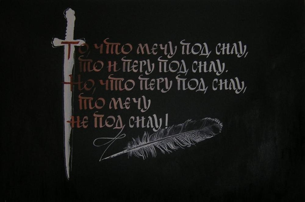
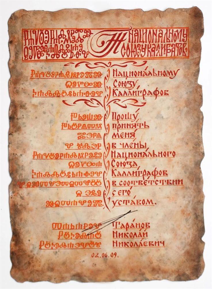
A great number of people feel genuine joy when they look at beautiful handwriting. At present, the calligraphy art is applied in book, advertising and poster graphic art, in work intended for replication. At present, calligraphy is not limited to artistic performance of italics but has recourse to all font types. The modern understanding of calligraphy includes not only perfectly shaped letters of the old English calligraphy school but also modern solutions for font inscriptions and texts made by hand but having, first of all, a sufficient degree of artistic value. It can be both the name of goods, trademark, a monogram and a page in a hand-written book and the entire poster. The only requirement is beautiful writing.
The diversity of hand-made fonts is virtually unlimited, it is achieved by using different tools, change in density, slope, proportions, thickness, decorative nature of one and the same font. Own font that meets the content and the purpose of the inscription can be created for any particular purpose. Modern calligraphic fonts are entirely different by their graphic peculiarities from artificial and drawn scripts – they are described by quick performance and graphic freshness.