Ilya Bogdesko
1923—2010
St.Petersburg, Russia
Calligrapher-artist, People’s artist of the USSR, professor
Book magician
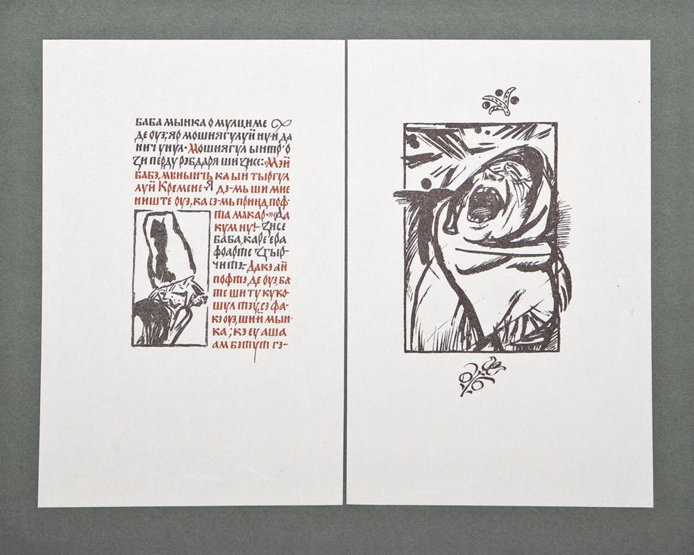
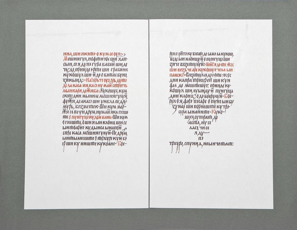
The mastership of Iliya Bogdesko, the People’s Artist of the USSR, has long been appreciated by the general public. His skillful design of Ion Kryanghe’s book “A purse with two coins” inspires the readers and conveys the feeling of gratitude to the artist who created vivid, funny and expressive national characters. He really “made the book”. Iliya Bogdesko designed it all: from the hard cover and text to the date line and price mark.
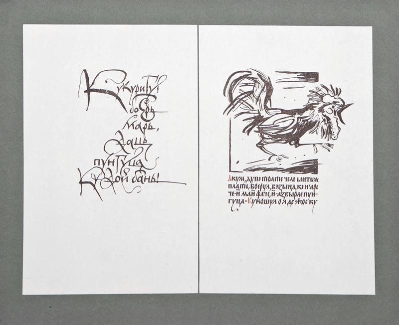
Profound knowledge of his Motherland’s traditions, historic beliefs of his people attract us and make us believe in this short educative fairy-tale about a little cock who got round a cruel landlord and helped his naïve master. It is a fairy-tale about the everlasting fight between good and evil.
The book typography is plain, exquisitely beautiful, perfectly artistic in all its nuances; it harmoniously fits the illustrations and decorative elements, it is easy for the readers (even in a miniature edition). Besides, the typography is based on the national semi-uncial font of the 16th-17th centuries and old Moldavian handwritten scripts. The work of Moldavian polygraphists is worth while mentioning in this context as well. The book is full of their love for the Motherland and pride for I. Kryanghe and I. Bogdesko, the foremost representatives of national culture. Moldavian polygraphists designed the book with high-quality reproductions, typography and cover. This issue of “The purse with two coins” is one of the best samples of Soviet book art in general. The 1st Degree Diploma the book was bestowed with in 1978 at the All-Union Book Art Contest proves it very well.
The first success came to Iliya Bogdesko, the graduate of the Leningrad Institute n.a. I. Repin, with his illustrations for Gogol’s “Sorochinsky Fair” which was immediately approved by numerous critics. One of them was quoted saying that “Bogdesko let a new fresh stream into the illustrative art”. It rarely happens that the graduate illustrations of a beginning artist were published without any further delay in 1952, it is even more surprising because it happened over 50 years ago.
As far as Bogdesko decided the illustrations for “Sorochinsky Fair” would be executed in a traditional narrative manner, he felt the need to study the historic and ethnographic material not by books but in famous Sorochintsy which was very well described by Gogol. Even if the artist’s design manner changed later, his manner of literary work interpretation was always the same. For instance, the edition of Pushkin’s “Gypsies” (1957) including only 18 illustrations is the book that made Bogdesko famous all over the Soviet Union. Only a few people know that it took him 4 years of painstaking work, psychological observations, several months spent in a traveling gypsy camping ground and about 1, 500 sketches drawn.
Bogdesko’s interest for national book traditions and folk craft and his long trips through Bessarabian villages brought to his mind an idea of designing handwritten books. Facsimile reprinting of such books would render the feeling of hand-made design and thus make the comprehension of classic books easier.
In 1962 the fairy-tale by Ion Kryanghe became one of the first books of its kind. The edition was a success. However, it was Bogdesko’s longing for perfection and beauty that made him return to this classic Moldavian book 15 years later and make a new different book design. The next handwritten book was a medieval folk ballad “Mioritsa” revised by Vassile Alexandri (1968). Bogdesko had worked on it for two years.
The Artist used to say: “I stylized the “Mioritsa” illustrations as a traditional Moldavian carpet: coloured flowers on a black background. I also got inspiration from late Moldavian icons which are plain and precise. However, it doesn’t imply I simply redisplayed them. I could feel free when my baggage of knowledge was as if easily packed in a rucksack behind my back and let me feel free… The font is handwritten, bicolour. If in “The purse with two coins” the colour served to separate the author’s words from the words of the characters, in “Mioritsa” the colour intensifies the expressiveness of the lyrics: the black is applied to describe the villainy, and the red describes pure thoughts, love for the country, fiancée and Mother.
Iliya Bogdesko continues designing handwritten books. After “Mioritsa” in 1970 he prepared the illustrations for one more folk ballad (revised by V. Alexandri again), “Kodryana”. The stylized handwritten font is applied in this book as well. Perfectly designed Bogdesko’s fonts won him glory. In his typography he combined artistic mastership and profound knowledge of national book art. Among the advantages of Bogdesko’s typography is his innovation of antiquity. The influence of his typographic experiments on the Moldavian culture of book design cannot be overestimated: a lot of Moldavian artists apply and vary the font. I wish this newly designed typography would become the type-setting font. However, this would take a lot of effort. Perhaps, fellow artists would help Iliya Bogdesko to create the type-setting font named after the author?
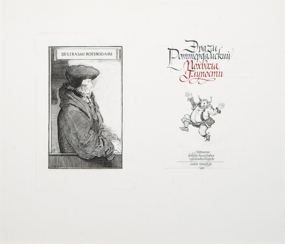
Iliya Bogdesko is constantly searching for something new. The drawing technique he used earlier doesn’t satisfy him anymore. In 1976 he executed the illustrations for The Praise of Folly by Erasmus of Rotterdam in his usual technique, and now he is working on a new sequence of illustrations for the book, applying the engraving with a copper technique.
“Compare the engravings and pen drawings in a book and you will immediately notice the advantages of the copperplate print. The same illustrations acquire new properties…I would compare it to the difference between the music you hear in the concert hall and recorded music…” says Bogdesko.
One of the books Bogdesko is proud of is Gulliver’s Travels by Swift (1980). It was published in two issues. One of them, a rare book executed in a labour-consuming engraving with a metal technique, was published in only 60 copies. The second one, a popular edition, with off-set illustrations was bestowed with the Ivan Fedorov Diploma at the All-Union Book Art Contest in 1980.
Every new book created by Bogdesko, proves his artistic motto: “Always in my manner but different every other time”.
K. Burov,
Book designer
The Book Magician, notes of the art editor
about I. Bogdesko
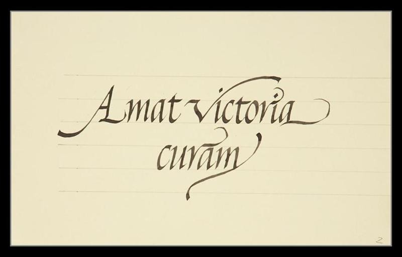
Amat victoria curam (Victory favors those who take pains)
Paper, ink, pen, 2003-2004
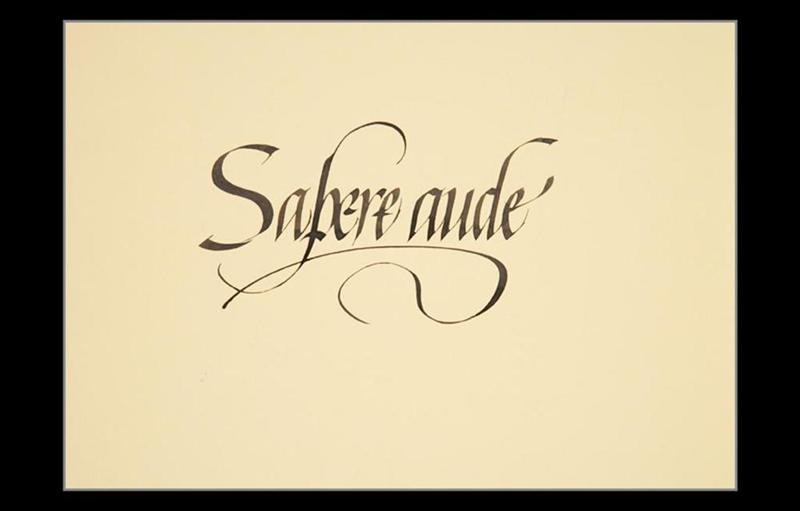
Sapere aude (Dare to be wise)
Paper, ink, 30x21 cm, 2002
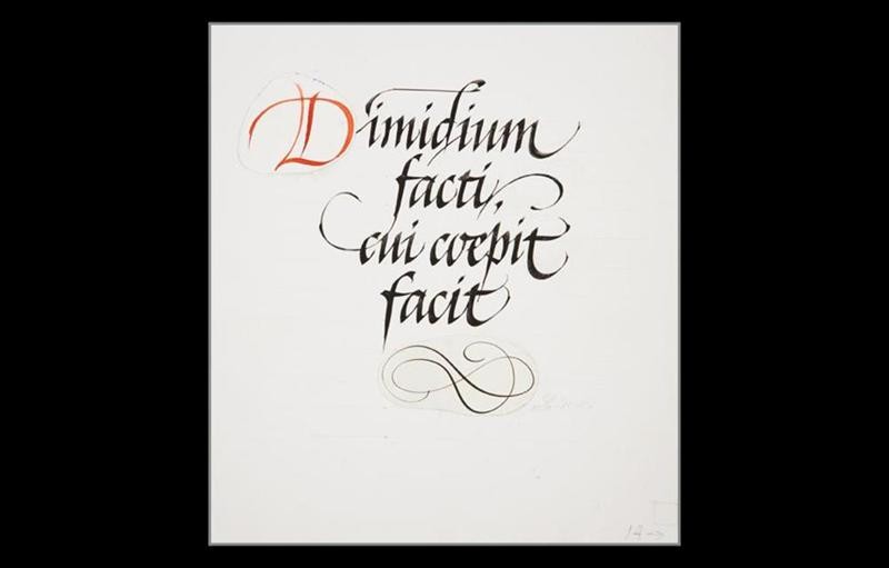
Dimidium facti, qui coepit facit (He who has begun has the work half done)
Paper, ink, 24x26 cm, 2002
Laboremus (Let us work)
Paper, ink, 17,5x10 cm, 2002
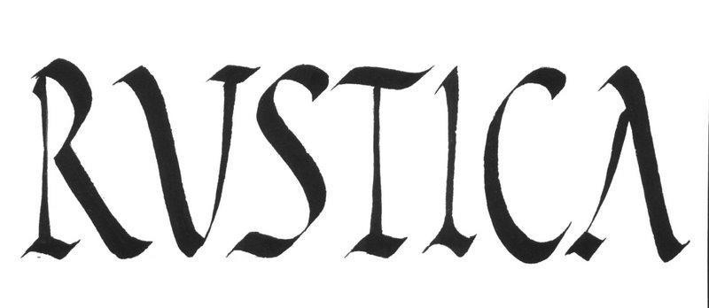
Rustika
Paper, ink, pen, 25x20 cm, 2003–2004
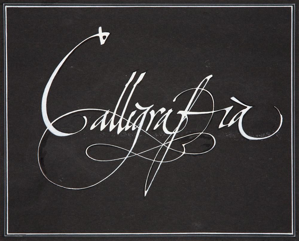
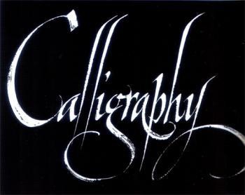
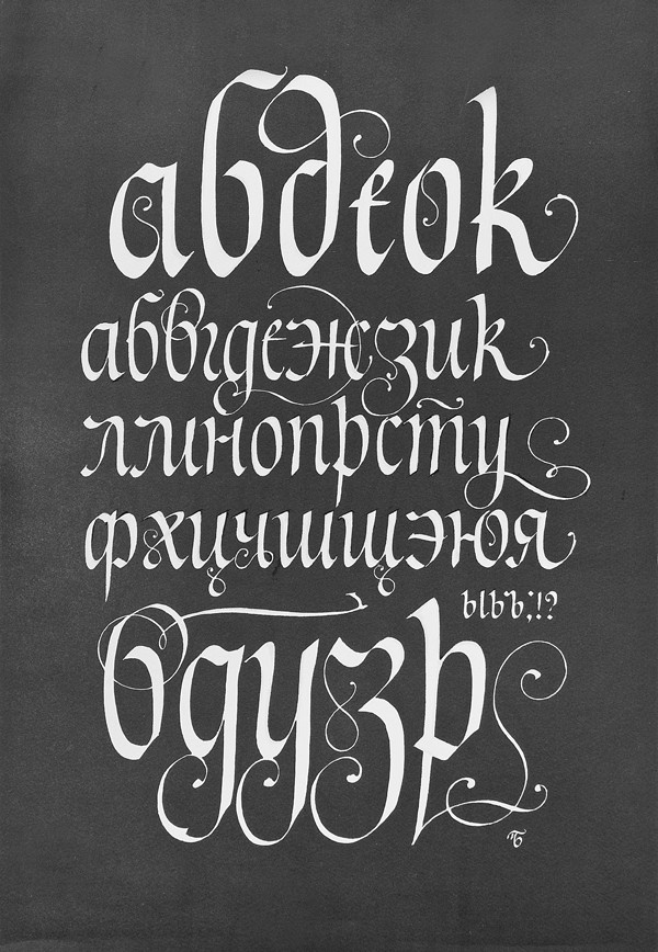
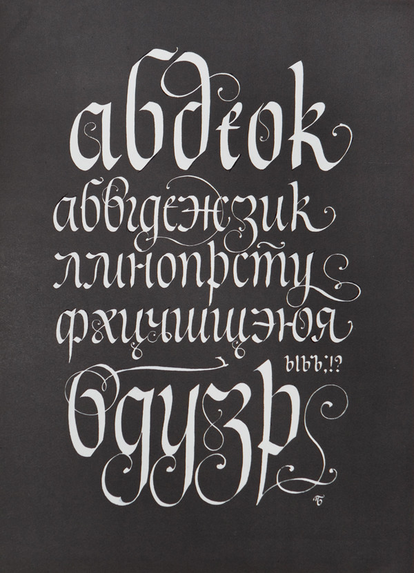
Calligraphy on black
Paper, ink, broad-nib pen, 21х29 cm, before 2004
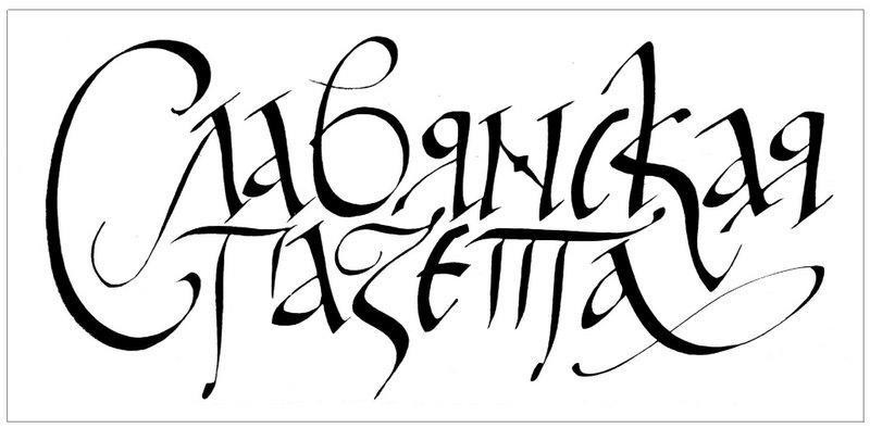
Slavic paper
Paper, ink, pen, 30x17 cm, 2001
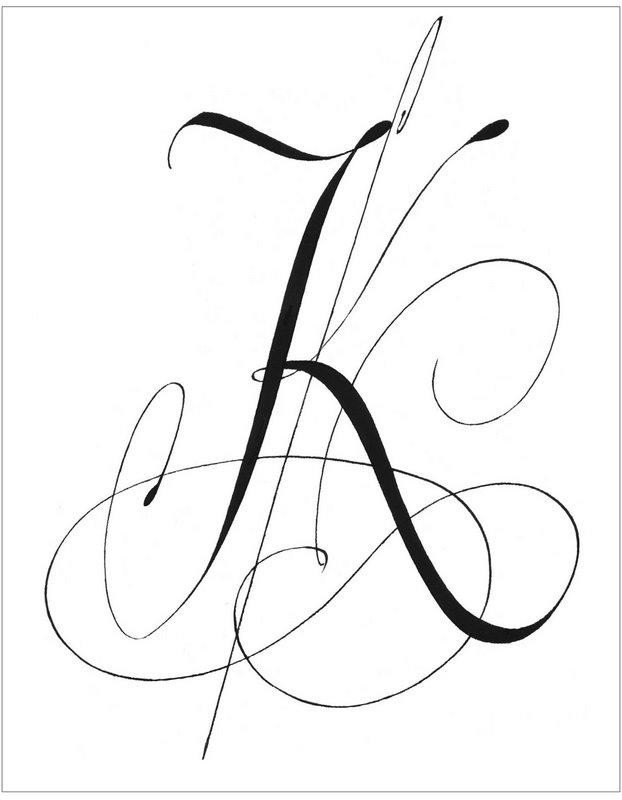
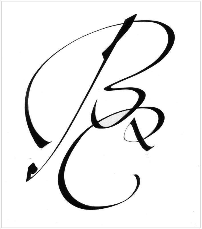
Two initial BC
Paper, ink, broad-nib pin, 21х29 cm, before 2004
Non scholae sed vitae discimus (We learn, not for school, but for life)
Paper, ink, broad-nib pen, 29x21cm, before 2004
Calligraphy torshon
Paper, ink, broad-nib pen, 29x21 cm, before 2004
Calligraphy
Black paper, white ink, 28x23 cm, 2001
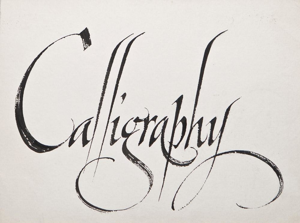
Calligraphy
Сursive writing, broad-nib pens, ink, 39x29 cm
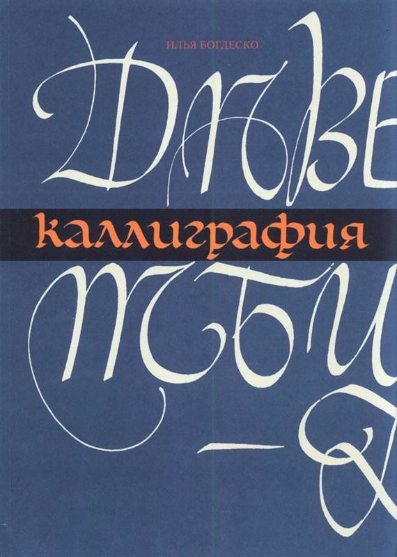
Calligraphy (book)
AGAT Publishers St. Petersburg, 21x28 cm, 2006
Amazing uncial
Paper, ink, 42x31cm, 2008
Headpiece
Etching, 28x39 cm, 1991
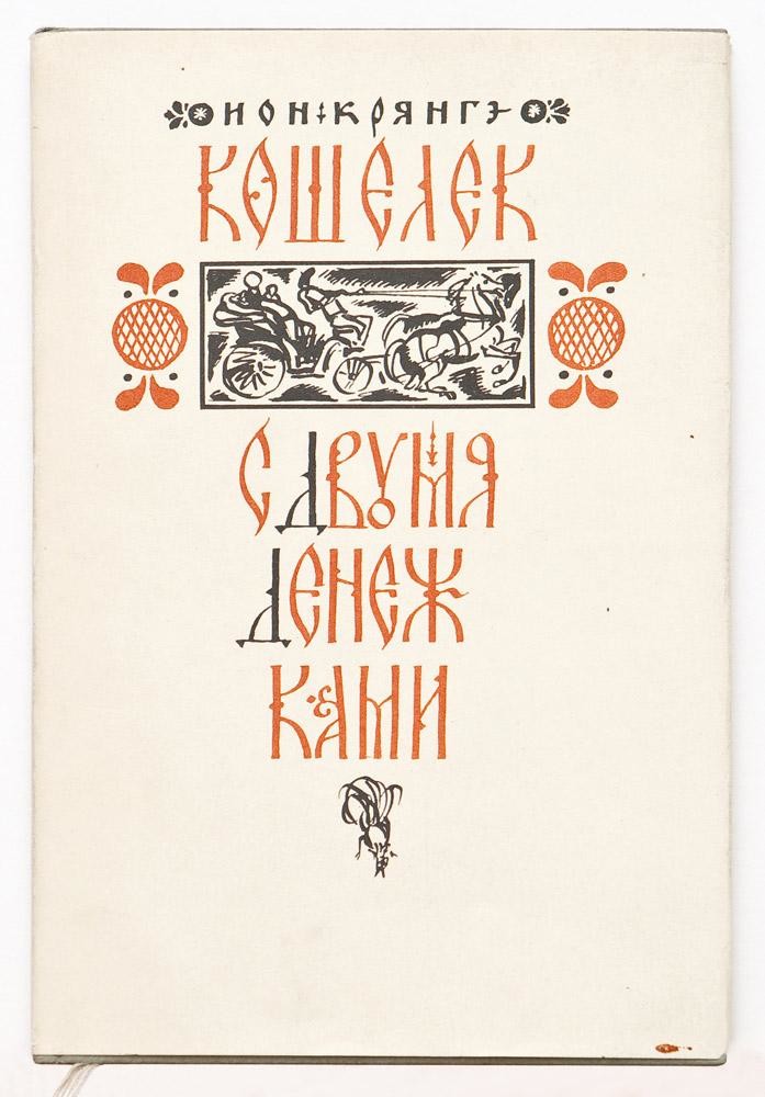
“The Purse a'Tuppence” (book)
Literature Artistique Publishers, Chișinău, 50000 copies, 15x23 cm, 1977
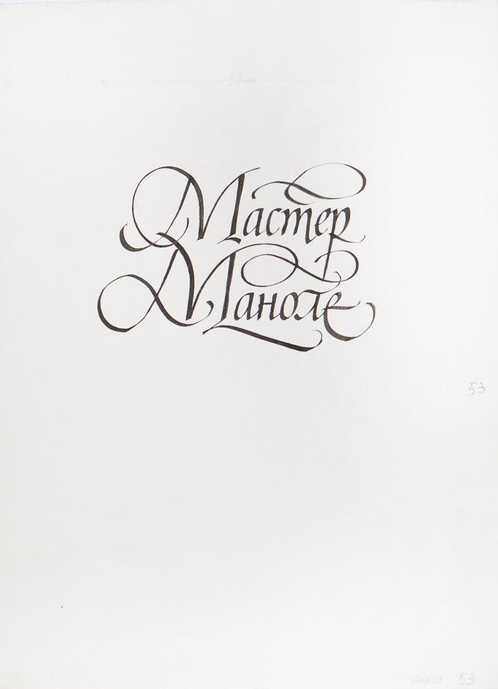
Sheet “Meşterul Manole”
Title page, broad-nib pens, Italics, 27x37 cm
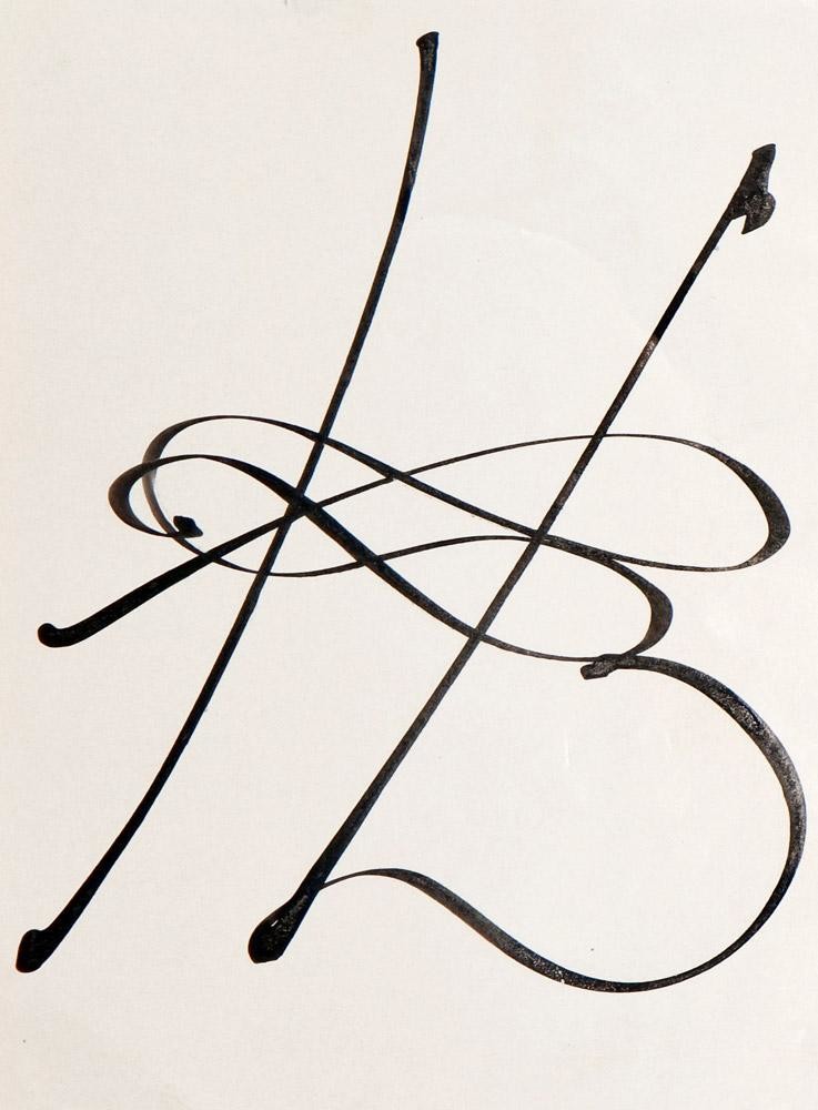
Sheet “Н”
Calligraphic monogram, Chinese ink, broad-nib metal pen, 15x19 cm
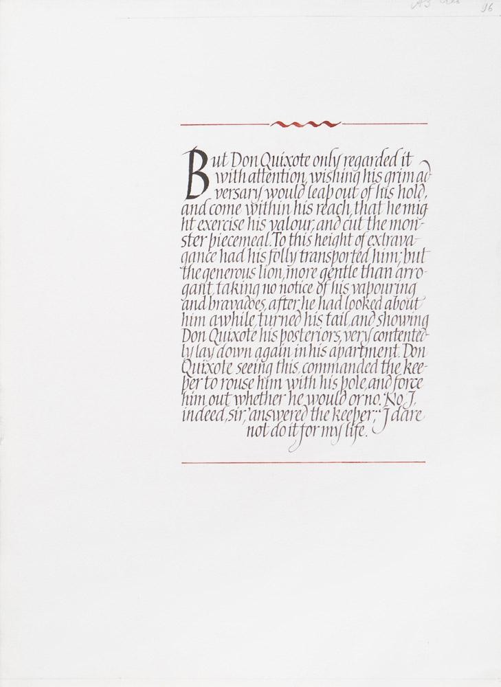
Sheet “But Don Quixote only regarded it…”
Black ink, red gouache, broad-nib pens, 28x39 cm
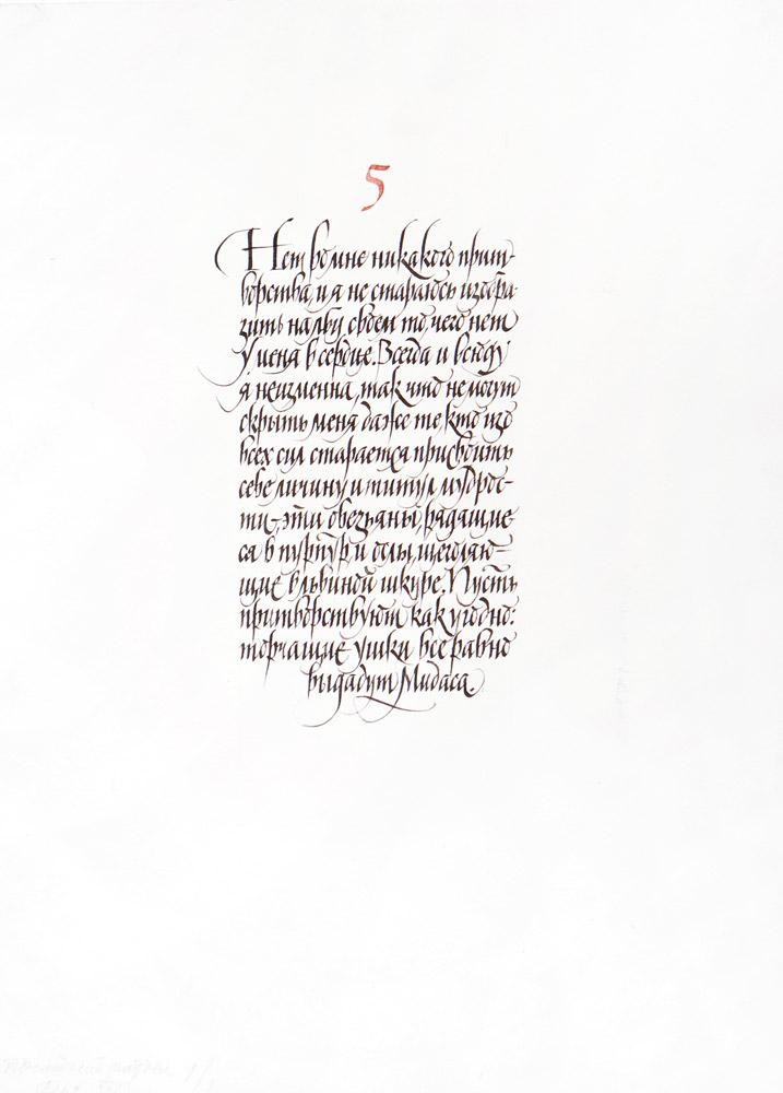
Sheet 5
Black ink, red gouache, broad-nib pens, 24x34 cm
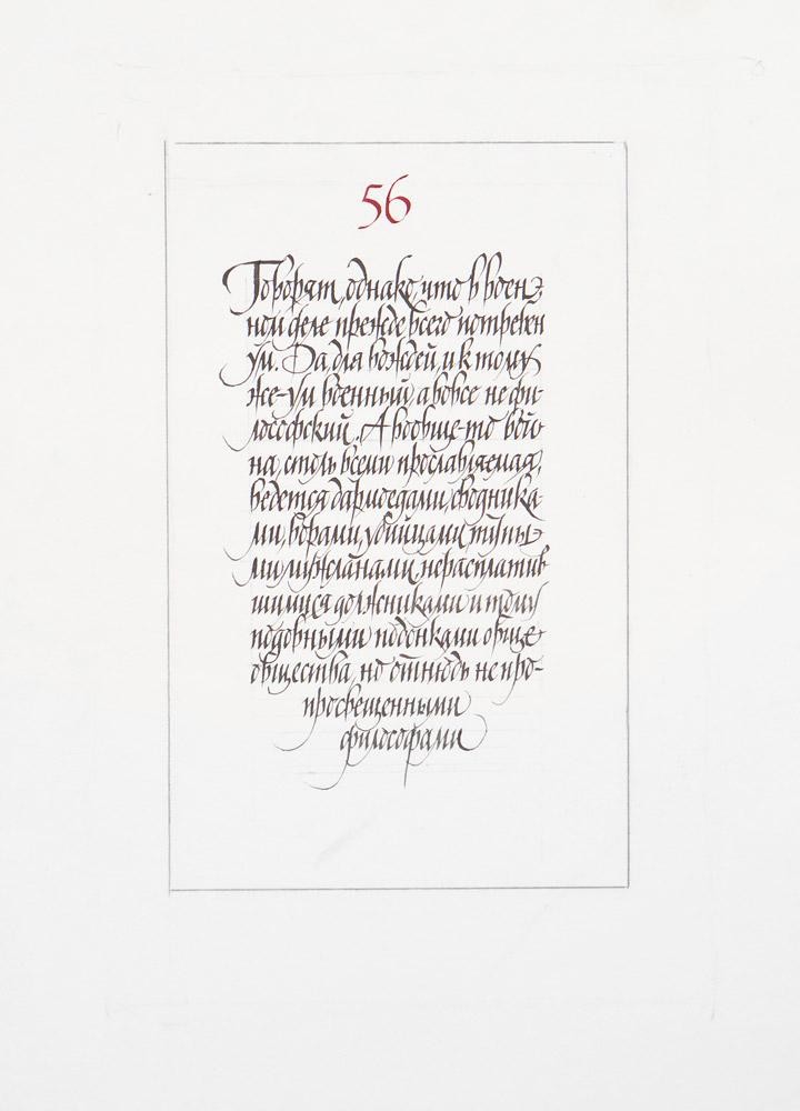
Sheet 56
Black ink, red gouache, broad-nib pens, 25x35 cm
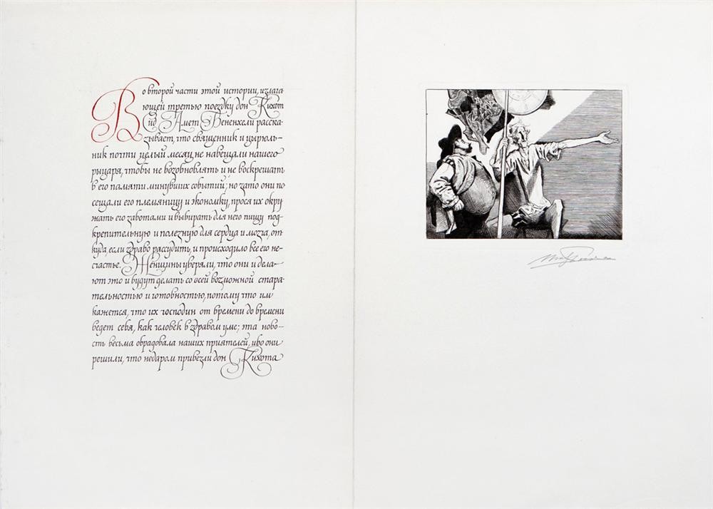
Page spread of the “Don Quixote” book (“In the second part of this story...”)
Picture – etching, text – Italics, broad-nib metal pen, 59x36 cm
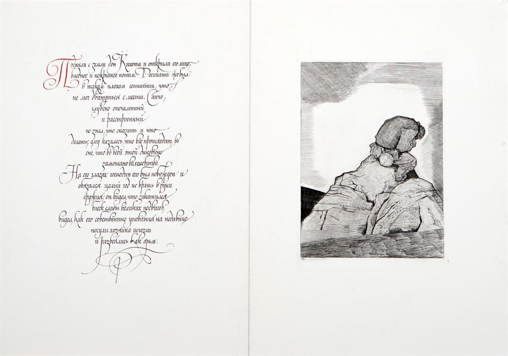
Page spread of the “Don Quixote” book (“They lifted Don Quixote from the ground and...”)
Picture – etching, text – Italics, broad-nib metal pen, 50x36 cm
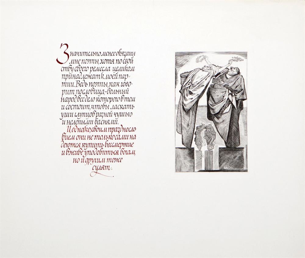
Page spread of the “The Praise of Folly” book (“Much less obliged to...”)
Picture – etching, text – broad-nib pen, black ink, red gouache, type – humanistic Italics, 36x31 cm
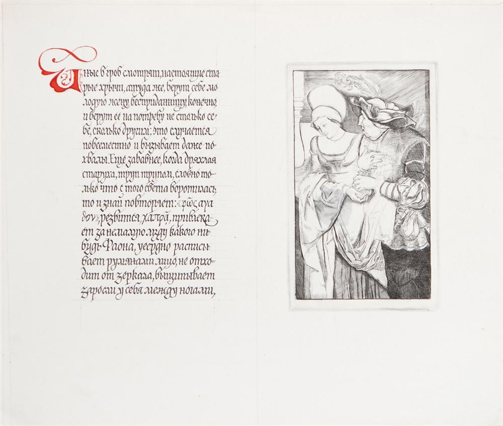
Page spread of the “The Praise of Folly” book (“Others looking in the coffin...”)
Picture – etching, text – broad-nib pen, black ink, red gouache, author’s stylized Gothic, 31x26 cm
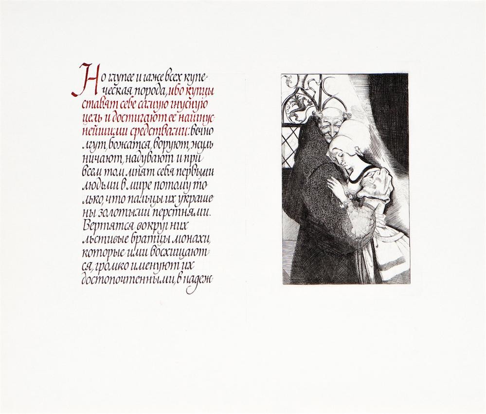
Page spread of the “The Praise of Folly” book (“But the most foolish and wicked are…”)
Picture – etching, text – broad-nib pen, black ink, red gouache, type – humanistic Italics, 32x28 cm
Page spread of the “The Praise of Folly” book (cover)
Picture – etching, text – broad-nib pen, black ink, red gouache, author’s interpretation of Gothic script, 32x28 cm
Pages from “The Purse a'Tuppence” (“Once there was an old woman and an old man”)
Black ink, red gouache, broad-nib pen, author’s interpretation of Half-uncial Cyrillic book hand, pen drawing, 34x27 cm
Pages from “The Purse a'Tuppence”
Black ink, red gouache, broad-nib pen, author’s interpretation of Half-uncial Cyrillic book hand, 35x27 cm
Pages from “The Purse a'Tuppence” (“Cock-a-doodle-doo!”)
Black ink, red gouache, broad-nib pen, author’s interpretation of Half-uncial Cyrillic book hand and Cursive handwriting, nib drawing, 34x28 cm
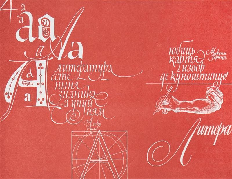
Literature
Font composition, broad-nib and sharp-pointed nib pens, 30x23 cm
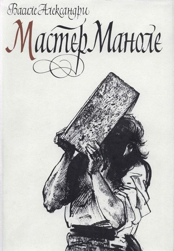
Meşterul Manole (book)
PH Literature Artistique, Kishinev, 21x29 cm, 1986
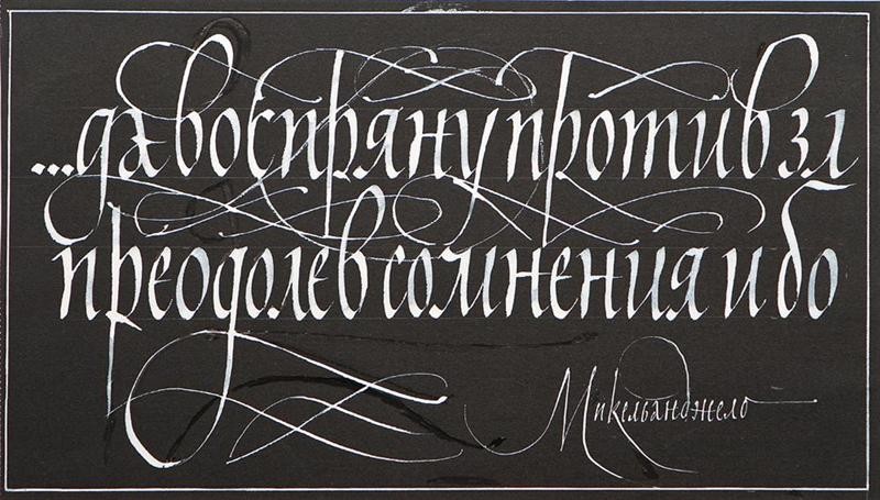
Michelangelo
Black paper, white gouache, broad-nib pens, words “…and shall rise against evil, overcoming all doubt and pain ”, 31x17 cm
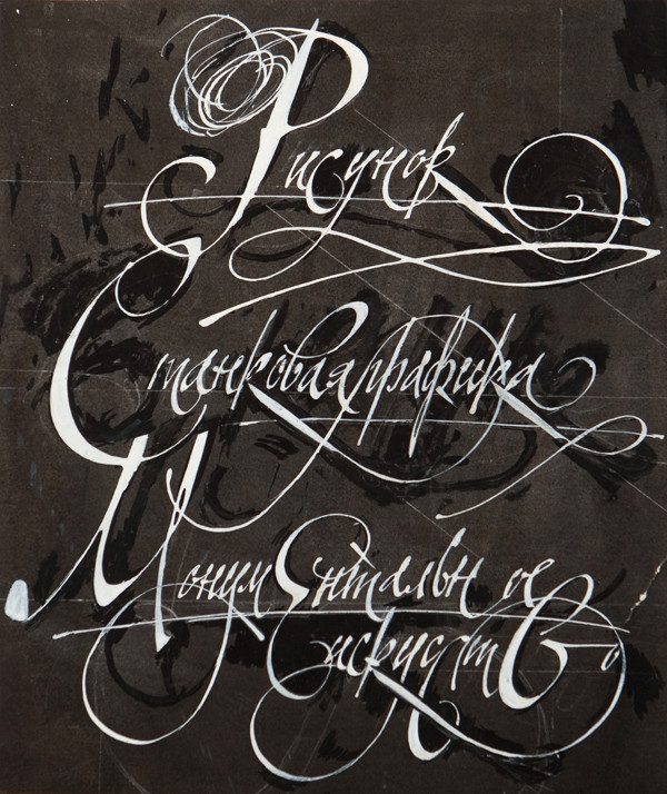
Sketch. Easel graphics. Monumental art
Black paper, white gouache, broad-nib pens, ready for print (ink finishing), 29x34 cm
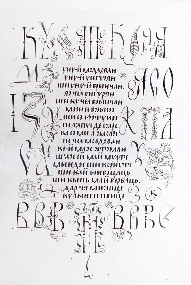
Yny-i moldovian
Photocopy. Original: broad-nib and sharp-pointed nib pens, composition of Old Russian fonts, words in Moldavian, 19x26 cm
Font
Cursive handwriting, broad-nib pens, ink, ready for print (white gouache finishing), 31x22 cm
Font composition
Broad-nib pens, black paper, white gouache, ready for print (black ink and white gouache finishing), offset process, 39x27 cm, 1984
Font composition 2
Broad-nib pens, black paper, white gouache, ready for printing (finishing in black ink and white gouache), 28,5x40,2 cm, 1983
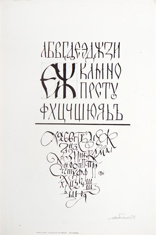
Fonts
Composition of old Russian fonts, ink, broad-nib pens, 29x43 cm, 1984