
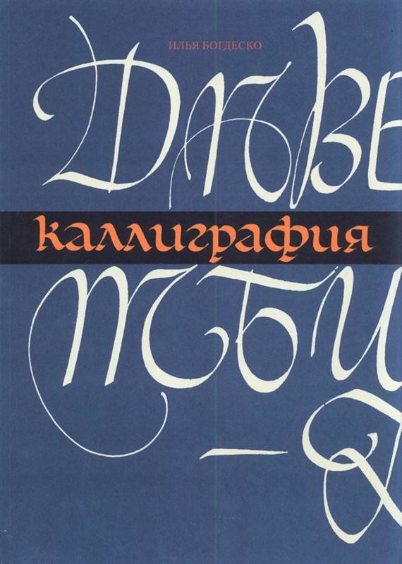
Ilya Bogdesko
1923—2010
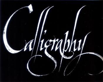
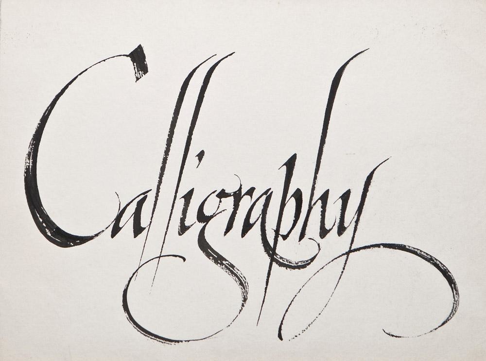
Art of Calligraphy
Nature often gives people an ability to experience the finer things. Some of them from childhood strive for music, others – for painting, ballet or architecture. But there are people who are inspired by a special sense, by sense of a fine letter. Calligraphy becomes a dream for them.
What does calligraphy mean? This word comes from the Greek language (“callos” meaning beauty and “grapho” meaning I am writing). Nowadays calligraphy is the art of making beautiful and elegant handwriting.
Calligraphy is a very ancient part of human history. Together with written language it has been improved for years. It is characterized by the constant aspiration for beauty. We perceive the sense of calligraphy, its aesthetic charm with especial trembling and awe. It is an invaluable heritage, the only professional school for those who are not indifferent to calligraphy, who want to improve their skills in this sphere throughout their whole life.
They say that if one wants to get good results in any kind of art he/she has to be gifted. Of course this will not harm their chances. But who can say from the very beginning that one has this talent? The most important thing is desire. If calligraphy attracts you, try to do your best and you will certainly find the talent which is sure to be on the other side of great labour.
Equipment
Working place
Calligraphy demands concentration, comfort and silence. It is good to have your own table somewhere near a window with the appropriate day- and evening-light. There should be enough space on the table for your writing-materials: plane-table and desk 50×70 cm, tools and paper. It is better to have a desk with a changeable inclination. You will also need one rough sheet of paper in order not to soil the original text with an accidental blot.
Paper
For calligraphic works smooth glossy paper is usually used. On such paper a wide-foot pen leaves more elegant, beautiful, and clear strokes.
Good paper inspires an artist. We would like to bring your attention to the fact that in calligraphy before drawing the first letter you should look at the whole sheet of paper appreciating not only its physical characteristics but as a graphic surface as well. First imagine what you are going to write on it, think about where to write the future elements, how the blank margins will help to express the sense of future images.
Ink
Chinese ink is known to be the best. It looks like a little bar. It is ground to powder on a special stone or on frosted glass adding some distilled water. This ink trickles down from the pen well and has a nice rich tone. Ink from bottles must be diluted with water, or because of its stiffness you risk getting rude ugly letters. From time to time shake the bottle with ink. In many shops you can find special calligraphic colour ink. It easily flows down from the pen and has nice tints.
For beginners I have a piece of advice: try to prepare ink yourselves using soot, barks, rinds of walnut and pomegranate, etc. Sometimes you will get such unexpected and tender colours which you will never find on sale.
Wide-Tip Pens
In the picture you see different kinds of wide-tip pens, a double pencil and a peaked pen. The first pens are produced by foreign companies as complete sets, with different widths of the writing part. The width varies from 0,5 mm to 5 mm and more. Do not despair if you have not got manufacturing pens. Instead of them you may use pens made from reed or from feathers.
After all if you do not have a good pen you may even use a wooden chip of which you can make a tool imitating a real pen.
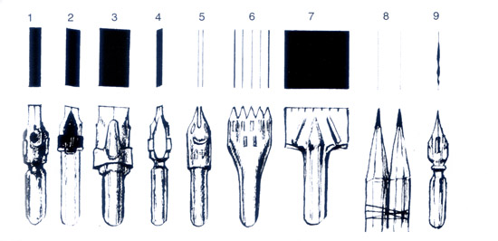 Kinds of wide-tip pens (cuts of writing parts): 1 – straight cut; 2-3 – right cuts; 4 – left cut for lefthanders; 5 – decorative pen; 6 – pen; 7 – stylo pen; 8 – double pencil; 9 – pointed pen.
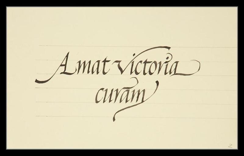
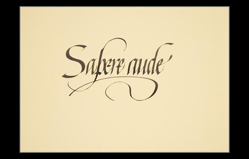
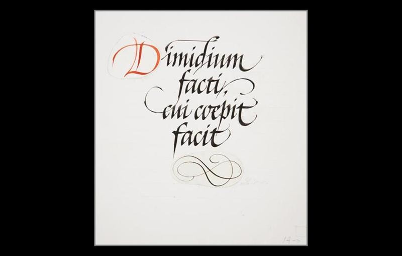
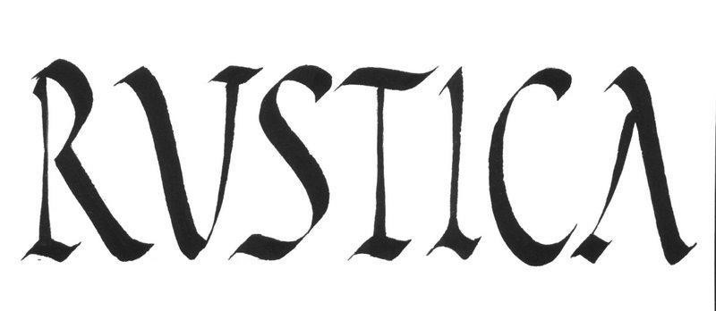
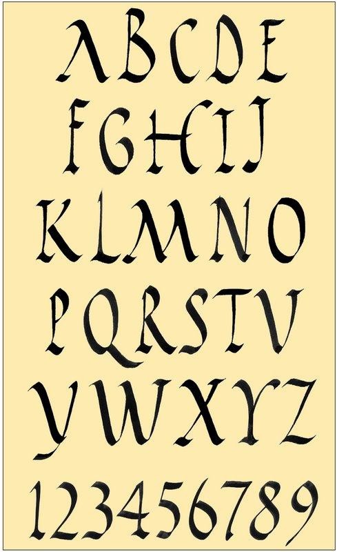
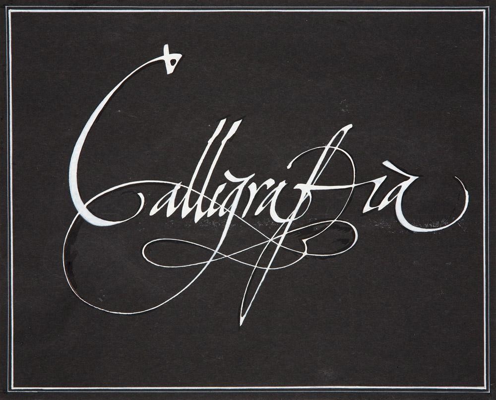
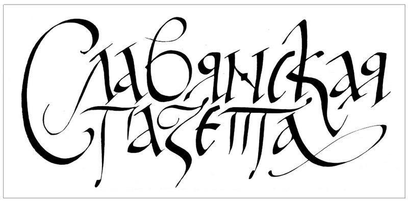
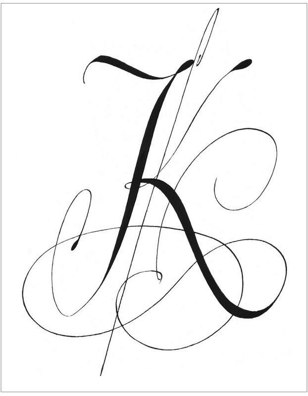
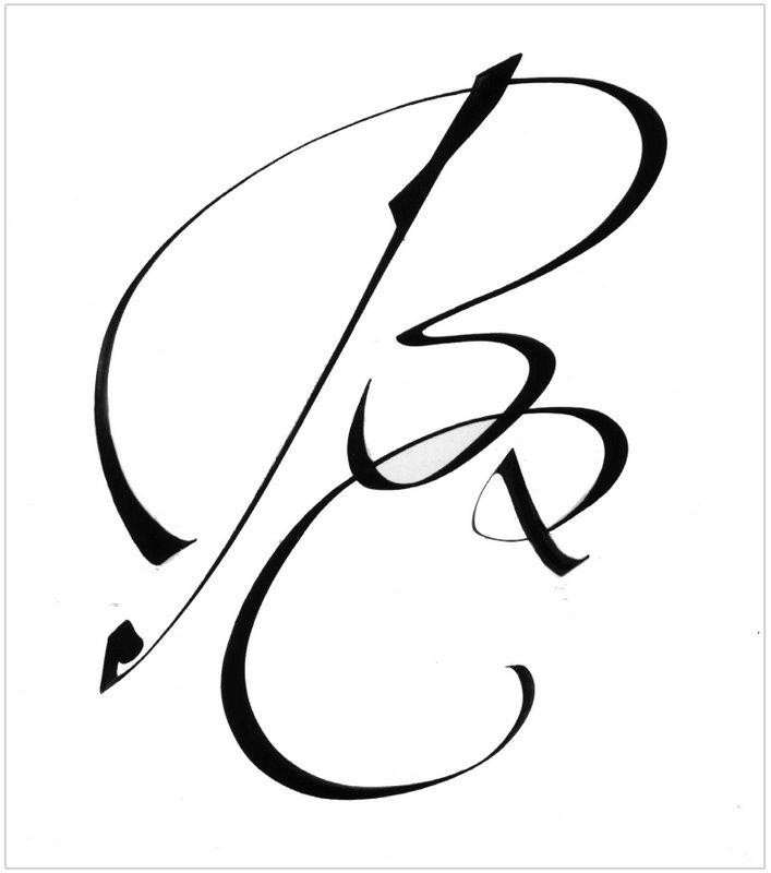
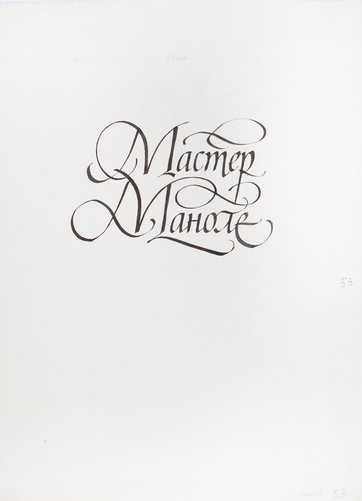
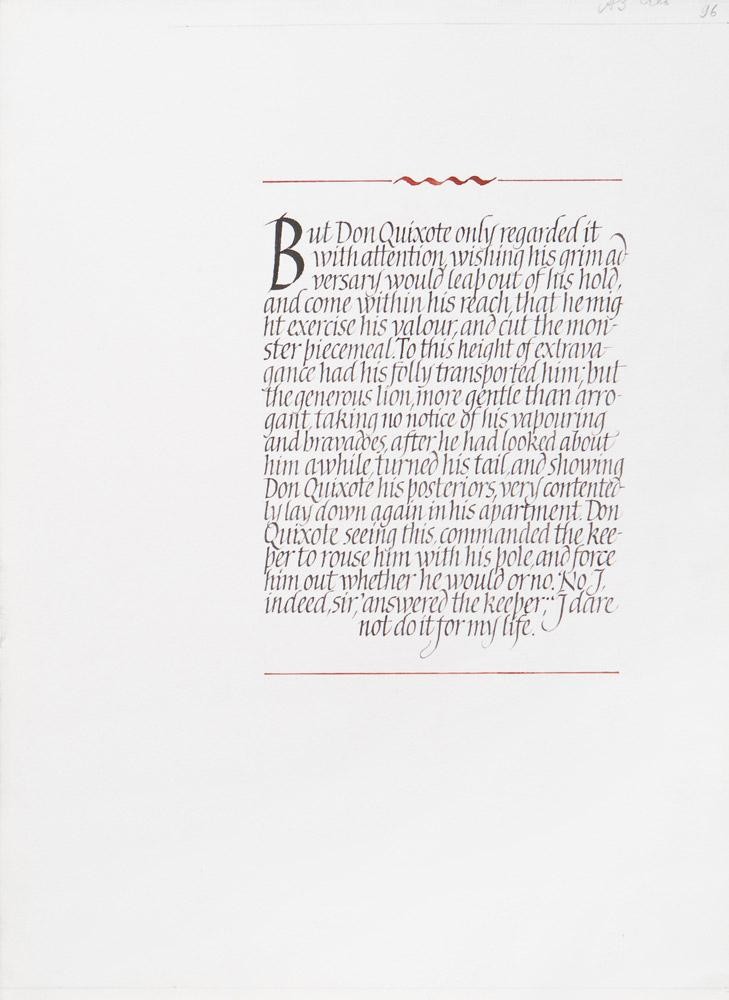
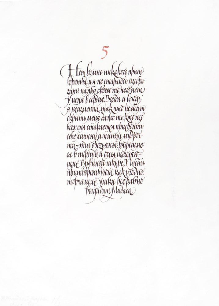
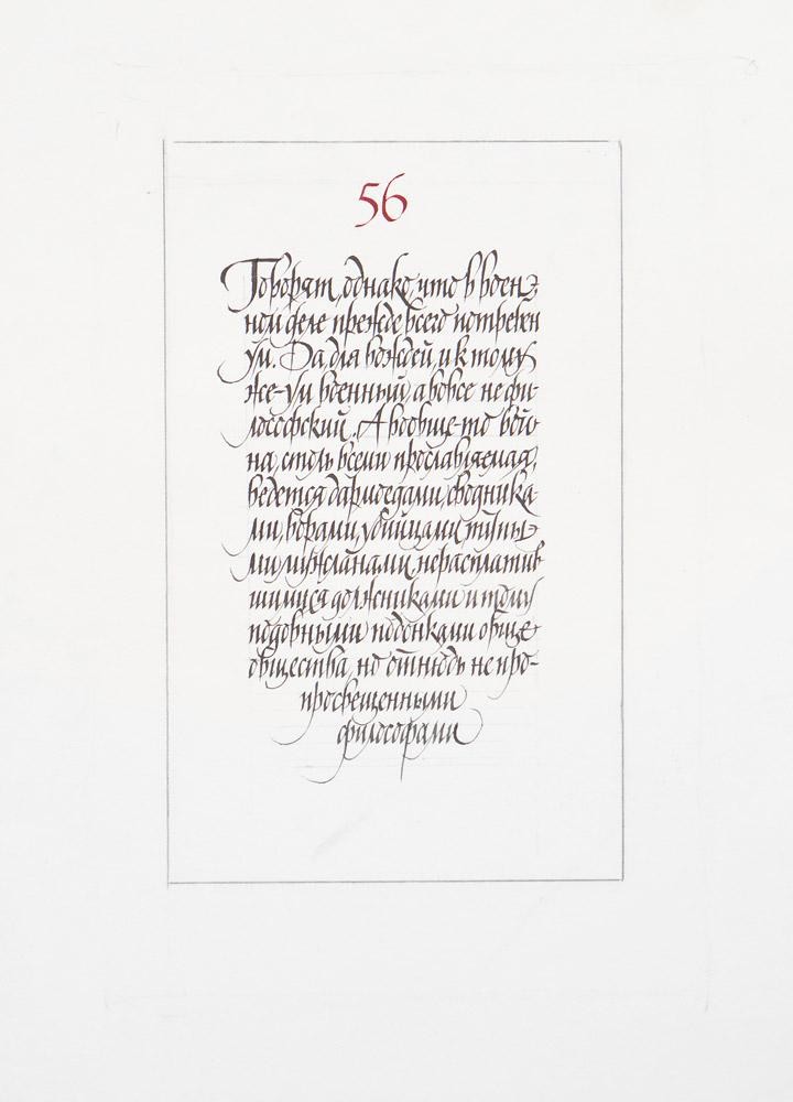
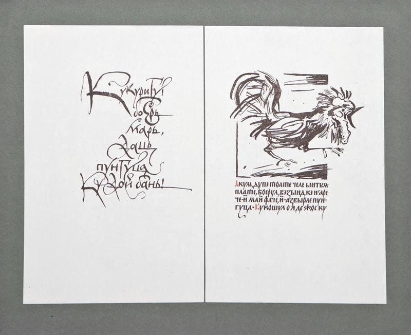
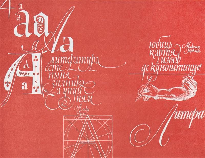
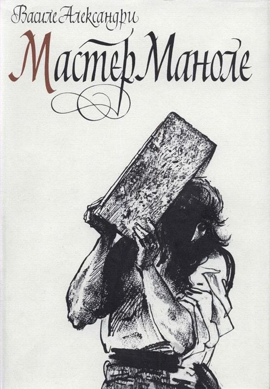
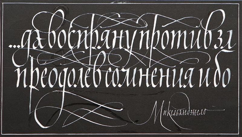
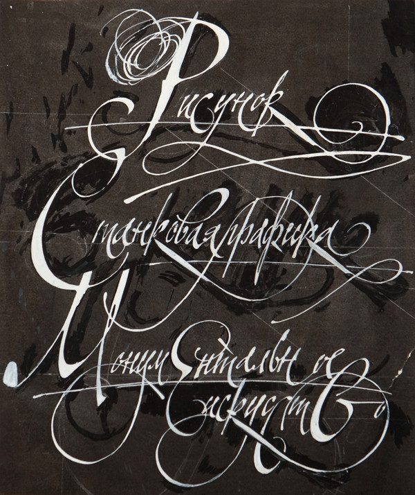
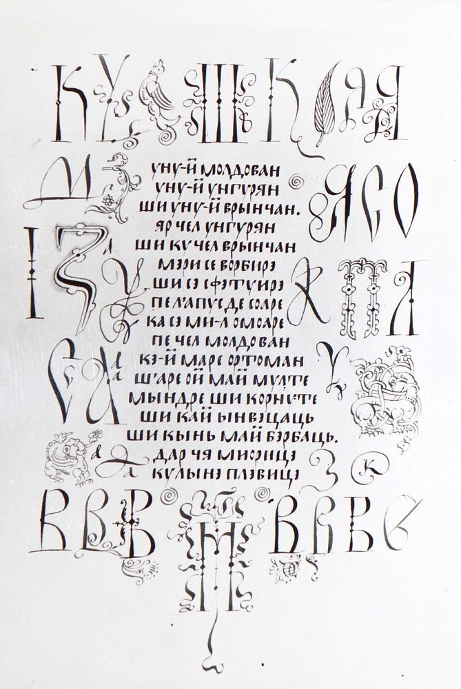
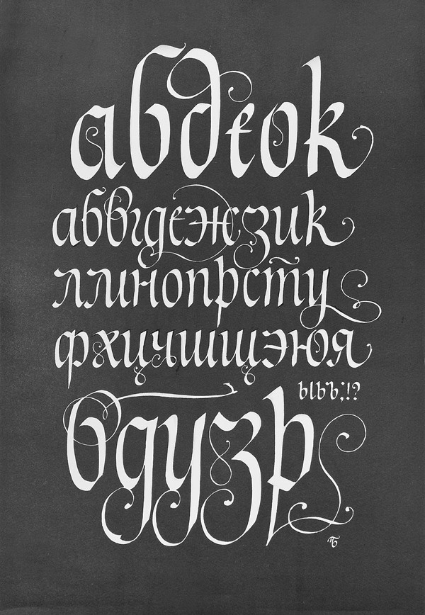
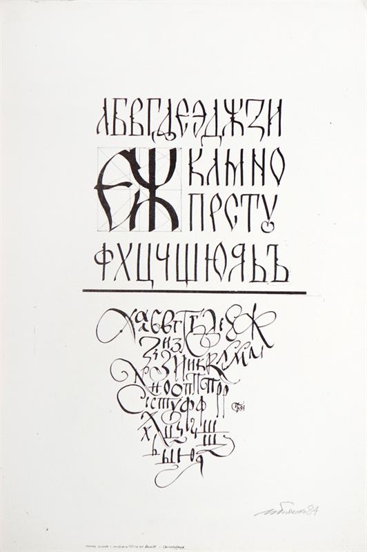
Author works


Exhibition opens in
2142
days
Words Of Wisdom
For the largest part ill handwriting in the world is caused by hurry.
(Lewis Carroll)