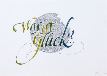
Maierhofer Johann Georg
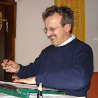
Maierhofer Johann Georg
Regensburg, Germany
Сalligrapher
The way of Calligraphy
"letters act as practical and useful signs,
but also as pure form and inner melody."
Vassily Kandisky
There are three great regions where calligraphy developed: Asia, the Orient and Occident.
The energy of the form is fundamentally the same, only the ways in which calligraphy is performed differ from each other.
In Europe, including eastern Europe and the USA calligraphic interpretations have developed. The great Roman time, the Celtic way of life and calligraphy, the Romanesque style and all other cultures where different lifestyles express themselves in music, thinking, painting, architecture, calligraphy and other human activities.
In the 13th century there was a split in schools of calligraphy in Europe: the Italian and the German. The Italian school was a further development of the earlier Romans and included the new style of the 14th century: the Renaissance. The German style began in the Gothic period, i.e. architecture and writing represented the kingdom of God on Earth. The path that leads to God comes first, egocentrism comes second. This is shown by the broken shaft in the letterforms of Gothic script. It develops into the “Schwabacher” and other “Fraktur”-forms in handwriting and print. In 1941 these forms were forbidden by the Nazis. Since this time Latin forms have been also used in Germany in handwriting and print.
Nowadays calligraphy is not apparent in the official educational system in Germany. It can be learned from other calligraphers or by studying books. A tradition of modern calligraphy in Germany comes from the “Type Foundry Klingspor”. In this tradition K.G. Hoefer founded the “Schreibwerkstatt Klingspor”. Another calligraphy society is “Ars scribendi”, founded by Professor Werner Eikel. In the Year 1998 Professor Pott published a “Schreibmeisterbook” which exemplifies contemporary callygraphy.
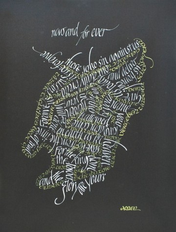
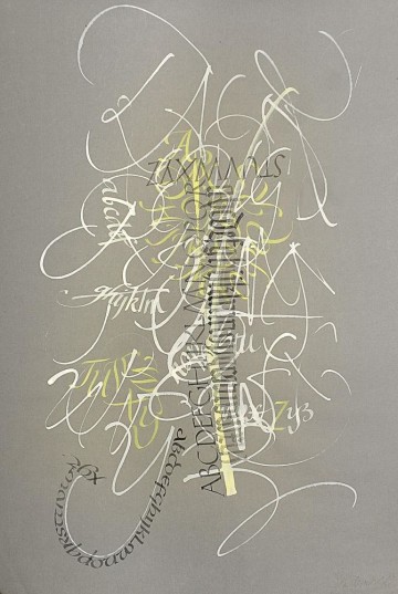
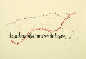
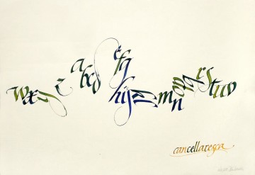
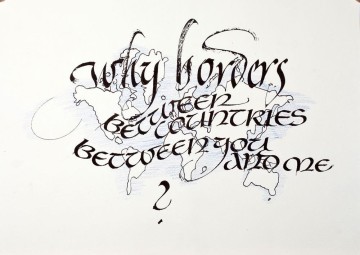
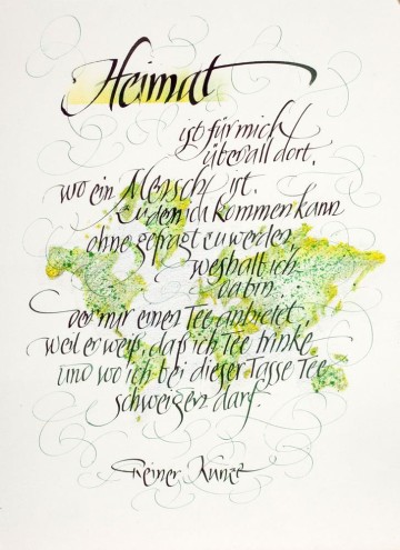
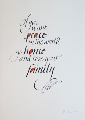
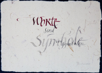
Calligraphy nowadays is not doing historical scripts.
Calligraphy nowadays is to work with our own feeling of pressure and release, is to manage the speed of forms on the paper and also the nearness and the distance of the letterforms to each other.
We can practice this in calligraphy and also in all other human activities.
Let us live!
“God always gives you a second chance”
Gottfried Pott
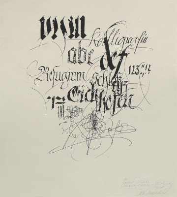
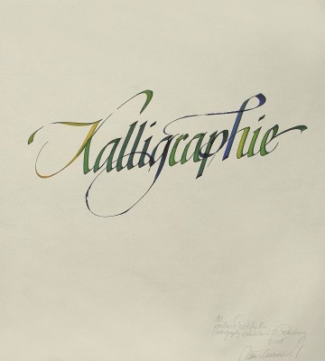
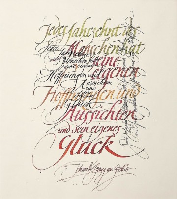
Author works
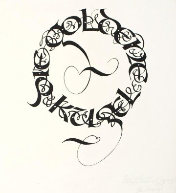
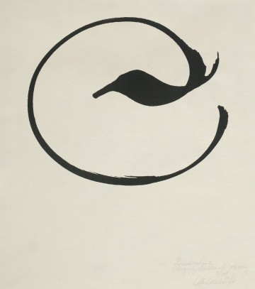
The Golden Sphere. Entry Page of a fairy tale written by Hans Maierhofer
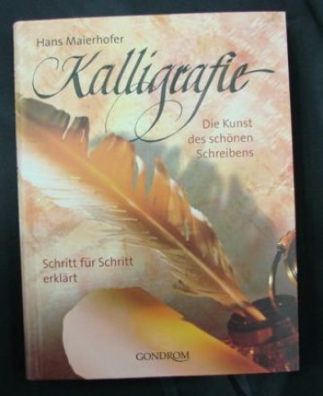
Written in uncial forms in a circle, black ink, Parallel-Pen, ingres-paper, 49x65 cm, 1998Kalligrafie. Die Kunst des shonen schreibens (Calligraphy. The art of Beautiful Handwriting)
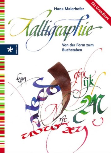
Gondrom Verlag GmbH, Bindlach, 2005Kalligraphie. Von der Form zum Buchstaben (Calligraphy. From Shape to Letters)
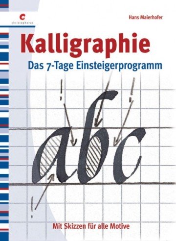
Urania Verlag, Stuttgart in the Verlagsgruppe Dornier GmbH, 2006Kalligraphie. Mit skizzen fur alle Motive (Calligraphy. With Sketches for all Subjects)
Urania Verlag in the Verlag Kreuz GmbH, 2007Man′s beauty is in the beauty of his writing.
