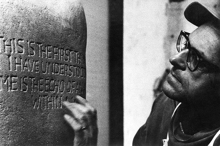
The stonecutter who gave life to letters
In John Neilson’s splendid and comprehensive account of the work of Ralph Beyer, the author recounts how in 1962 the lettering scholar Nicolete Gray’s review of Beyer’s inscriptions at Coventry Cathedral appeared in the journal Typographica. Gray was assessing a project conceived on a monumental scale – Beyer’s eight Tablets of the Word on either side of the cathedral’s nave, his equally dramatic lettering cut from brass sheet and set into the threshold floor and his further inscriptions in the Chapel of Industry, as well as a range of quotidian signage. Beyer might have hoped for a sympathetic review. He had, after all, sought out Gray after reading her article ‘Theory of Classical’ (1953). He had felt liberated by the example of David Jones’s idiosyncratic calligraphy illustrated in her piece, and found her sympathetic to freer forms of lettering, noting her awareness of the German calligrapher Rudolf Koch.
As a friend of Ralph’s father, Oskar, Koch had shaped Beyer’s understanding of the power of lettering in his boyhood. Encouraged by Basil Spence, the architect of Coventry Cathedral, Beyer had taken early Christian inscriptions and symbols as his inspiration. These had been the subject of two books by Oskar Beyer and throughout the Coventry project Ralph was encouraged and sustained by his father. Beyer’s lettering at the cathedral was in part a tribute to his father and to the world he had lost; half-Jewish, Beyer was sent to England at the age of 16 in December 1937 and his mother was to die in Auschwitz. Gray’s response was therefore a shock to Beyer, the pain of which did not diminish over the years. She was particularly critical of the Tablets of the Word, the most important part of Beyer’s demanding commission.
Gray suggested that Beyer lacked ‘the creative imagination or intensity of religious feeling which David Jones could have brought to the work’, taking issue with the inscriptions’ ‘false informality’, the uneven scale of Beyer’s individual letterforms, his spacing, his adaptation of early Christian symbols – the key, the vine, the cup – which she found ‘crude and banal’. She did, however, appreciate the scale of the lettering, noting that from the cathedral threshold it was possible to read the tablets – carrying texts from the New Testament – while looking down the long nave towards Graham Sutherland’s tapestry. But she did not recognise Beyer’s ambition to create communicative sculpture. Cut into stone that stood proud of the wall, Beyer’s inscriptions were worlds away from David Jones’s essentially private Latin or polyglot work on paper.
Beyer’s work was always best appreciated by individuals outside the world of lettering, beginning with Nikolaus Pevsner’s recognition of Beyer’s talent – he described him as ‘married, untidy, poor but serious and sound’ – when they were both interned at a camp in Huyton during the Second World War. Basil Spence remained unfailingly loyal to Beyer, noting that he was ‘a diffident and humble person, though a most sensitive carver’ well able to create letters that could be ‘“felt” – some irregular, some smaller than others, but each one a piece of incised sculpture in its own right’. Similarly the architectural partnership Maguire & Murray appreciated Beyer’s gifts. In 1954 Keith Murray had given Ralph a commission for a slate altar at St Katharine’s, Shadwell, an early experiment with free lettering, while his inscription for Murray & Maguire’s St Paul’s Bow Common of 1960 still stops the heart – THIS IS THE GATE OF HEAVEN in shutter-cast concrete above the architects’ austerely functionalist porch. Beyer continued to work for the firm, in 1985 creating unusual raised plaster inscriptions in English, Turkish and German for a nursery school in a deprived part of Berlin, a project that gave him great pleasure.
This review of The Inscriptions of Ralph Beyer by John Neilson appears in the March 2021 issue of Apollo.
Read more on www.apollo-magazine.com
 The stonecutter who gave life to letters
For the largest part ill handwriting in the world is caused by hurry.
(Lewis Carroll)


