
Stunning Hand-Illuminated Version Of Tolkien’s ‘Silmarillion’
For a school project, a German art student hand-illuminated and bound a copy of J.R.R. Tolkien’s Silmarillion.
Benjamin Harff, who hopes to work as an illustrator and calligrapher, created this one-of-a-kind manuscript for his exam at the Academy of Art in Germany. It took Harff one year to create his book, financing it himself.
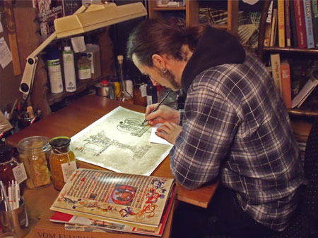 Creator of "Deluxe-Silmarillion" Benjamin Harff at work
The Tolkien Library website got in touch with Harff for a lengthy interview and obtained several photos of his deluxe edition Silmarillion. Check out an excerpt from the interview here below.
"I created the deluxe-Silmarillion for my exam at the Academy of Arts. My first idea was to create illustrations for the Lord of the Rings, but I realized that the films had left a too strong impression upon me, so I could not work free. So I decided to illustrate the Silmarillion. The calligraphy was first planned to be reduced to one single initial for each chapter. So I studied the „History of Middle-Earth“-books as well as the Letters of J.R.R. Tolkien and especially his works as an illustrator. I also tried to find out what inspired him lyrically and visually and I think you can put that into one word: nature".
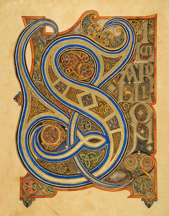 Front page of “Silmarillion”
"It is obvious that Tolkien was also a lover of calligraphy, especially medieval. In the book „J.R.R. Tolkien – Artist and Illustrator“ I found a hint about a book concerning calligraphy Tolkien had read. So I bought the same book and worked it through".
"That was the point where I had more and more fun in doing medieval calligraphy and finally I had to make a decision: Illustrations or calligraphy. This was not easy, because I had made very excessive preparations for the oil-paintings, but my time was so short, that I could not do both".
“All the initials, the calligraphic pages and illumination was drawn and painted by hand. I used a steel-pen and Indian ink as well as brushes and water colours. For the metal colours, – silver, gold, and copper – I took acrylics, because they are easier to handle than really laid gold and you can also work with water colour on acrylics. After this all the work had to be digitalized by scanning and photography, followed by the fitting into the text. This was done in only very short time, and that is why there are so many errors in the typography”.
“When I just look into a book about medieval calligraphy (and I read several of them) I am at this point influenced by what I see. But I can say that I did not copy anything, but only adapted the styles, so where similarities occur, they are not intentional”.
“With its mythological character the Silmarillion suited best, because the blooming of medieval calligraphy was also in a religious context. In this exam I had the possibility to play with all styles, put my own ideas into them and find the one I like best”.
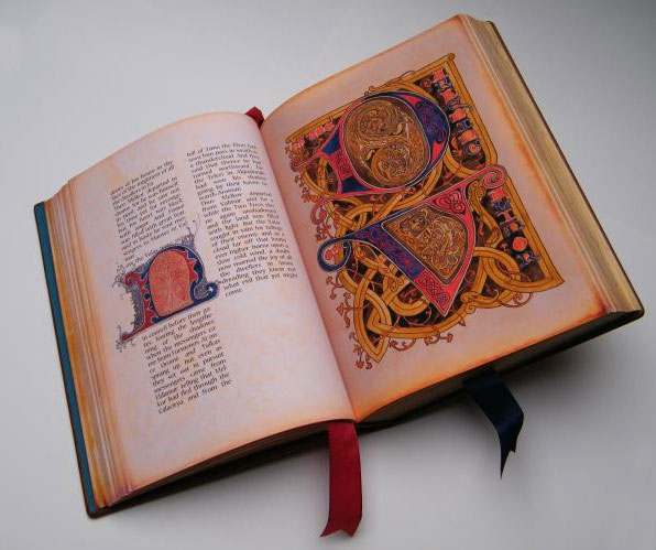 Spread of the handmade book
 Sources: The Tolkien Library, Geeks of Doom


Exhibition opens in
2113
days
Words Of Wisdom
When there are no words left, the meaning is still preserved.