Nissan has a ‘Challenging’ New Plan
 Nissan’s new strategy «Power 88»
Nissan Motor Co. announced a midterm plan Monday dubbed «Power 88» — a playful reference to a pair of numerical goals for 8% growth. It isn’t the first quirky name for a business strategy from Japan’s No. 2 auto maker by volume. In recent years, other plans have been called variously «Nissan Value Up», «GT 2012» and «Nissan 180».
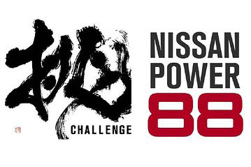
But the latest plan, at six years the longest by far since Renault formed its partnership with Nissan in 1999, is unique in one respect: its artwork. Unlike previous midterm strategies, the Power 88 catchphrase is accompanied by a dynamic rendering of a Chinese character meaning «challenge» (in Japan, Chinese characters are an important component of the written language).
The striking calligraphy was originally commissioned by Nissan for its annual New Year’s Party in January. Souun Takeda, a 36-year-old former corporate salaryman now known as one of Japan’s foremost up-and-coming calligraphers, created the image on a giant canvas that now hangs in Nissan’s global design studio.
«It’s a dynamic image that we thought would have a lot of significance this year», says Shiro Nakamura, Nissan’s Chief Creative Officer for design and brand management. «It turns out, that was truer than we knew at the time», he said, referring to the subsequent March 11 earthquake and tsunami.
Six weeks ago, Nissan says the design was re-purposed as a logo for the Power 88 campaign (with the addition of the English word «Challenge» in the lower right corner) and submitted to compete internally with two other candidates. It was the only one with an image accompanying the stylized text, which sealed the deal, Mr. Nakamura said.
Ironically, Nissan’s midterm plan sets ambitious targets for almost every major global market — except Japan. Speaking at a news conference Monday, company CEO and President Carlos Ghosn said the auto maker would remain committed to domestic production of one million vehicles a year, but that increases in output and sales would come from elsewhere. «All of our growth is going to come from outside Japan and Europe», he said.
Yet the Japanesque logo conveys a sense that Nissan remains very much a Japanese company, at least at heart.
«We wanted to show the world Japan’s power», Mr. Nakamura said. «Our domestic production is small, but very important to Nissan’s core identity».
Source: The Wall Street Journal
Calligraphy — the written beauty of feelings.


