Outside point of view
My understanding of calligraphy differs from the view point of professionals who are the majority of art school teachers. A lot of new schools of calligraphy have appeared for the past 20 years. The teaching of calligraphy and handwriting has improved and now it helps us to understand the logic of letter design and study all available variants of calligraphy created with different instruments.
In late 1970“s when I first learnt about calligraphy, it wasn’t considered to be an independent kind of art in Russia. The specialists distinguished between book design, design graphics, banners, and as for fonts they were considered as elements of these kinds of art. As for calligraphy, it was perhaps the most “light-minded” element of font. My Teacher, Irina Guseva, used to say that the only place where she really practiced calligraphy was Leipzig High Graphic School with teacher Albert Kapr, and later, in 1970“s with S.B. Telingutter. After his death in 1970 she spent her time ”in a quiet nook writing something in her notebook and never knowing if anybody needed it…”. The courses of typography where she was invited as a teacher were a chance thing. I was swallowing all her words, interpreted them in my own way and then created something calligraphic, and, as I thought it then, original and beautiful, something that made me happy.
It is always better to study when you like what you do, especially if your Teacher gives you an opportunity to analyze and improve your creative activity. I think I was lucky to have three typography teachers in the studio of calligraphy and typography: E.M. Drobyazin, who enlightened us with the history of writing; I.A. Guseva, who encouraged all our experiments at the same time correcting the “flight of creative thoughts”; and M.V. Bolshakov who worked in the strict academic tradition. My trips to Tallinn also played a huge role. It seems as if they teach calligraphy at school! By the way, their broad nib technique differs from the European.
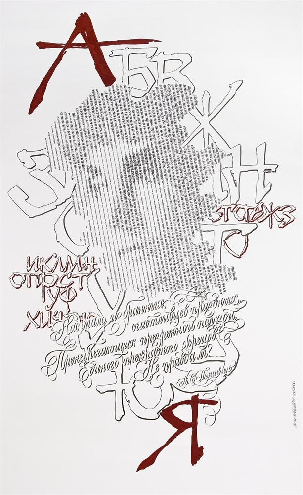
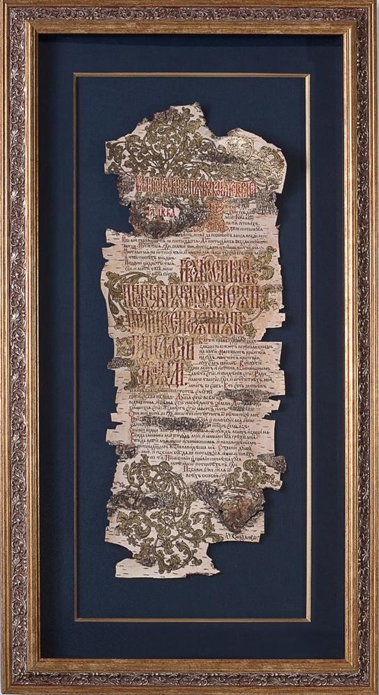
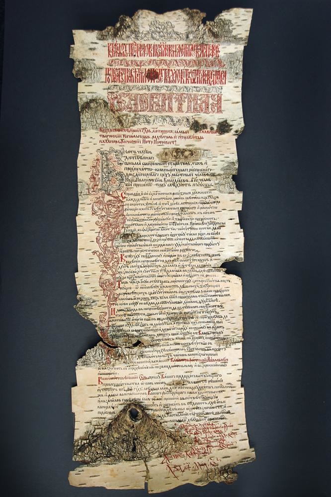
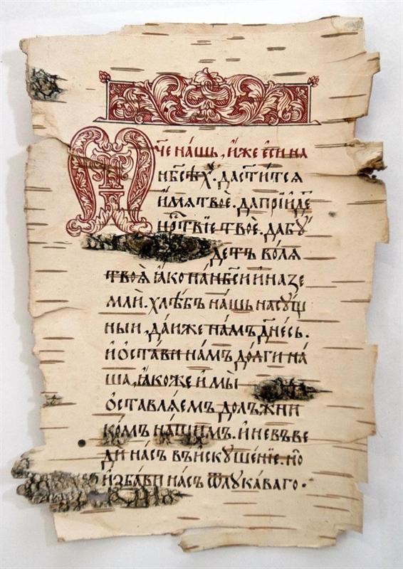
Font has its canonic forms which originated from the writing styles characteristic of every historic period. However, despite the proportions and rules of word depiction, every manuscript reflected the scribe’s individuality.
Any human activity is an inseparable part of life and every life takes any opportunity to develop. Like a child from the first days of his life masters and broadens any skill available to him. Everything develops in the same way.
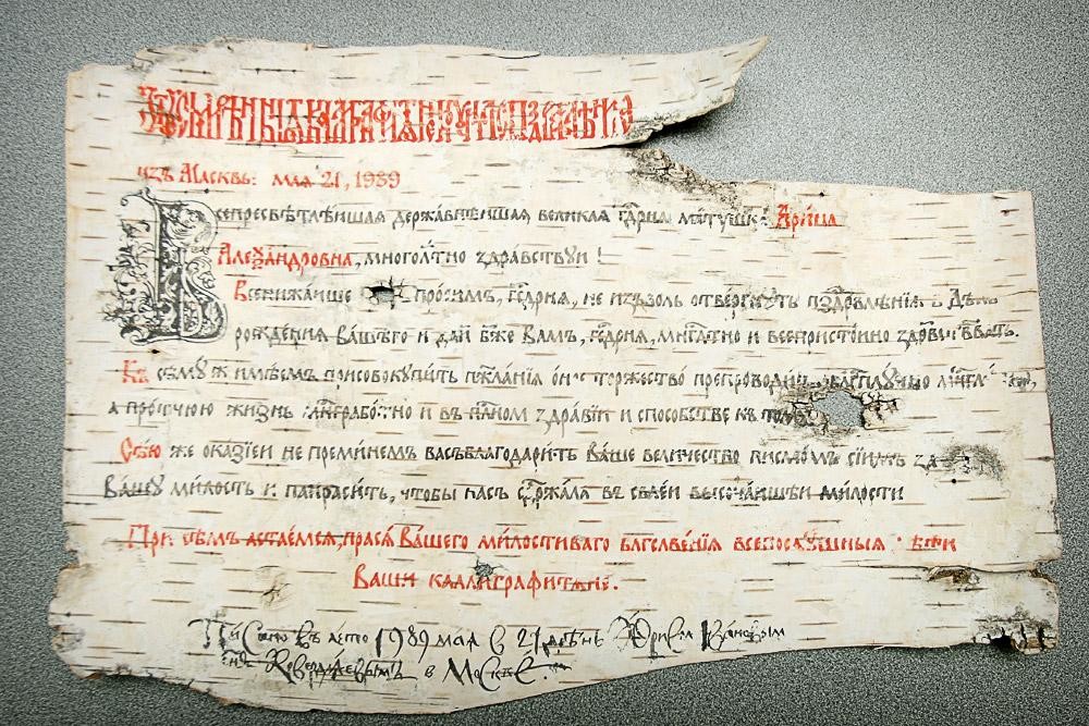
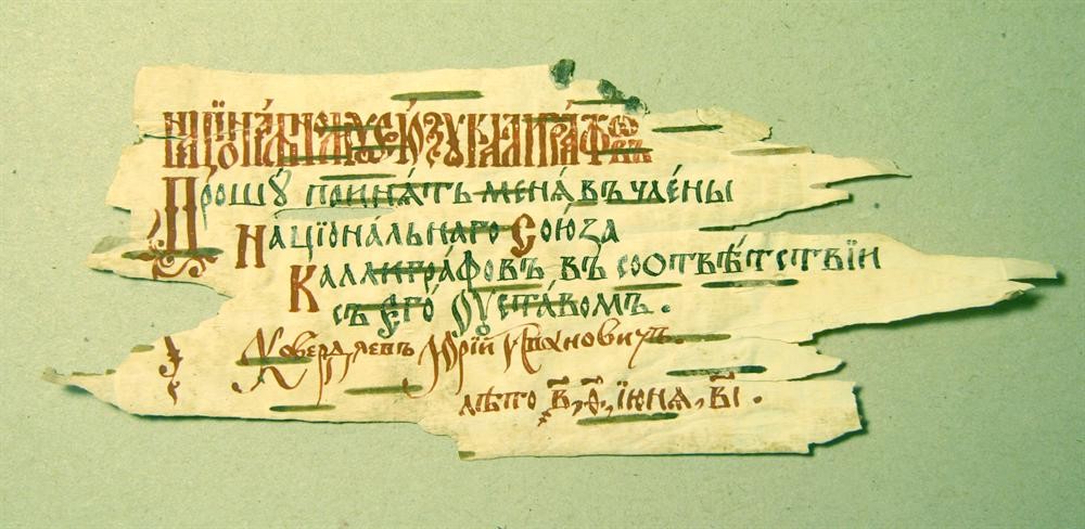
When literacy was a privilege of the upper society handwriting was available for the selected ones. But as the number of people “initiated” into the secret of handwriting grew, they invented more methods to promote of this means of data storage. As many scribes, as many writing variations. Absence of communication between the scribes determined crucial differences of numerous writing styles and further evolvement of every original style. Different languages also influenced writing styles, as far as different sounds required certain alphabetical marking. The languages were also influenced by national peculiarities. Initially the formed styles of writing served the distribution of religious texts. But as scribes were rewriting the holy texts, they learnt to adopt writing styles (little by little) to more legible variants. Illumination of manuscripts was becoming more varied and picturesque, new talented masters were appearing, the traditions of almonry schools were forming. As life conditions were changing, more elaborate writing styles and fonts were designed. As far as I see it, font development is not yet finished. Only time will tell what font development will be like (indeed, in his time Copernicus didn’t know about “black holes”, Lomonosov knew nothing about the Mendeleyev’s table, Pushkin was unaware about electricity and Tchaikovsky never knew about the synthesizer). There will be temporary declines or even periods of oblivion of some arts and technologies, but those short periods of regress will inevitably lead to their breakthrough. If for some time artists forget about calligraphy they soon will start to miss it. I don’t think there is any need to deliberately save calligraphy. It will not be suppressed by computers or drawing instruments. Quite the contrary, due to modern technologies handwriting can move to a new level. This is what future generations of artists are supposed to do.
Everything that was and will be designed by people will exist for as long as Homo Sapiens exist. People will never stop admiring the beauty of nature, human beings and human creations, by the way, improvement of the latter is a never-ending process.
New paintings, symphonies, palaces and cars will be created due to or despite the traditions. Calligraphy is always new. “Originality and individuality are the elements of a calligraphic font”, said Albert Kapr. Thus, development of calligraphy is also inevitable. It is important to carefully study the classic specimens of capital and calligraphic fonts, chronological and technological history of writing development and regularly practice the basic styles. With professional knowledge and skill one can experiment all the time, avoiding professional errors which later may be wrongly interpreted as creative bursts.
I think contemporary calligraphers should teach young people love and devotion to calligraphy, and young artists in their turn will contribute to future development and prosperity of calligraphy.