Yaroslav Kuts
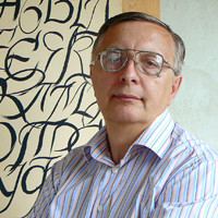
Yaroslav Kuts
Lviv, Ukraine
Calligrapher, designer, graphic artist, pedagogue
Beautiful Writing is More Succinct and Deeper
Calligraphy has more precise historical names in Russian and Ukrainian, which are easier to understand – beautiful writing. The art of beautiful writing has been cultivated since the old days and was highly appreciated in each community; yet it was the model and the factor of development of culture, art and the entire community.
What is hidden behind this notion? To write beautifully, one should master the tools and materials for writing perfectly, and they are endless. One should understand that the process of writing is the same overcoming and mastering of the material as in painting, sculpture and other types of art and craft. The same laws of compositional and plastic buildup of the space work in the art of calligraphy, as in other types of art.
However, the main thing in beautiful writing is to master and train eye estimation and hand, to properly subordinate it to emotions and mood of a human being. Of course, to learn to write beautifully, one should master certain, quite simple work methods, preparation of the work station and other “trifling things”. One should always remember that it is on trifles that any art is founded on. Art differs from craft by this “bit”, i.e. “trifles”.
It is impossible to master beautiful writing without thorough and painstaking labour, without constant practice. The main thing here is that there are no age limitations for its mastering.
But why should a modern person, equipped with technical achievements, return to the historic past? It turns out to be that, losing the skills of writing, we lose not only in development of a hand and an eye — be lost in our emotional and mental development.
A hand-written page is always warmer and more emotional than a printed one. It has a greater energy, let alone individuality. Beautiful writing always means an illustrative and individual disclosure of thoughts, emotions, feelings and aesthetic views. This is a true transfer of energy.
Calligraphy is now the main source of replenishing printed fonts. However, the fonts that fill our computers now are willing to improve.
The Ukrainian Academy of Printing in Lvov is constantly improving and developing the art of calligraphy, especially from the time when N.N. Taranov taught there and published the educational textbook of Manual Font (Higher School Publishers, Lvov, 1986). In mastering both Slavic and Latin historical types of writing, we are working on modern calligraphy, and the main objective in mastering Latin calligraphy is adaptation of Latin types of writing to the Cyrillic base. It opens ways to approximation of cultures and civilizations, and expands our range of manual fonts.
One of our priorities is elaboration of new type fonts. Nowadays we have about ten type fonts created on the basis of historic and national calligraphy.
New printed font development is our another priority. At present, we have in stock nearly a dozen printed fonts, many of which were created under the influence of historical and national calligraphy.
The last such development is Naris font set. It has clear-cut historical roots of the Old Slavic uncial and semi-uncial writing. Even at the stage of patenting, it was tested in the Kobzar gift edition as the main textual font. However, they did not do without calligraphy in Kobzar. The composition of its binding is created in the broad pen technique, under the influence of the Ukrainian shorthand.
Getting back on to the main topic, I would like to note that modern advertising, packing and labeling industry, letting alone the publishing business (design of printed editions) should be interested in development of calligraphy as clearly developed individuality and emotionality.
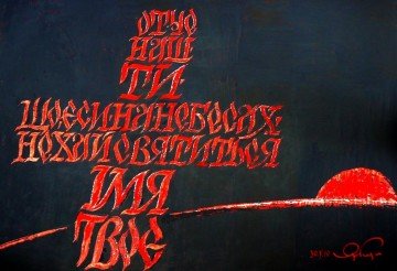
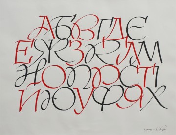
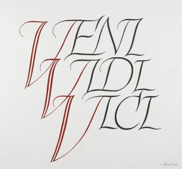
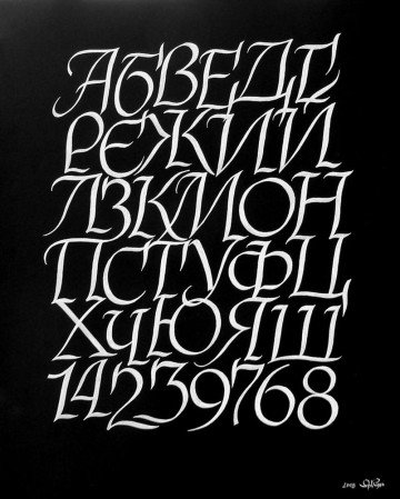
Author works
Calligraphy is a kind of music not for the ears, but for the eyes.
(V. Lazursky)
