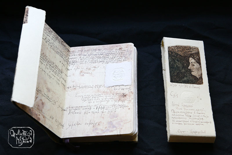
Font and calligraphy in the book media
We don’t often realize that the contemporary or familiar book image is rather conditional. The book cover, binding, interior illumination, illustrations, font size and type sort depend on the time of book production. The book and its arrangement reflect the human consciousness. The complex contemporary book production developed on the basis of a plethora of discoveries and innovations in book production. And relation between the old and new processes of book production was often missed as time went by. Thus, by the 19th century Russia lost the culture of broad-nibbed pen writing and by the end of 1950's handmade bookbinding vanished.
The aim of this article is to explain the variability of functions font fulfils in a book.
Books are perhaps the most popular and universal form of knowledge transmission. That is why we are going to consider the problems and role of calligraphy through the prism of books. There is a quantity of factors influencing the book’s exterior. Those are political events, change of technology, habits and customs. Let us consider some of the historical book types.
In 200's BC the Copts acquire codex – the sheets of parchment bound in a kind of a copybook.
A papyrus scroll (used by the Egyptians from 3000 BC to 500-600 AD, and till 1100's by Greeks). In the antique period leather and parchment scrolls were also used. The Greeks and Romans used diptychon and triptychon (and polyptychon consisting of a quantity of tablets), the book consisting of two or three tablets (or ivory plates) covered with wax. They were attached to one another with rings or leather belts.
Italic was extensively used in the Roman Empire. The so-called regional writing types develop on the basis of Roman Italic: Irish and Anglo-Saxon (the so-called island minuscule), Merovingian, West-Goth, Old-Italic. After the decay of the Roman Empire, codex as a kind of book was borrowed by Egypt and Rome, Byzantine, then the Arabs and finally after the Crusades had finished it returned to Europe.
The early era of European book didn’t use miniatures or gilding. It was the epoch of Quadrata and Rustika in Europe. The illumination will first be applied in European books after the Crusades when the Crusaders get familiar with Oriental culture. The books of 1000-1100's differ considerably from the books of 1200's and succeeding centuries. The square book hand– quadrata – was written with a horizontal pen. The Rustika font (from Italian RUSTIKA – peasant-like, simple) was written with an inclined pen. The font was characterized by sharp, straight lines, supple curves, thick and thin strokes, angled stressing and incised serifs.
The empire of Charles the Great practiced a new font type which was called Minuscule (from Latin MINUSCULUS — tiny) and later referred to as Carolingian minuscule. Initially the roles of capital letters were performed by the same minuscules enlarged in size. In the 11th century there were substituted by Lombardian versal developed from the letters of capital Roman and uncial script.
The eastward Crusades in 1200-1400's stimulated development of book and literacy. The books on hunting, war craft, love novels and frivolous literature are impossible in the conditions of a monastery scriptorium. Thus, in the 12th century the University and the first public library appeared. As a consequence private calligraphic and bookbinding workshops were founded. Thus, we see how different French, Italian, Spanish, English and German books are.
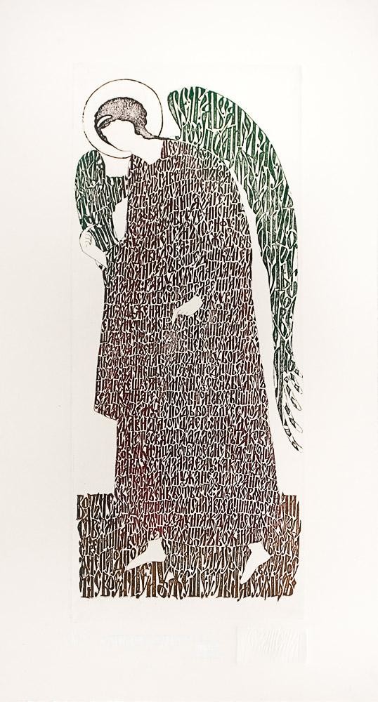
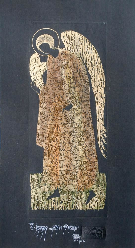
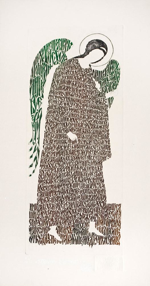
In this period national fonts were being formed. The Blackletter developed. In the 12th century it is spread all around Europe and has a plethora of variants.
The letters fill the page tightly and evenly resembling the interweaving of fibers. The font is called Textualis. By the end of the 12th century Cursiva appeared which was extensively used in chancellery. In the 13th century Italy introduces Rotunda. The ”illegitimate” font – bastards appearing in the 14-15th centuries are simultaneously used in France, Italy, Germany and Spain.
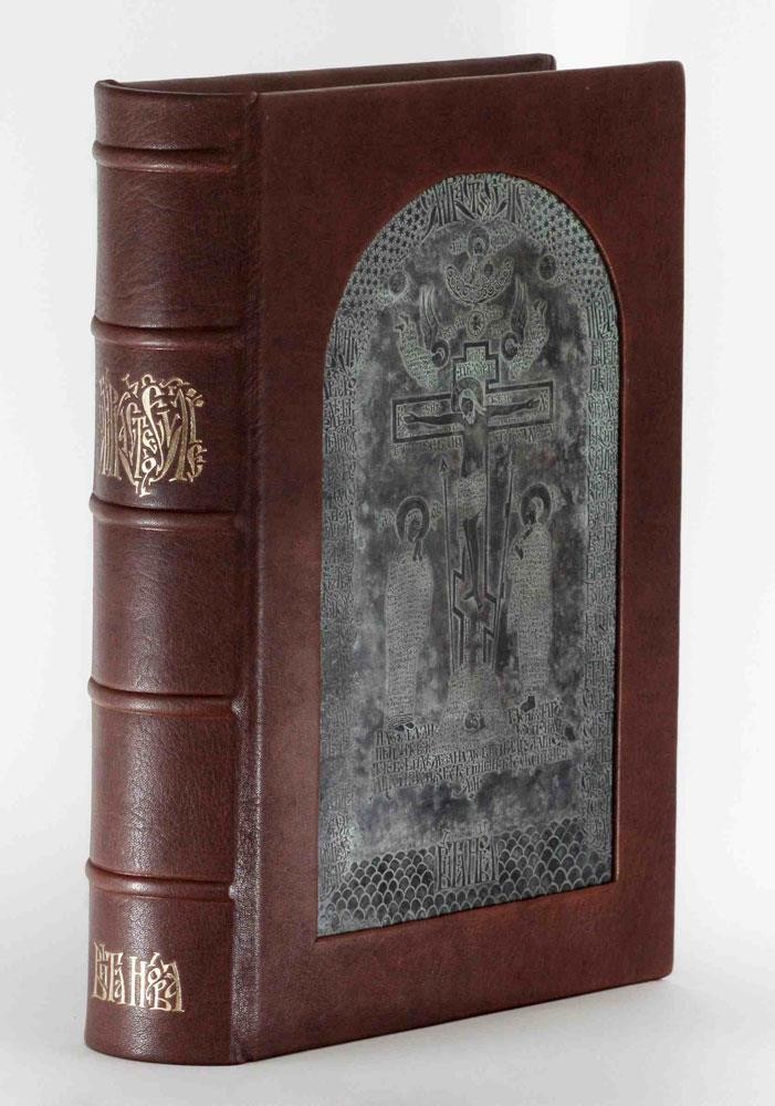
The national bookbinding peculiarities are developing in the meantime. Thus, bookbinding in Germany is made of white hogskin. The picture is made in black and contains an image of a human being (a kind of ex libris). The locks are large and rough. The French make a leather bookbinding with a framework and rounded backbone, whereas pictures inside and ex libris are rare. The English bookbinding always has an image on it. It is the dawn of the era when a book is made for a commissioner with due account of his tastes.
Humanistic ideals create a new kind of literature, new calligraphy (the unequalled masterpiece of cursive writing by Arrighi, La Operina) and more traditional book logics. What is interesting here is the fact that the prototype of Classic Antiqua is Carolingian Minuscule which will be preserved till the present day in its initial form. It was quite a chance thing, for the most renowned scholars of the time took minuscule for the ancient classic type of writing and called it Antiqua.
Leonardo da Vinci was studying the problems of geometric arrangement of fonts. His student and follower Luca Pacioli created his one font type on the basis of Golden ratio and called it Divina Proportina (Divine proportion). Let us consider the Bible of Borso d’Este from Italy. The initial caps here are profoundly stylized and miniature was as if hidden in the decoration of the book margins. Let us consider one more example of image and font cooperation. The book is a canzone by Petrarca, the initial cap is written into the image and the page resembles that of a sealed chart.
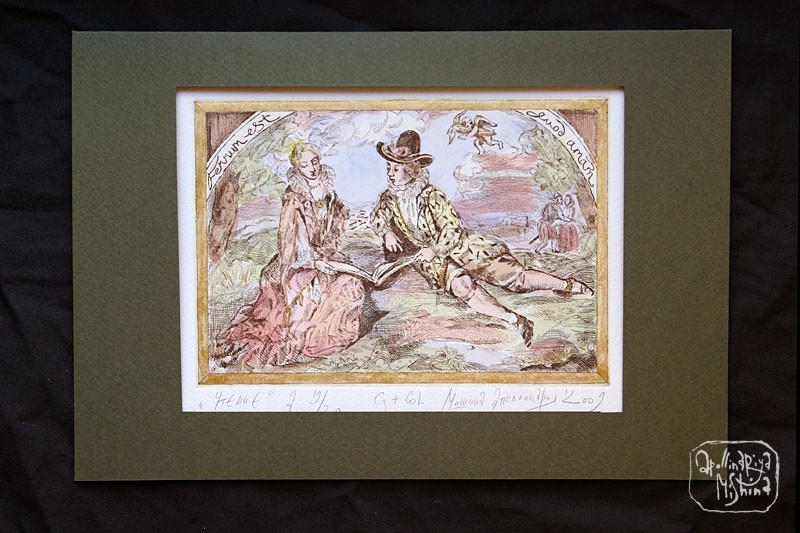
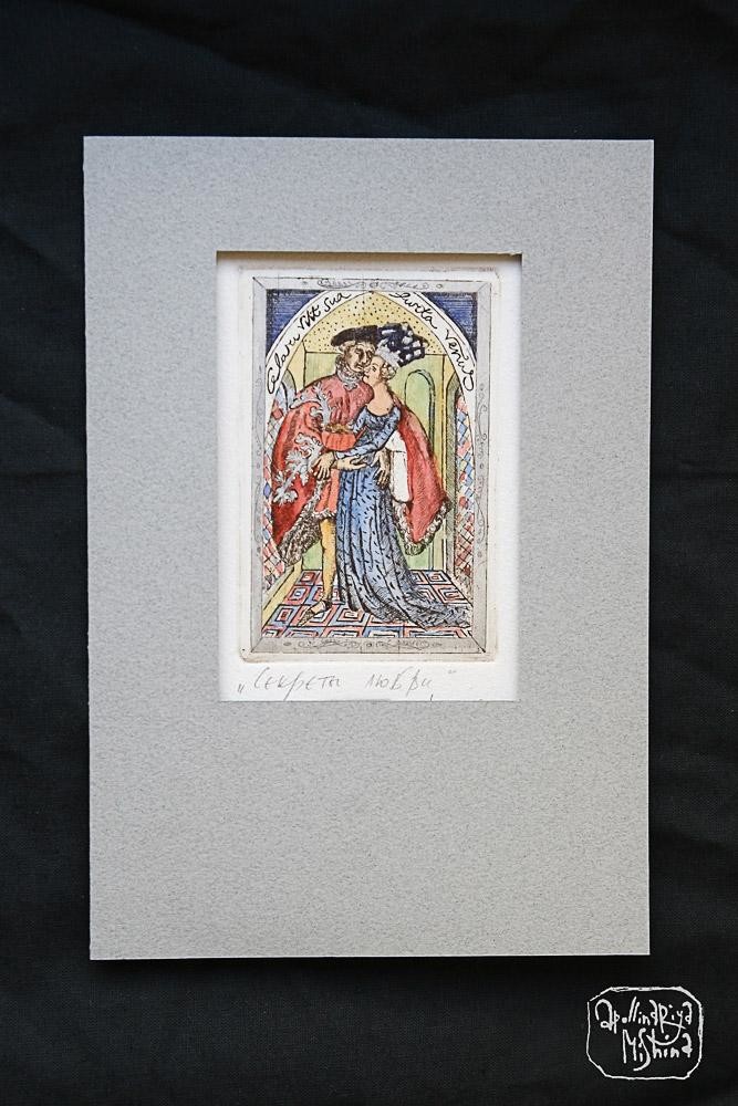
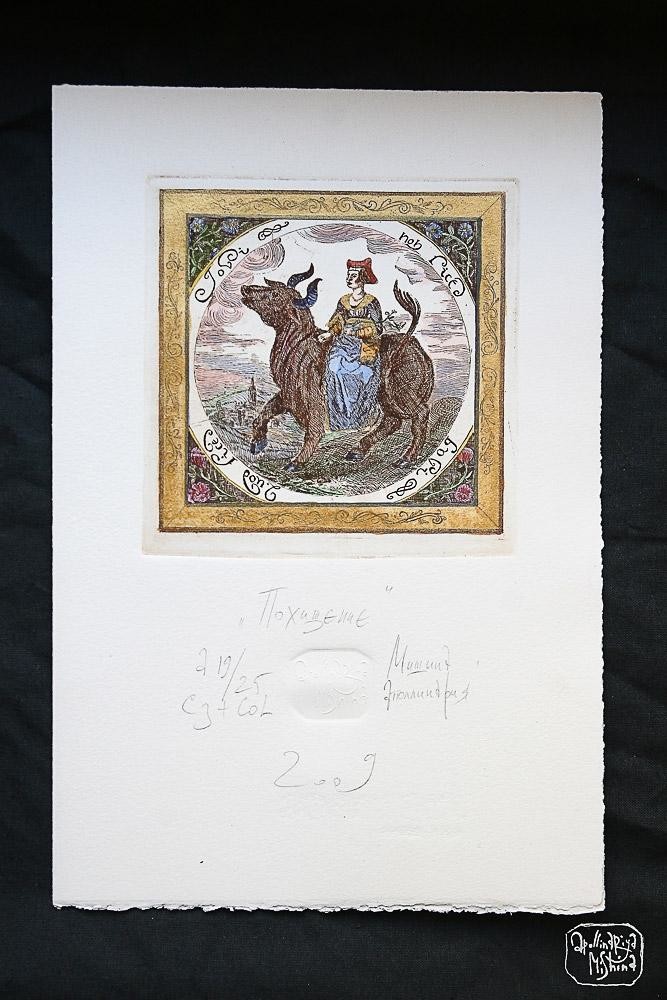
The Theatre of Love were the erotic books popular in France and Netherlands in the 17th century often featuring a cautionary element. We see the pages of one and the same book contain different font types. The framework decorative ornamentation is made with a pen. It is the flowering of copperplate print in Spain when calligraphy fulfills a function of beautiful handwriting as well as that of decoration.
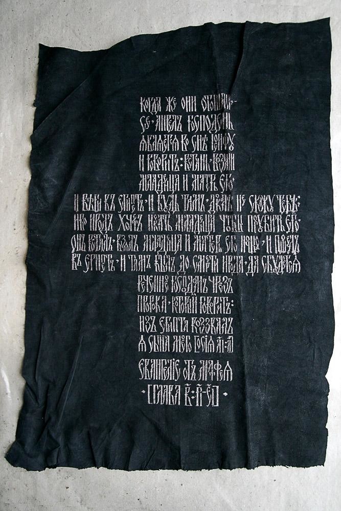
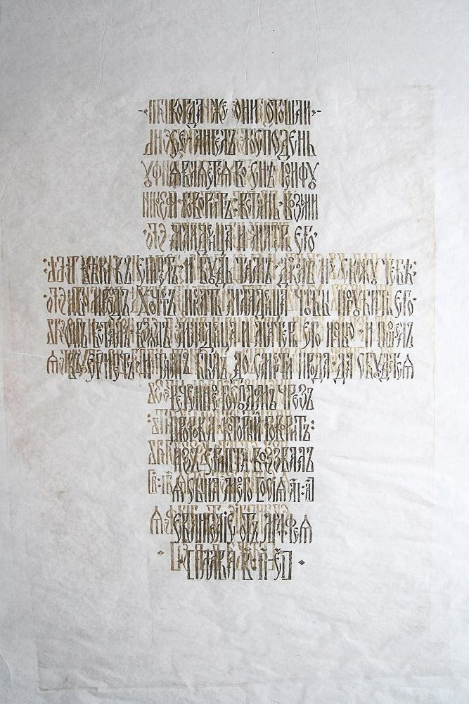
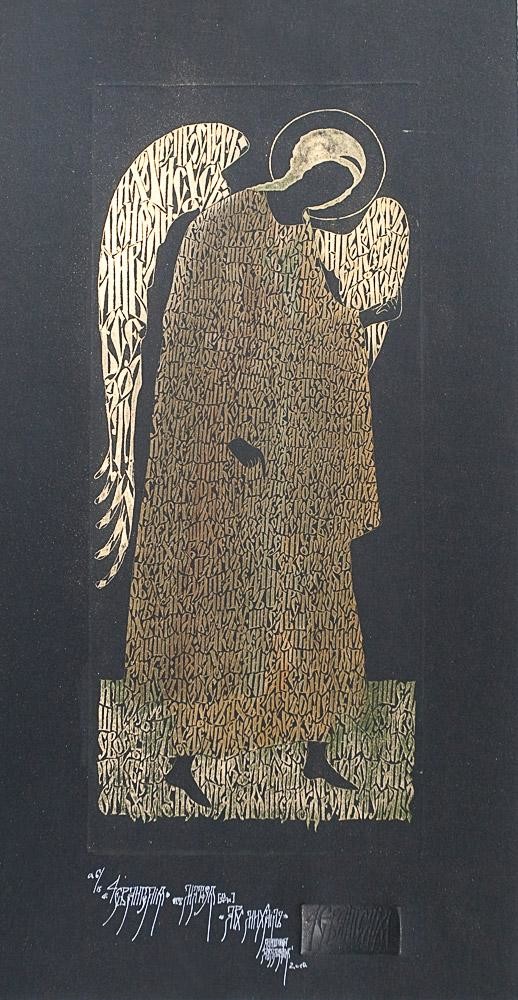
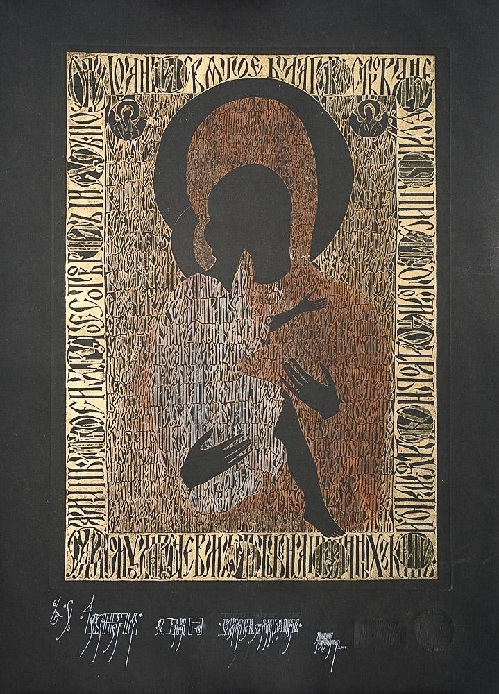
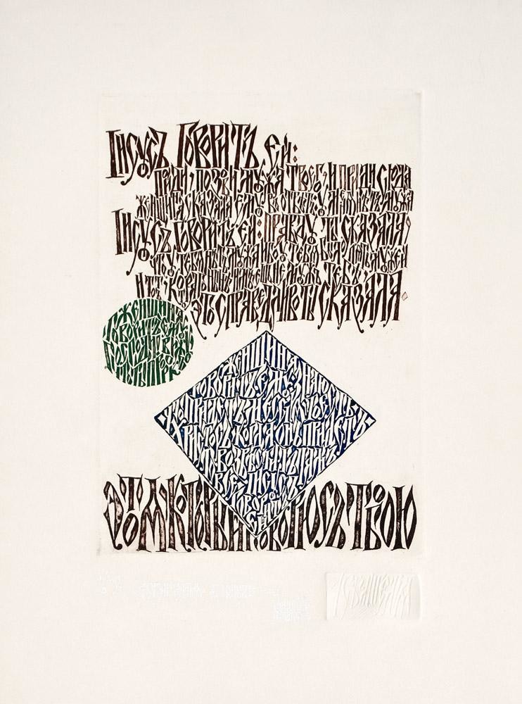
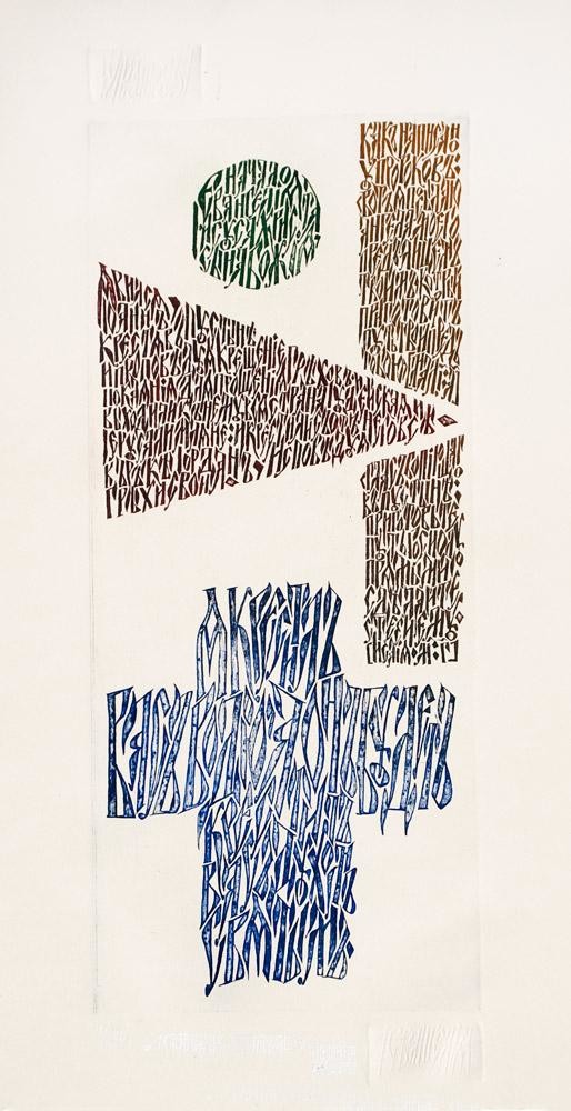
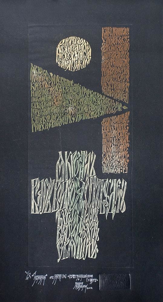
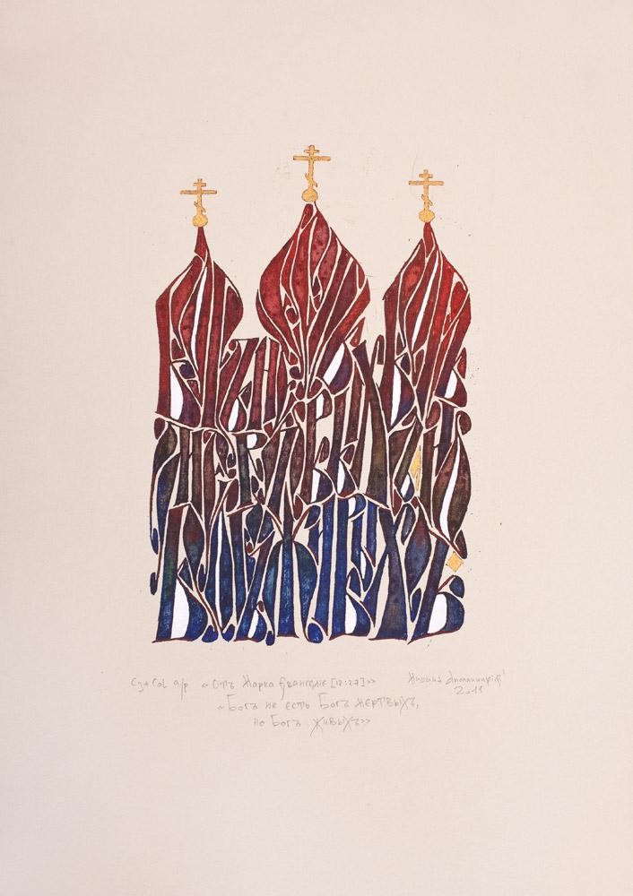
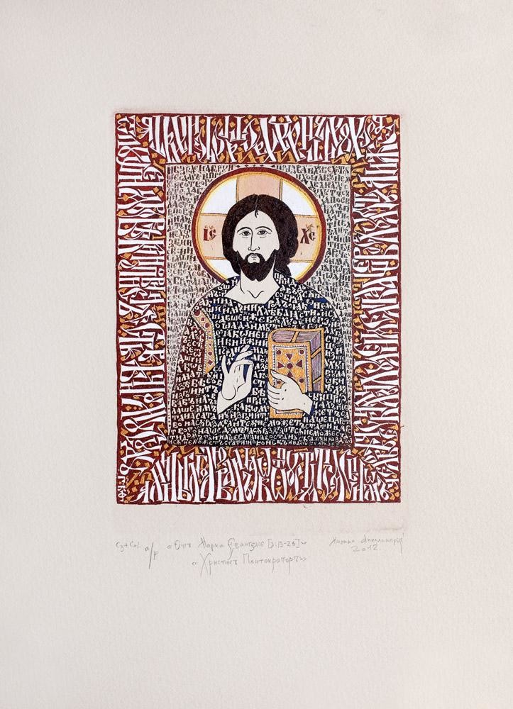
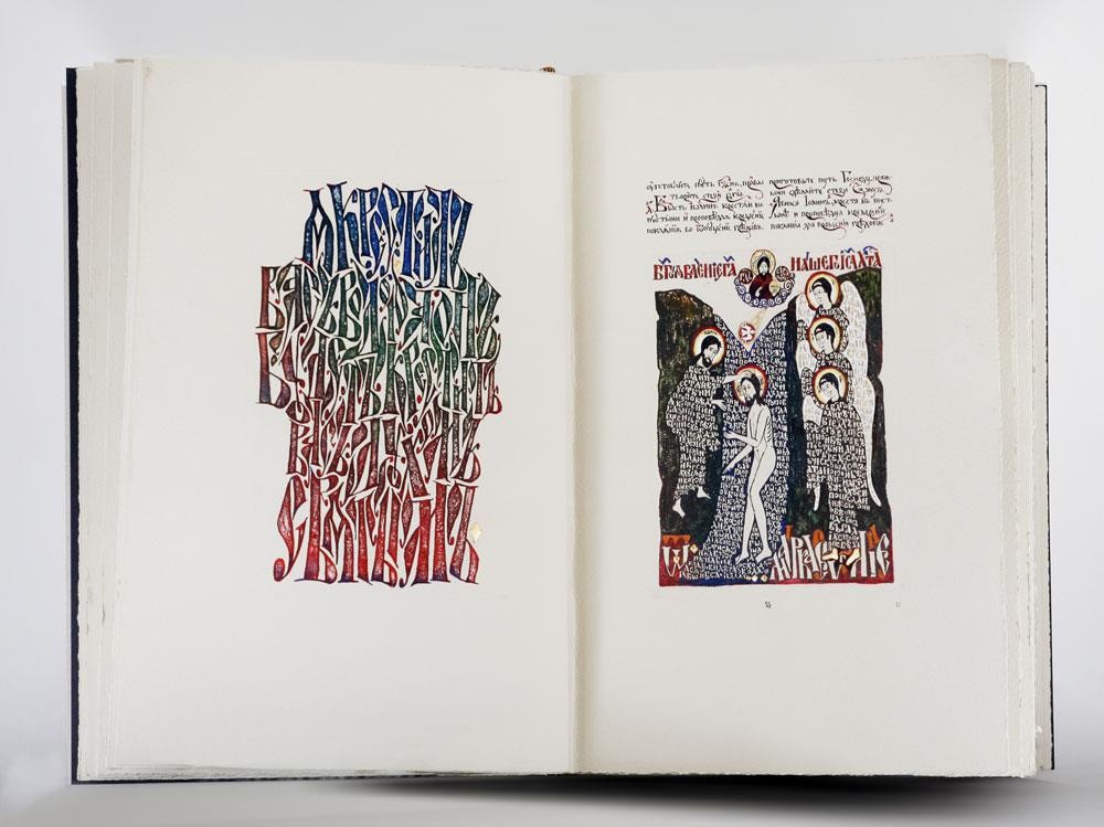
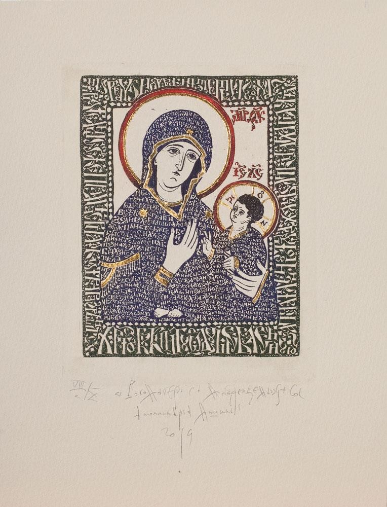
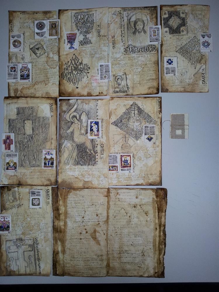
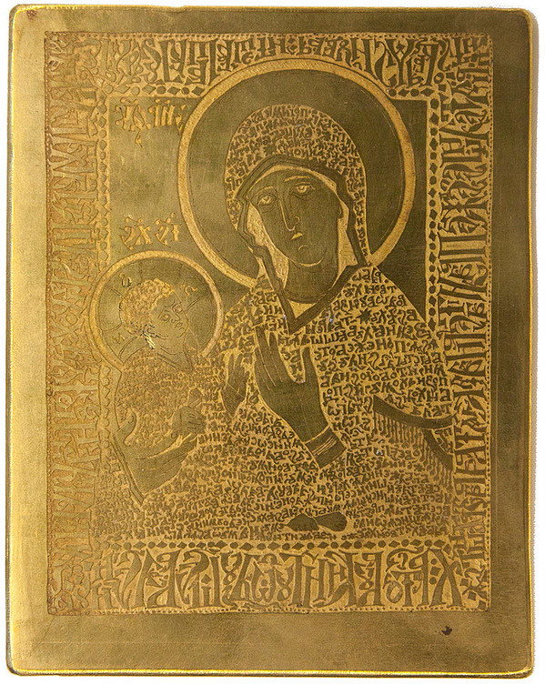
The crucial difference of the book culture in Russia is explained by the peculiar historic development of Russia. The peculiarity lies in the fact that having embraced Orthodox Christianity the Ancient Rus became the heir of Byzantine. Uncial and half-uncial scripts were used for religious books and cursive writing – for secular writing. Calligraphy played the ideological role.
The first secular books (irrespective of “Lubok”) appear in the reign of Peter the Great. The irony is that culture of secular book is implemented from the top-down. The German masters of bookbinding are invited in Russia during the reign of Peter the Great. However, the Byzantine decoration traditions (geometrical ornamentation) are preserved. In 1710 Peter the Great initiated the script revolution for an ideological reason.
In the 20th century the book culture in Russia underwent a series of significant changes. The transformation in the field of book decoration starts with work on the quality of an illustration. The artists of the World of Art group are inspired by the vignette drawings, ornamentation drawings, without relating them to the text content or script character. Every artist covered individual subjects of easel painting and graphics.
In the 1920's-1930's Russian constructionist artists moved the book to a new level. They achieved artistic expression with help of font and photographic illustrations refusing traditional book decoration (vignettes, runaround) and designed a new ”smart” conceptual book.
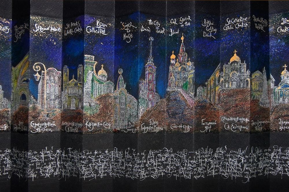
We have considered some books and made sure the book image is directly related to the social and economic society development. And the functions of font and calligraphy in a book can be very different, from the informative one to ideological.
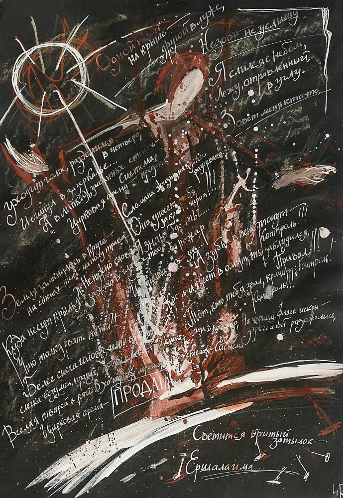
A quote about calligraphy
In the modern conditions of globalization it is necessary for a progressive personality to possess knowledge of one’s culture. Calligraphy as a culture of writing and object to study and piece of heritage is the answer to the question about the value of this knowledge. The Russian history of calligraphy and book culture in Russia is unique and amazing. It is also interesting to take the measures to preserve and develop the Great Live Russian Language.