Biography
Anatoly Moshchelkov was born in 1959. He graduated from the Moscow State University of Printing Arts, the Faculty for Graphical Arts, Department of Art and Technical Design of Printed Products. He is a full member of the Union of Artists of Russia. He is a Graphic designer and calligrapher. A winner of the national award in the sphere of Modern Russian Fine and Decorative Art “Russian gallery 21st century” in 2008, Anatoly also won the regional Aphanasy Kulikov Fine Arts Award in 2006 and 2008.
Autobiography
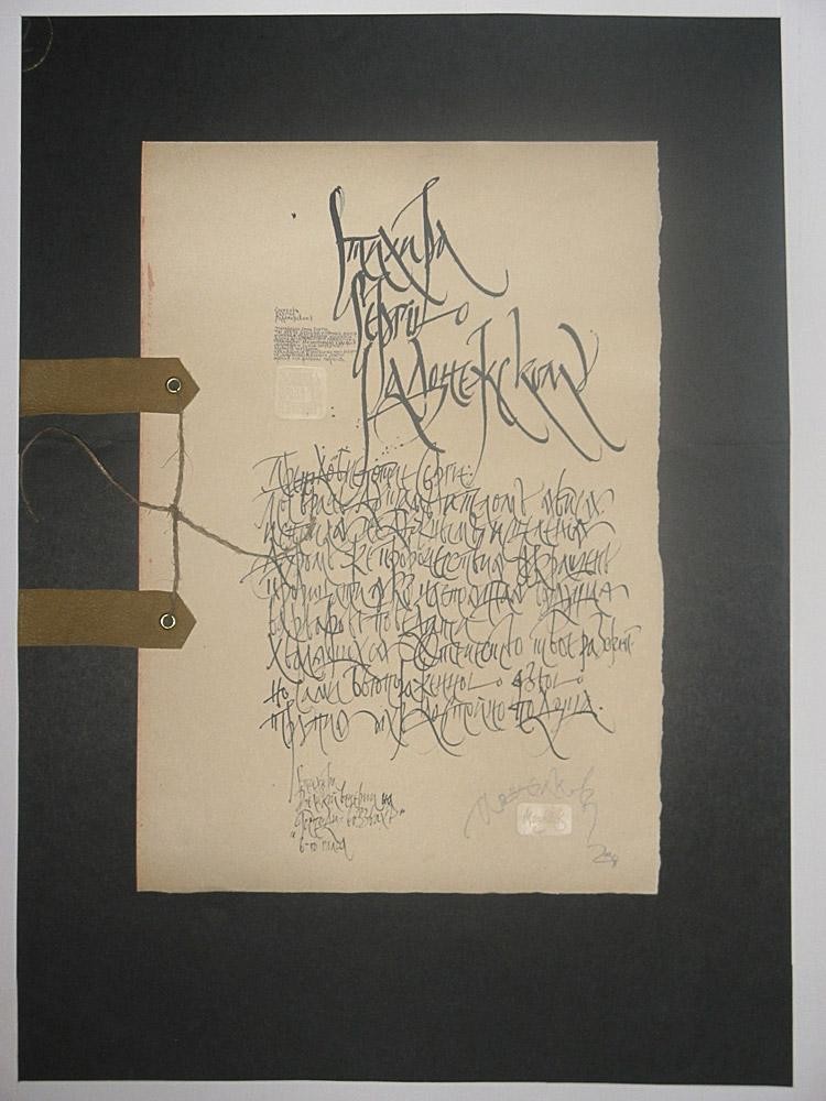
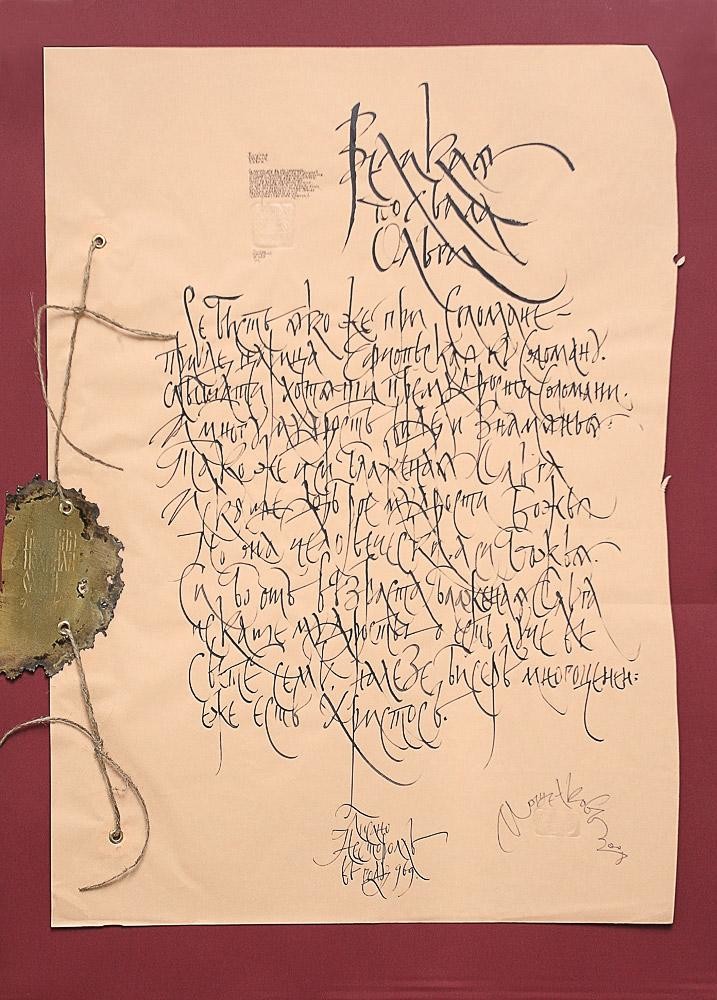
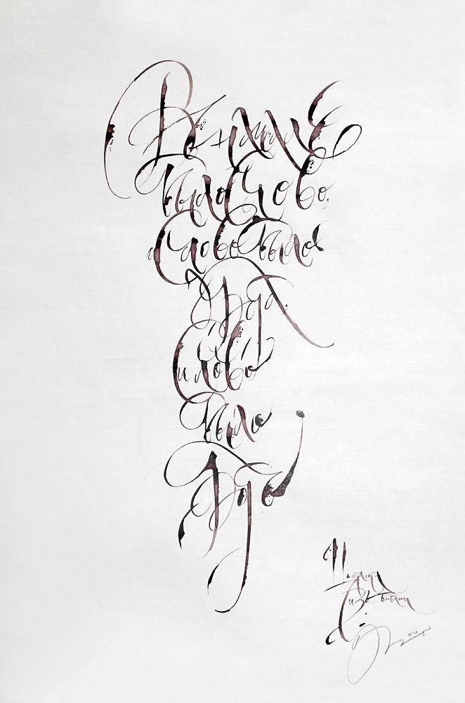
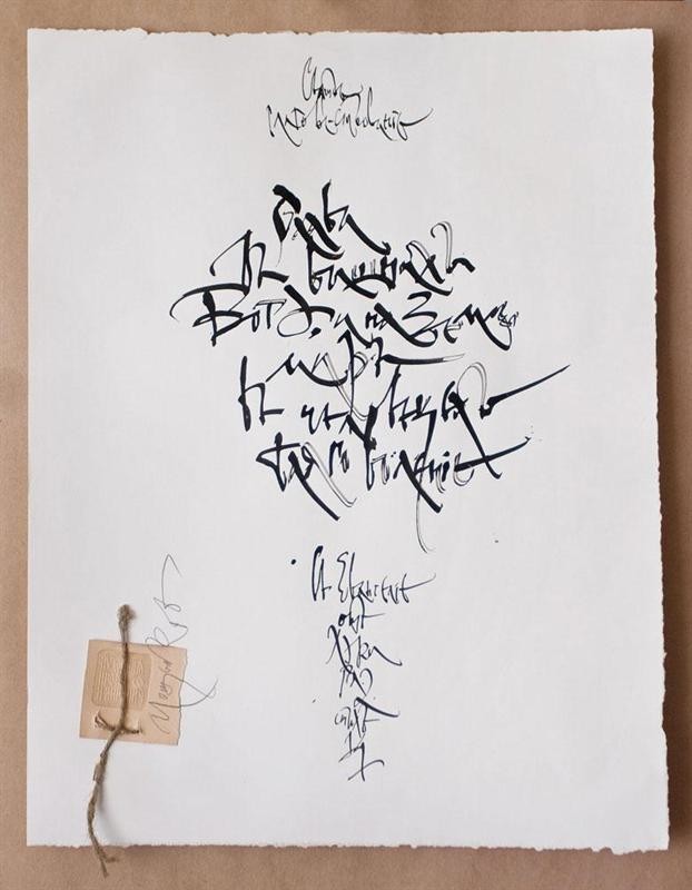
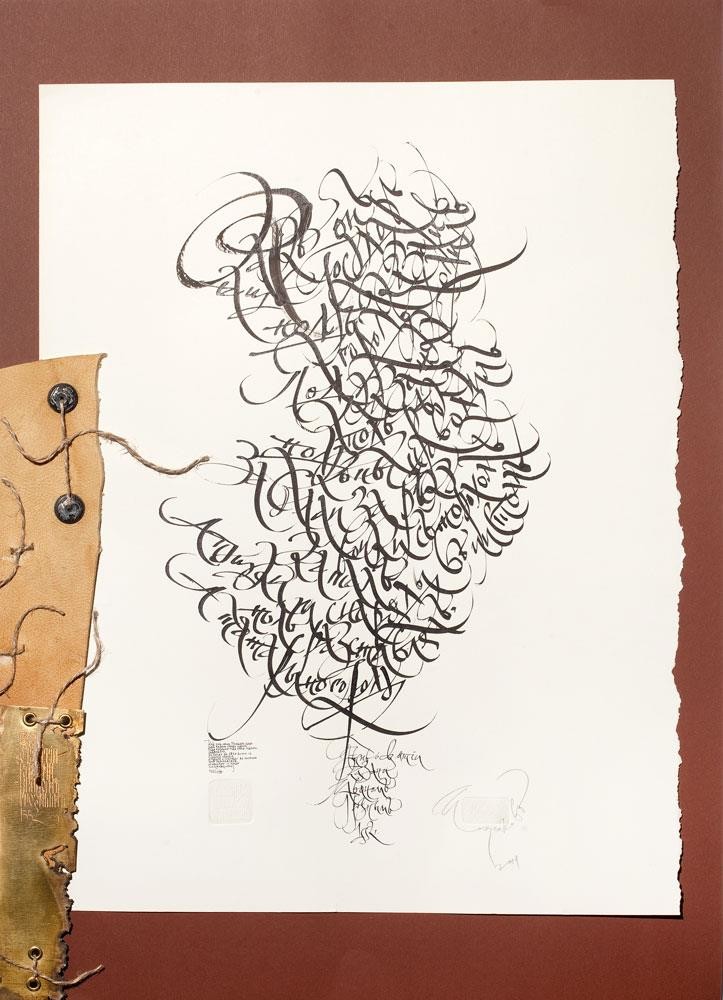
The 1980s were a period of vast experimentation with handwriting. The Moscow Cyrillic cursive handwriting (14th-17th centuries) was the prologue for my research in the handwritten cultural heritage; it blazed the trail for a large-scale creative evolution. Analyzing cursive styles of historic documents at the university and modifying their typical traits, I realized again and again the flexibility of the Moscow Cyrillic cursive handwriting. It’s incredible ability to instill the page with passion or, vice versa, with lyricism and meditation by means of two or three signs. Once I “borrowed” ligature from the Ukrainian cursive handwriting, my works acquired a new creative momentum. Ligature’s artistic intelligence is already a complete work of art in itself. The main challenge for me was saturating the sign, the handwriting with artistic completeness, with the rhythm that would mould the basis of the future image. So I had to sift out the most productive elements, the most fertile elements, I’d say, and had some luck with it. Henceforth every reference to paleography engendered new handwriting features: the crooked hand of Boris Godunov, with its futile attempts to fit in the line; excessively elaborate shorthand of Patriarch Nikon; the hectic, massive strokes of Peter the Great; and many other scribes’ of the past, leaving us invaluable handwritten heritage.
The 1990s were hallmarked by: further experiments, implementing accumulated experience, and materials. I introduced some graphic elements such as: drawing, etching and embossing. These I applied to the following works: Akhmatova’s Requiem (1995), Charles De Coster’s Thyl Eulenspiegel, and Cervantes’s Don Quixote.
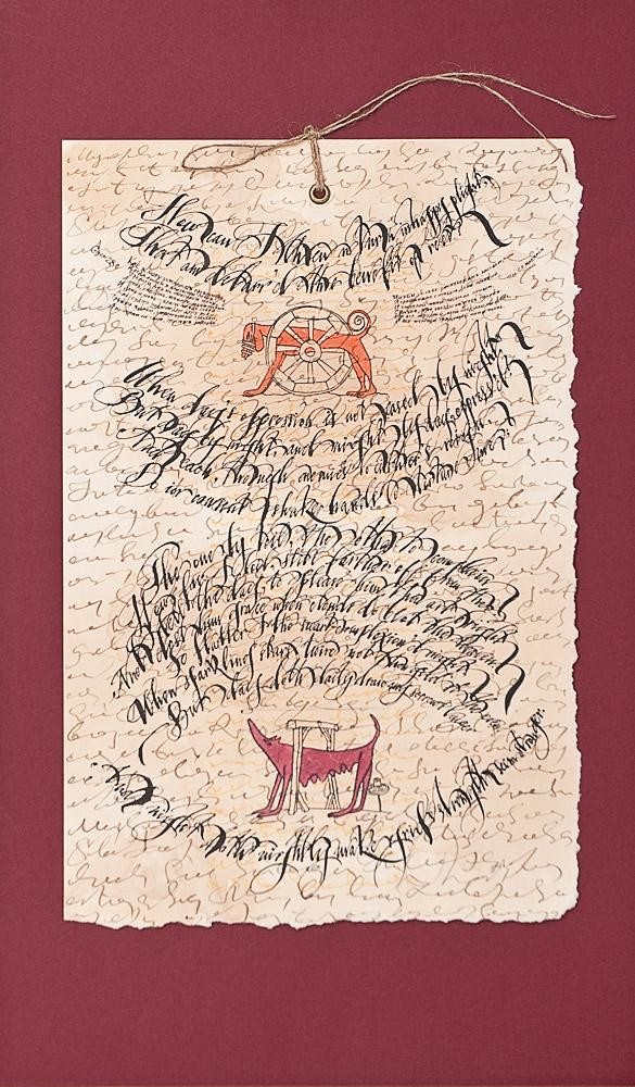
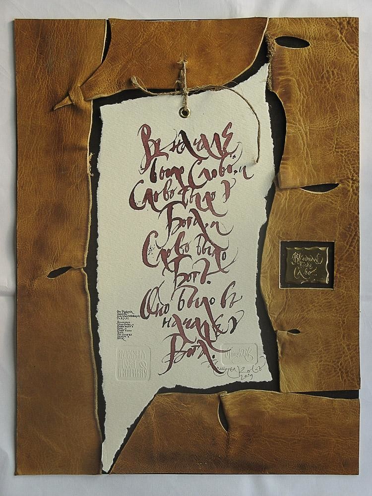
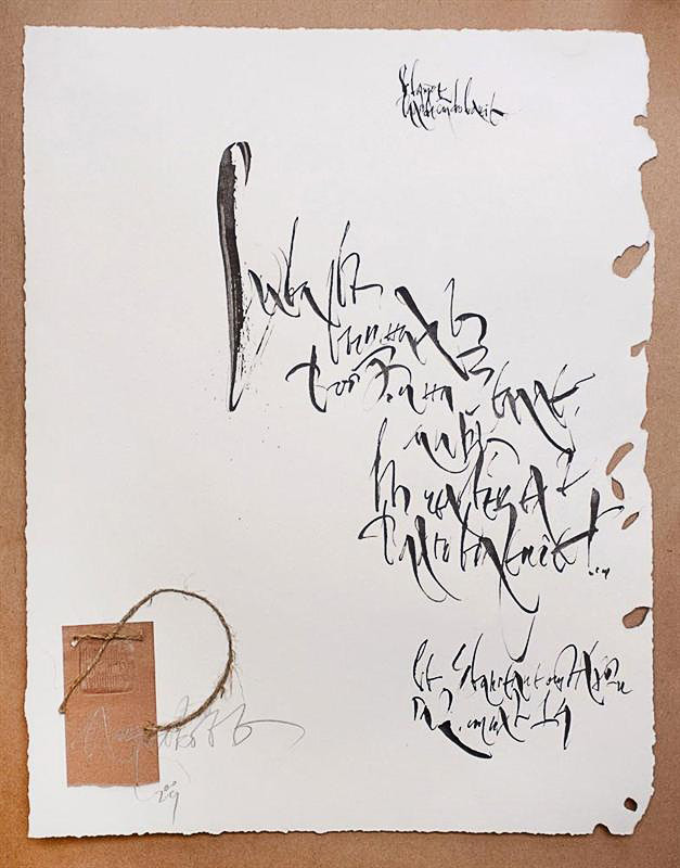
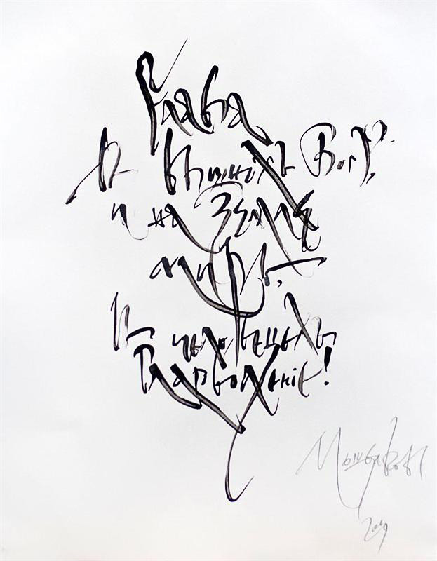
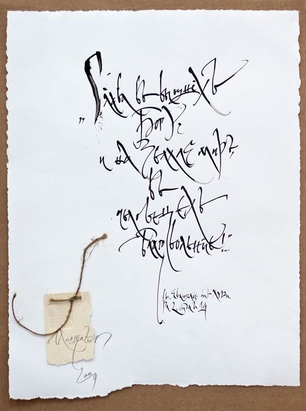
The 2000s account for research and analysis of my own work. My calligraphy underwent text and word “compression” into a sign as ligature’s herald. I tend to “loosen” the sign as an artistic image. The lesser challenge is to exhaust all possible compositional and rhythmic potential of the sign-space continuum. The greater challenge was to fix the artistic image on the two-dimensional space and in the metaphysical plane. This “loosening” tendency can be traced in my approach to materials as well. A rhythmic interdependence of two dissimilar sources appears: the rigidity of wood and metal and the fluency of calligraphy (writing). The materials’ constituents acquire new qualities, longing to cast off the fetters of nature; whereas calligraphy (writing) manifests more rigidity and stiffness. The two are drawn irresistibly to each other, bound to acquire each other’s properties. The synthesized inner tension gives birth to a new artistic image, like in my Letters or the Museum of Manuscripts series.
The ultimate artistic image can be achieved by means of the interrelation of calligraphy and image, which can be illustrated by the Three Bible Tragedies (2005, 180х100, triptych), The Book Of Revelation (John the Apostle). Apocalypse. (180х500).