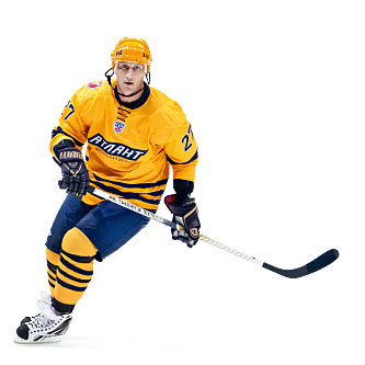
Leaders in Team Style Development
Atlant Ice hockey team based in Mytishchi, Moscow Region (Continental Hockey League (KHL)) have always paid much attention not only to game play and team environment but also to team identity.
Not so long ago, they made a breakthrough in team identity design – truly NHL-style in jerseys design, corporate lettering and team logo was new for KHL but not for “Atlant”.
In the middle of season 2009-2010 they were searching for a new style. Change of colouring and jerseys’ cut were discussed. Tenders and contests were issued, dozens of new “Atlant” team style concepts by many design studios were submitted for consideration. Finally, it was decided to take retro-design as basis and strengthen it with restrained minimalism. Jerseys were “cleaned” from unnecessary elements, colours were corrected and fixed. The first shoulder emblem in KHL was introduced. All elements were made as stripes, and in previous seasons the team had jerseys with dye-sublimation print.
 “Atlant” team logo
Numbers also changed. The font which the League officially recommended was changed for newly developed company font Atlas X-Sport – the first official font of the team in KHL. It was based on traditional college fonts of 1920-30 that are unmistakable identified by the spectators as a classic sport font. It was implemented gradually, during a couple of seasons.
 Atlas X-Sport font
Based on retro-style concept, the font was stylized for the 1970-80s. To avoid static characters in club name logo, the slant was set at 30-35 degrees. Finally, they got a good manly font, suitable for such a dynamic and rather brutal game like hockey. Sharp angles, dynamic, clear-cut and straight lines – all that reveals the aggressive aspect of the logo. Expressive ascetics, an air of superficial boredom and reservedness add a certain touch of austerity.
The Uniform of 2011-2012 differs from the previous version in the club emblem – it is on the right shoulder because the spear should always look ahead and never threaten its own net. Last names, numbers and players’ marks are set in Atlas X-Sport font. Manufacturer was changed: Canadian Reebok gave it up to Rossport.
 Aleksei Kovalev wearing a jersey for a guest game in the offseason
Every individual locker in the “Atlant” dressing room has a message for the player: “Thanks for your great game”. If a player had awesome game and did the best he could it would be a pleasant thing to read. If not – these words will be a stinging reproach. In addition, every player’s jersey has a tag inside which says (of course, in a special team-font): “Win! Because you’re the Atlant!”
 ”Thanks for your great game”
Source: Andrey Gorbunov (AUM studio)
Calligraphy — the written beauty of feelings.


