
Calligraphic Sprat
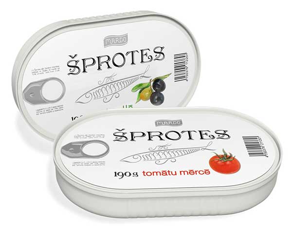
Freedomart, an agency dealing in brand promotion, pushed Latvian sprats onto the market. The new sprat trademark needed a catchy visual identification image. The goal was to outshine the rivals, who had usurped the classic black&golden colour combination. The solution found was a white can with original design.
«The idea was to show that our product is 100% natural by means of this design. We used illustration techniques, combining water-colors and calligraphy, to create an impression of a fine and delicious delicacy, — Oksana Temirbekova, Freedomart Creativity Director, explained, — Calligraphy is largely neglected in design, because its technique is pretty sophisticated. The outline of the fish here is fashioned in this calligraphic technique».
The profile of the fish on the can is also of interest. As a rule, the fish, depicted on sprat cans, lie flatly and horizontally. So Freedomart team decided to depict the fish in biting, its body slightly bent downwards, — yet another way to visually hint at the freshness of the product.
Not only the new can design was executed, but it was also tested on «customer-friendliness». The survey showed that the new sprats were preferred by 47% more customers as compared to other market novelties.
 Calligraphic Sprat


Exhibition opens in
2113
days
Words Of Wisdom
Calligraphy is the flower of a man′ s soul.