A brief paleographic digression
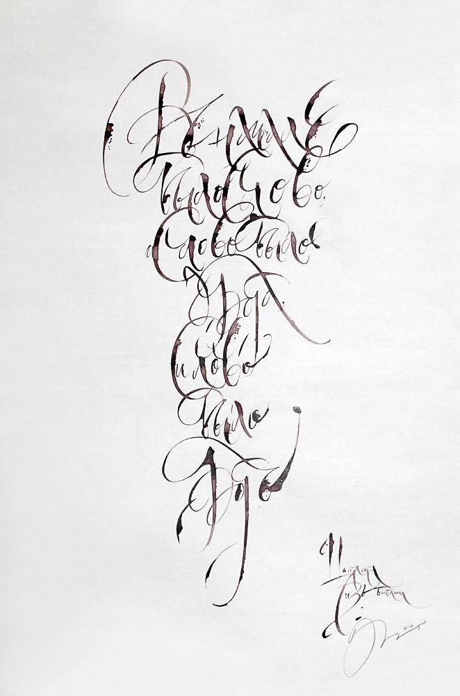
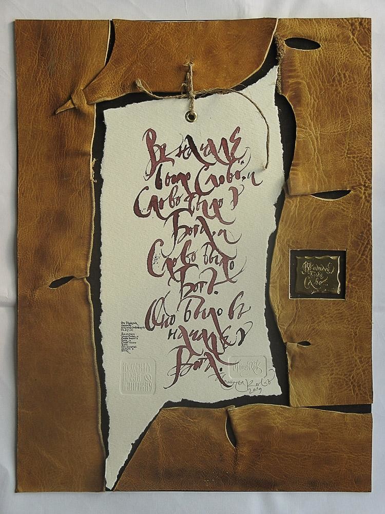
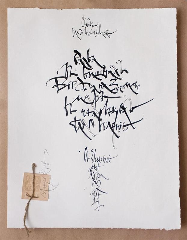
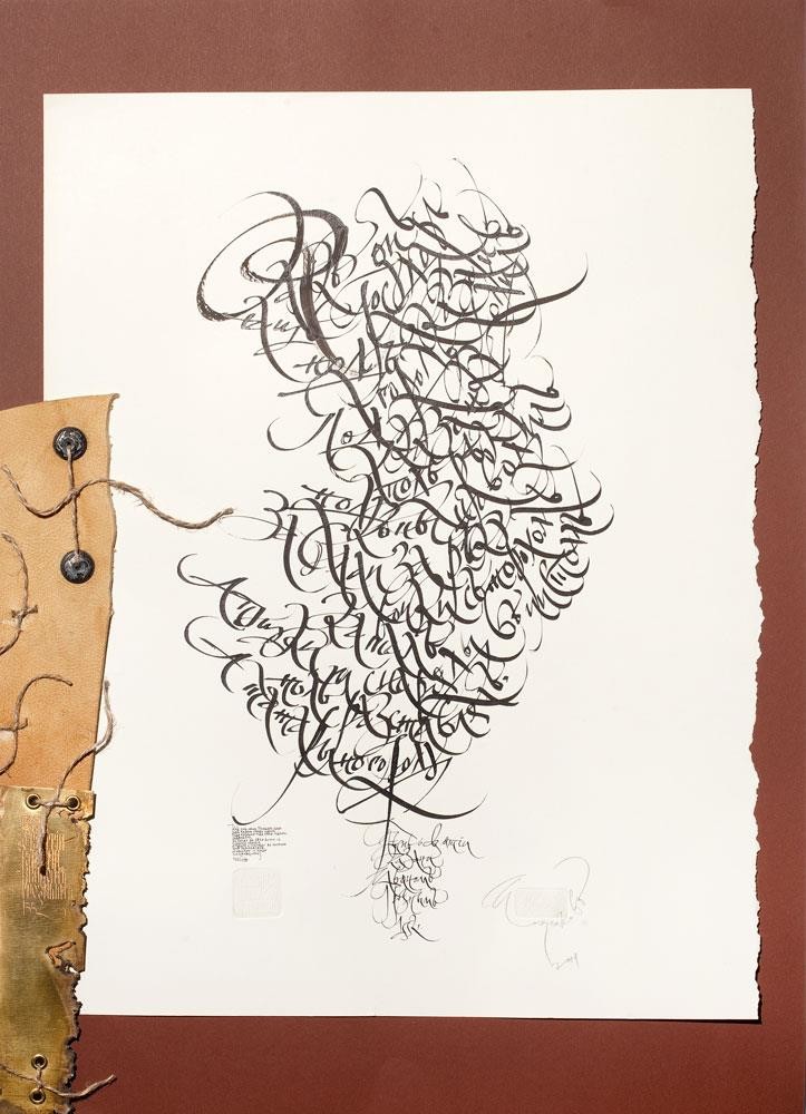
Calligraphy by definition is that sphere of fine art where individuality of the artist is revealed completely in comparison with, in painting and the prints. At the heart of calligraphy lies handwriting, something that is peculiar to a person from above, independent from his points of view and principles, and reveals those internal peculiarities that can be recorded in a few minutes. In calligraphy image-bearing is possible for years but performance is in hours and minutes. Possibly, this inconsistence of the considered origins also results in a certain way of life and thoughts that is a peculiar feature of a few calligraphers. It’s almost impossible to learn calligraphy; it is possible to master type law, to know theoretical and practical writing of graphemes, but still to be far from calligraphy. It is the same as ability of rhyming that doesn’t make you a poet.
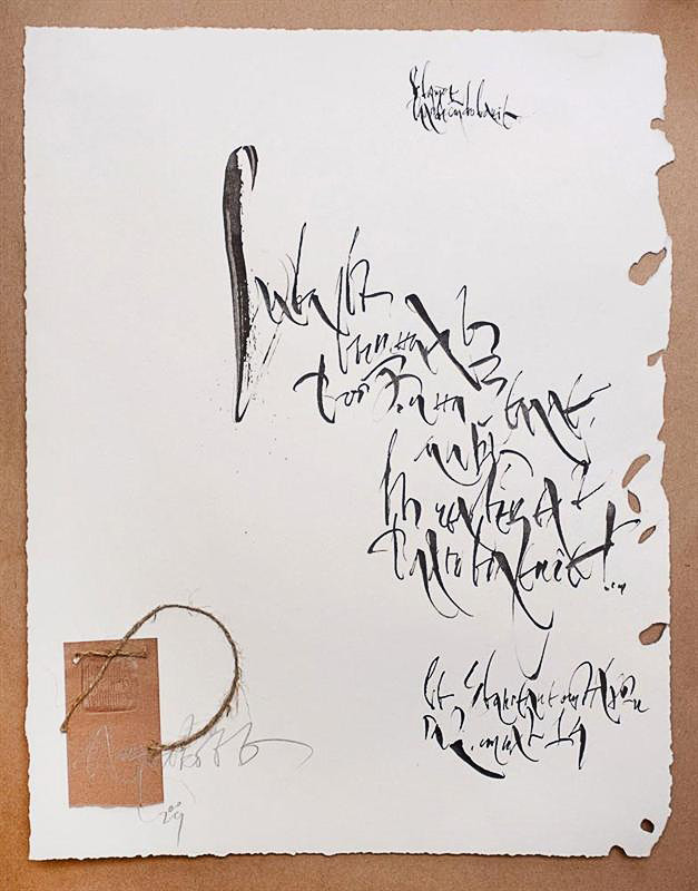
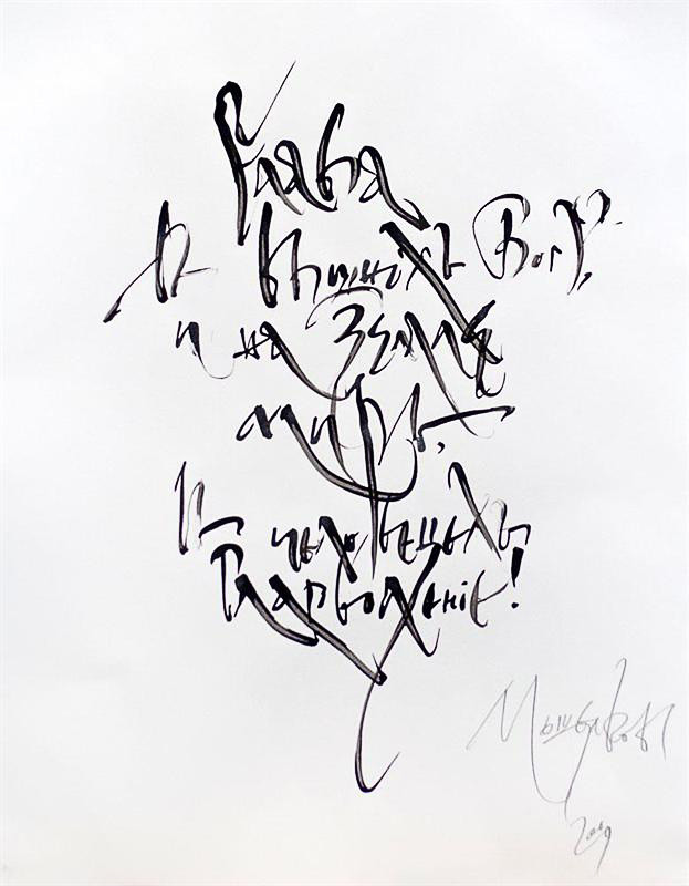
Giving the analysis of what has been made in calligraphy, and I think about the greatest contradiction of life and spirit. To some extent, logic is an art devastator and where logic begins, there art comes to an end. Art and calligraphy, in particular, a category of metaphysical feature, and detailed explanation prevents from understanding the essence of a question. Possibly, only retrospective analysis of calligraphy can comply with logic. The history of calligraphy in the world is unique: the East, Western Europe or Russia. For example, “shaking” Charter in Russia as the early form of Cyrillics, has begun quickly enough in comparison with the East and Asia. In the given context I speak about the theory of a sign, as the art-graphic concept. The logic of charter writing seemed to be so firm that hardly anything is possible to take it aback. As it turned out fragility lied in this firmness. The structure of a sign itself had quite restricted communicative opportunities. But despite its early form, which was unvital, the charter is the greatest pattern of the “disciplined” design, remarkable monument of which is “Ostromirovo Gospel” — 1056-1057.
In such a kind of stability the charter has existed no more than three centuries and to the beginning of 14th century began to change, becoming more mobile and viable. And as a whole for five — seven centuries the charter writing has undergone enormous changes.
Communicative and utilitarian requirements wanted to change the character of writing that makes Russia, Europe and China absolutely different where calligraphy was born to be calligraphy. From 221 C.E. it’s has penetrated through all population levels as art as the meaning of life, and independently from a person, gets the status of spiritual criteria. And in Russia in 11th century a small number of penmen desperately trying to deduce them on a significant level, still charter writing was within the limits of those constraining forms for the sake of which writing appeared: the book. The whole of the origins constraining and limiting charter freedom as a variant of writing, could not be a separate, independent form, remaining within the limits of laws of the capital writing with invariable perpendicularity of signs.
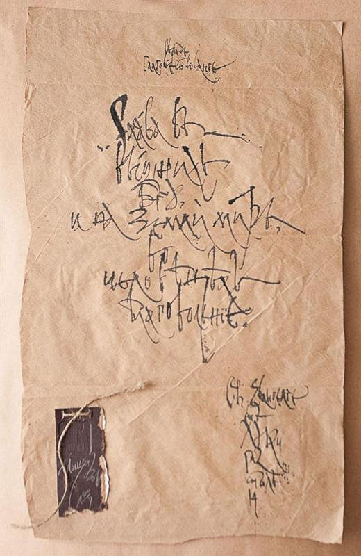
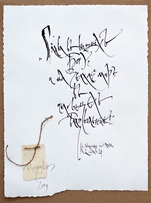
Strange as it may seem but something absolutely different is going on, the status of spiritual criteria began to restrain the development of a written sign. Even in cases when fast hand of the penmen involuntarily inclined letters to the right (example: Gospel Lectionary 10th – 11th century “Savva`s Book”), it was impossible to call it a change of graphic form of a sign. The sign tectonics remained the same. It happened later with a debut of a semi charter when there are up and descending strokes, as important lines for structure and text as a whole. Then the basis for a calligraphy birth has been put. For the first time, the penman felt that the status of spiritual criterion defined only for the canon writing, refers to it as well. Now he was guided by his own understanding of a letter, line and page. There is a constant updating of a sign, their outlines vary, angle of writing is more various and easier, a sensible skew appeared in “Ivan Fedorov’s Apostle”, 1564. Nevertheless I would refer it to the artificial division of a hand-written sign, as the art-graphic form, interpreted by a penman. Formed in 14th century almost simultaneously with the semi charter, cursive writing had more practical character. But the promptness in performance, wider coverage of objects: charters and state certificates, allows cursive writing as a kind of the Cyrillic writing to show not only viability, and become an independent type of writting, but also to be a prologue of modern calligraphy. Paleographic investigations reveal three different types of cursive writing: Moscow (15th– beginning of 18th century), Belarus (15th — 16th century), Ukrainian (17th century). The Ukrainian cursive writing had a significant and a unique elegance for a large number of detailed sections, on the one hand, and on another hand, more inconvenient due to a number of letters written over or under the words. Ligatures often met and it gave more definite elegance. But Moscow cursive writing is considered to be more simple and perfect one. Elements from cursive writing became the basis for the Civil Russian alphabet introduced by Peter the Great from 1707-1710.
Considerable patterns of cursive writing of 17th century are considered to be: “Alphabet of Slavic language and a writing cursive writing to learn how to write…” 1652/53, “Bukvitsy of Slavic language” — calligrapher Ileyka, the richest pattern of a monument of early Russian calligraphy, “Hand-written patterns of letters”, Kariona Istomin, 1694.
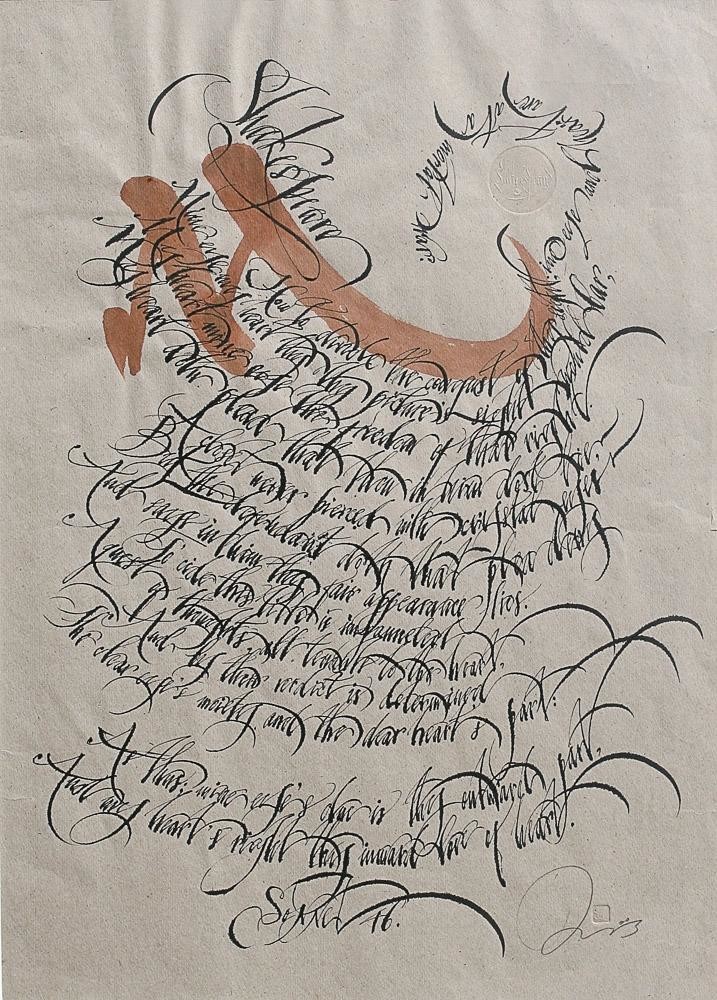
It is believed that Peter I stopped the cursive writing “movement” by “civil writing”, initiating the development of a sign by the construction way that resulted in the creation of the volume of fonts, both printing, and hand-written. But this development following the way of constructivism, could hardly not “bore” the artist. And approximately at the turn of 19th century calligraphy is making the second volution of its development which has existed about one century, at this stage we are similar to Western Europe. With the technology development the artist-calligrapher “is forgotten” again. The typewriter invention extruded Gogol’s Akakiy Akakievich. To some extent it defined handicraft and talent of a penman, “natural selection” took place, there was one of a thousand which has continued the third volution of calligraphy art development, which I myself as a calligrapher belong to.