Brief Historical Information on Development of Writing and Calligraphy in Ukraine
Without going into disputes as to the existence of proto-Cyrillic writing, the origins of the Cyrillic writing and without touching upon the history of uncial writing, which is common for Slavs, we will start with the Ukrainian semi-uncial writing. This original semi-uncial writing of Volyn writers was used by Ivan Fedorov for making of the fonts of the famous Ostrog Bible published in Ostrog in 1581. This semi-uncial writing is distinguished by the small size face, small contract between the primary and connective strokes, a rather free graphic interpretation of the letters, in which not all of the main strokes are continued to the upper and lower line of the font.
The Galich and Volyn semi-uncials of the 16th century are very original. The influence of Gothic fonts can be discovered in them (in the drawing of the letter A, in acute serifs).
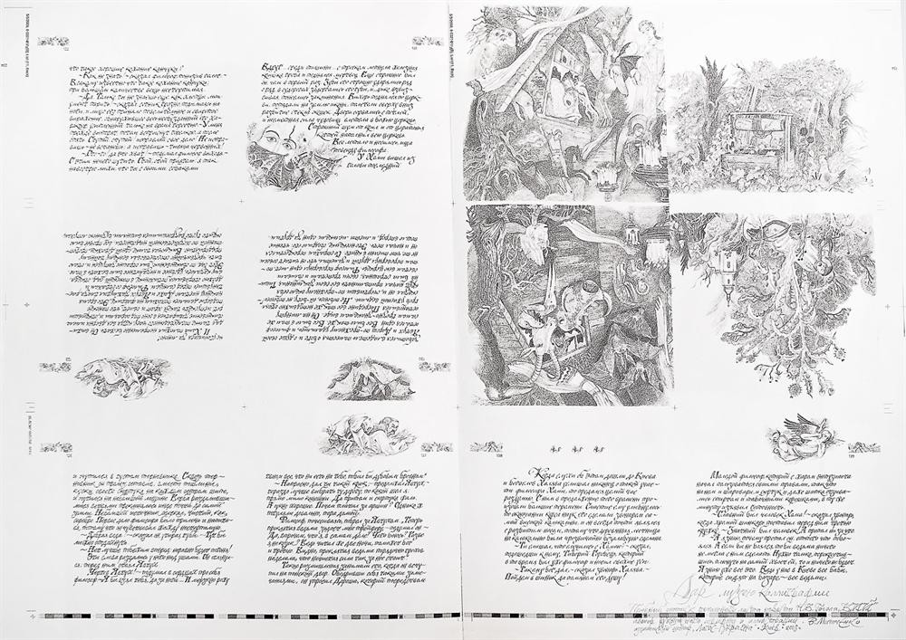
The original graphic design of fonts of the Peresopnitsky Gospel created in Volyn (1556/1561) attracts attention. This is the summit of the Ukrainian book art of the 16th century. The Gospel font is referred by many paleographs to late uncial font, in which individual letters reproduce the uncial of the 11th-12th centuries; other letters are upgraded (Ж, З, М, О). The middle line is raised high in the font (from the height of the main stroke).
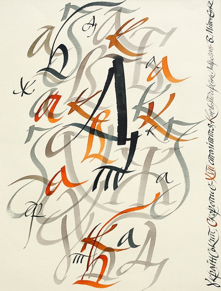
But the originality of the Ukrainian shorthand should be specially noted. A well-known Ukrainian paleograph, Ivan Kamanin, singles out the four periods in the Ukrainian shorthand development in his article entitled Materials on the History of South Russian Writing in the 15th-17th Centuries. In each new historical period, the font was exposed to external influence (of Latin font through Poland, northern Russian shorthand etc.). As a result of complex development, the original Ukrainian shorthand took shape by the 17th century. Under the influence of Latin graphemes, letters N were written. Letters Ж and Ф were written very originally (modified at the level of graphemes). Undulating elements and different types of loops (vertical, horizontal, connective loops) as well as saber diagonal elements produced a major impact on the graphic of writing.
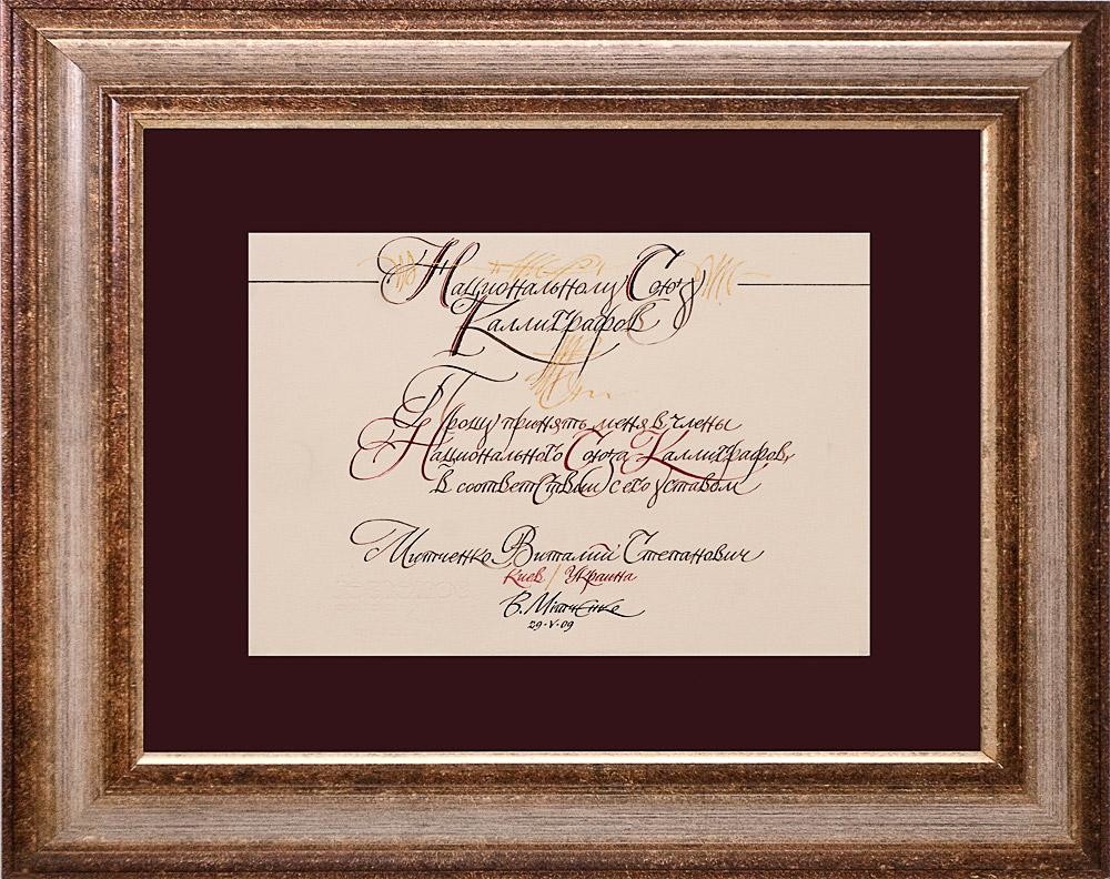
So-called firstplowing and ligatures were used very subtly and resourcefully. At the start and at the end of the message, a sheet was decorated with temperament baroque flourishes.
The 18th century brought civil unified writing to Ukraine, the 19th century, household writing, with certain reminiscences of the 16th century short-hand. The biggest reformers of the Ukrainian font in the 20th century were graphic artists – Vassily Krichevsky and Georgy Narbut.
V. Krichevsky passed the way from the artist stylisizing short-hand fonts to a constructivist.
G. Narbut, a pupil of Bilibin’s and a friend of Sergey Chekhonin, a Moscow graphic artist, having returned to Ukraine in 1918, created his original style in the drawn font in book design in a short term. He managed to found empire, baroque, ancient Russian fonts in the furnace of its creative individuality and to adapt them to modern life.
Narbut had a whole galaxy of pupils and followers – M. Kirnarsky, R. Lozovsky, R. Lisovsky, A. Sereda, I. Padalka. The brilliant stylists, type designers and illustrators, P. Kovzhun and M. Butovich, who went to the West after the revolution, are almost unknown to a wide range of artists.
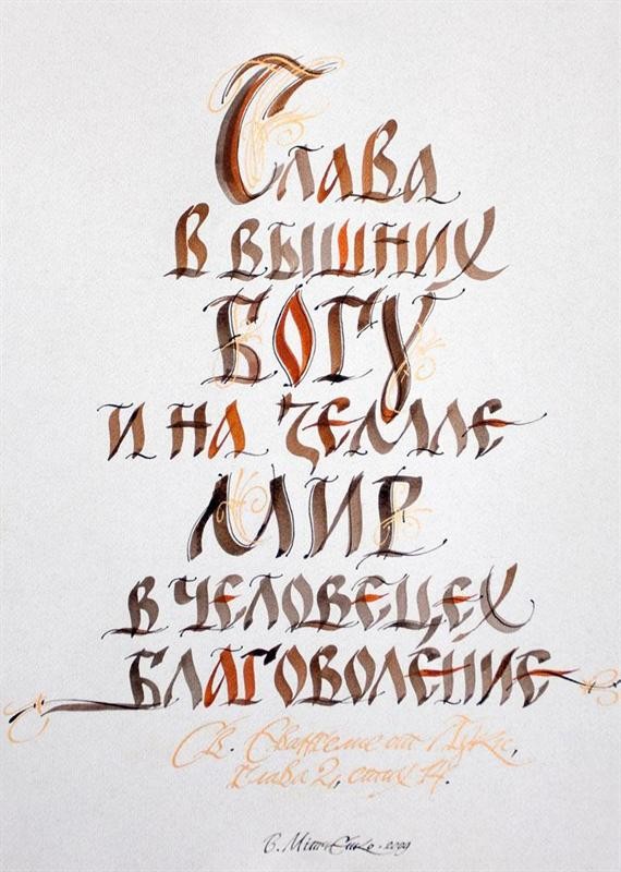
The 1940's and 1950's can be called the time of domineering of the ”decorative” style in script, when ornaments gained the upper hand over the constructive and imagery nature of font. Such well-known masters as I. Khotipok, Yu. Yunak and V. Fatalchuk, V. Khomenko, A. Ponomarenko worked in these years. In the second half of the 20th century, the best Ukrainian calligraphers restored the link with old-time traditions. Connecting them with the most advanced achievements in the field of book modeling, artists of the script entered a new quality level of use of historical calligraphy. V. Yurchishin and V. Chebanik can be called the biggest calligraphy masters of the 1960's/1980's.
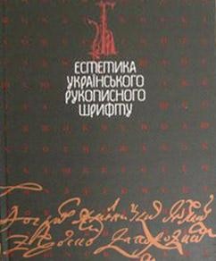
In these years, P. Chobit’ko performed active work in the Kyiv Art College. He planted love for script in several generations of young artists. Since 1986, the author of this text continued teaching. In 2006, the Font Life, an all-Ukrainian exhibition, took place in Kiev. Regions of the country were represented at it. Undergraduates and postgraduates of the Kharkov Design and Art Academy presented interesting calligraphic work. In spring 2008, the Cyrillic Feast exhibition as arranged for by young lecturers of the academy and enthusiastic calligraphers was held. I came across the problem of insufficient visual information on historical handwriting when I taught font in the Graphic Art Chair, National Academy of Fine Arts and Architecture (Kiev, Ukraine). Together with students, I started to gather samples and to copy old Slavonic historical fonts. The 15-year work resulted in the Aesthetics of Ukrainian Script album published in the Kiev-based Gramota publishing house in 2007.
I hope that the project ”The International Exhibition of Calligraphy” will bring together all the experts and fans of this noble art.