Contemporary Calligraphy in Italy
Today in the West, calligraphy is either associated with images of Medieval scribes bent over musty books in dark chambers, or to “beautiful writing” which was taught in Italian Public Schools until the 1960's. One seldom bothers to inquire further than this, to actually consider that today calligraphy is done by artists and amateurs alike, not only as a written communicative tool but also as a means of artistic expression.
Calligraphy has rarely been offered in schools as an artistic subject matter worthy of study, differing greatly from other cultural traditions as the Far and Middle East, where writing is one of the supreme art forms, considered superior even to painting. The different approach between Eastern and Western cultures could be attributed to the fact that western writing has functioned mainly in the role of alphabetisation, that is, made part of school programmes solely to teach how to write and ignoring the visual and artistic aspects of letters.
This way of thinking began as far back and resulted from the invention of the printing press, when the art of writing passed into the hands of publishers and type founders and thus estranged from the general public. Some people reached the stage where they were able to write like the printed letters. There is Edward Johnston, in England, to thank for having rediscovered the medieval art of calligraphy and of having given a new and broader meaning to the art of calligraphy.
Going back even further in time, to 15th century Italy, in Italy we witness a revolutionary cultural phenomenon: the Renaissance. During this important historical period for all of Europe the values of classical Antiquity (Greek-Roman) were reborn. This happened to calligraphy with the evolutionary development of the Humanistic Cursive, the cursive form of Littera Antiqua, which was derived from 8th century Carolingian hands and later called Littera Cancelleresca.
1500 years after the birth of the Lettera Capitalis Monumentalis, the letter form which is the foundation of the evolution of the Latin alphabet, Italy won first place with the Chancery Cursive and taught much of the then progressive Europe to write in this hand. In fact, models of Humanist Cursive spread rapidly, thanks mainly to calligraphy treatises and manuals written by Degli Arrighi, Tagliente, Palatino and other 16th century calligraphers.
Anglo-Saxons use the term Italic to denote “Cancelleresca” as they consider it an Italian derivative as well as a translation of the word corsivo. In Great Britain, Italic has become the standard for most post-Johnstonian contemporary calligraphy and calligraphers to the point of being used as a model for teaching in schools. In Spain, the Italian style is called “letra grifa”, from Francesco Griffo who used it in 1501 for printing designs.
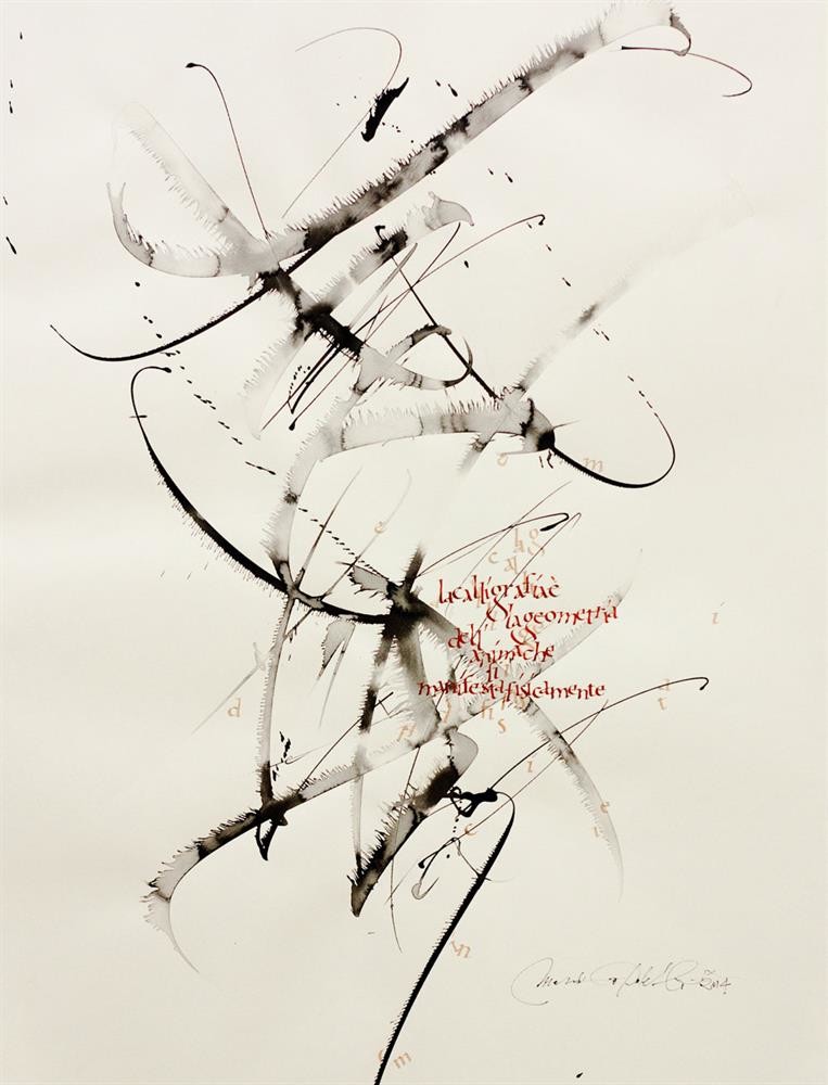
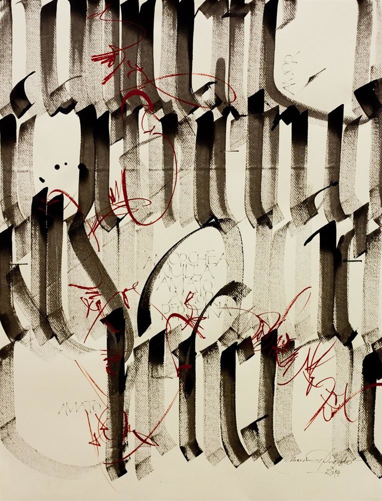
Italic is the basic lettering style of the late twentieth and early twenty-first centuries' calligraphic revival movement, and is still greatly appreciated by Western calligraphers. In the last decades, the Italian Cancelleresca has once again been adapted by much of the world as the principle model with which to explore the expressive possibilities of calligraphy. The flow of Cancelleresca, the ease with which it can be learned, and the characteristically naturalness of the strokes allow in this day and age an infinity of personal and expressive interpretations, the so —called gesture or expressive calligraphy. The arabesque and flourishing of Chancery Cursive reminds us as well of Arabic Calligraphy.
Today we live in a world conditioned by technology, which has led to the rediscovery of a primary need: the gestural movement, such as are seen in the Italian tendency to gesture with their hands when they speak. Human beings have an inner need to leave a personal mark, preferably written traces, in their daily lives. This is particularly evident in large European cities, where walls and transportation vehicles are covered in “graffiti”. These “tags” of “writers” from abroad are marks which enrich notably the repertory of forms of our classical letters.
Many contemporary “calligraphers” are unsatisfied with the term “calligraphy”. Hans Joachim Burgert prefers to speak of —the art of linear writing-. According to him, Western calligraphy has not yet developed all the possibilities and potentialities of the line. Western calligraphers often stayed focused on only the repetition of historical forms, inherited from the assumption that typography has to imitate calligraphy, and weighted down by the tradition of writing on a modular grid, rather than use the open spaces of a graphic line. In the history of Latin script, perhaps the only style to get anywhere near the concept of linear is the Roman Cursive of the 1st and 2nd centuries A.D., done on wax tablets with most unlikely ligatures.
The history of writing over the past millenniums has left us with an incredibly rich patrimony of various imaginative forms, which the novice calligrapher can learn and master and reproduce. Human beings react to forms and texts with their senses, which are transmitted to the hand holding the writing instrument, which in turn can cause a veritable and infinite metamorphosis of expression. As one writes, the forms of the letters can change so much they become illegible. In this way, the texts can not be “read” but only seen as a whole.
Roland Barthes wrote that ones relationship to writing is a relationship with the body. Eastern scripts, whether based on an alphabet or on pictograms, are by consequence calligraphic. Calligraphy in the East is a noble art, even a magic art, which requires a psychosomatic form. In the West, one aims to tame the body and then to emancipate it; in the East to govern the body and then to refine its pleasure.The development of Oriental writing is thus painting in all its immensity….. While Oriental and Arabic calligraphy offer the calligrapher greater freedom without sacrificing the legibility, the Western calligrapher for years has been seeking ways to experiment without ruining the clarity of the written word.
If experience and technique are important, then systematic exploration and study of our past historical heredity are even more so, so that we can use both traditional and invented writing instruments in the fullest way possible. Writing will then become a renovated form of expression, full of a new meaning and leading to further values of symbols, colours, strokes, and materials.
FROM THE INTRODUCTION OF THE CATALOGUE EXHIBITION: “Italy-Pakistan show in Lahore- november 2006”
by Massimo Polello – President of the Calligraphy Guild Dal Segno alla Scrittura Turin-Italy
Bibliography:
-Burgert Hans-Joachim, The Calligraphy line, transl.Neuenschwander B. Berlin 1989. Privately published
-Barthes Roland, Variazioni sulla scrittura, Carlo Ossola, Einaudi-Torino, 1995
-Zennaro Mauro Calligrafia , Stampa Alternativa, Viterbo 1997