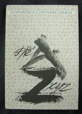
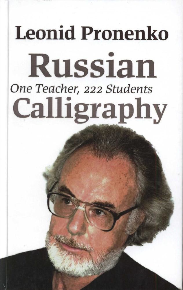
普罗年科•列昂尼德•伊万诺维奇

On Good Calligraphy Basics
I will try to single out several properties of good calligraphy. Perhaps, it looks absurd for how calligraphy can be bad if the mere word of “calligraphy” means, as is known, “beautiful writing”. Nonetheless, calligraphy can be regarded as a good one if:
- An artist knows the font anatomy well. If such knowledge is not seen, such calligraphy can be regarded as tame. Such writing cannot be improved either by flourishes or by good miniatures, drawings or dropped capitals. The work looks anemic, it will lack a strong backbone and, consequently, stamina. A professional artist will always identify the structural dependence between letters of any font he uses in his work. Even if it is abstract calligraphy. The proper structural link between elements of any thing, be it a designer’s work or the work of art, is the most important environment cognition law. It is not without reason that Leonardo da Vinci, when he got interested in the form of any object, tried, before he went to sleep, to imagine it disassembled and then assembled it into the single whole in his mind. Of course, an experienced artist (a calligrapher or a graphic artist) can in certain cases deliberately violate the form of letters and thus achieve special expressiveness of the text.
- An innermost law of art is correctly found proportions. An experienced master can deliberately distort them if it meets his/her creative idea. All of this comes with experience, when you have mastered classical proportions, be it the drawing of a human figure or a letter. No innovation is possible without it. The best works of modern calligraphy is based on professional discoveries of previous generations as rethought for the current objectives.
- An artist must be able to stop. Some virtuoso of brush and fountain pen, who master everything with Mozart’s ease, are so absorbed into the work process and their own mastery (especially when they draw their flourishes) as to lose the sense of moderation and start wandering in the forest of their own composition jungle.
- A calligrapher masters the fundamental methods of singling out lines in a font work (S.B. Telingater explained this properly and popularly in his time and, even though he spoke about an accident set, his advice is absolutely appropriate for a calligraphic composition, too).
The key methods of singling out lines in a font work are as follows:
- Application of capital letters in writing individual words and lines
- Spacing
- Application of fonts with different slope of lettering, width and density, with different thickness of the main strokes
- Introduction of especially contrasting individual words and lines in terms of drawing. The degree of contrast depends on the content of the text
- Underlining of lines with rulers. Rulers may vary by thickness and form. They are sometimes adorned with decorative elements
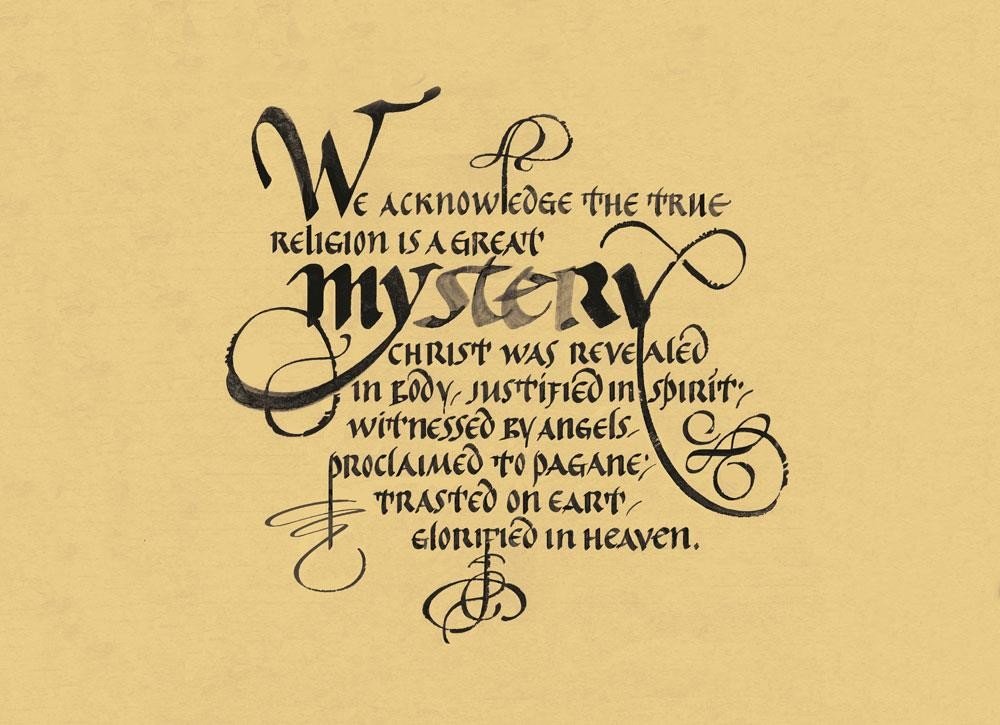
- Application of initials. Modern masters start a heading, a paragraph or a sentence with an initial. It is “submerged” into the text, placed into the upper or lateral field or in the center of a composition, sometimes – as a sort of illustration.
- Application of flourishes
- Application of considerable spacing that helps highlight the necessary words and lines, without any additional emphasis.
- Reasonable use of colour paints. A beginner calligrapher, while trying to make his work festive and fresh, sometimes introduces too many colors and eliminates all efforts to distinguish the essence of the work. You’d better take two paints but match them perfectly. One can give many examples when introduction of just one additional colour animates the entire composition.
By the by, as V.V. Lazursky liked to say looking at my then large moustache: “Listen to everybody. Make a mental note of everything but behave as you deem appropriate”. And the same to you.
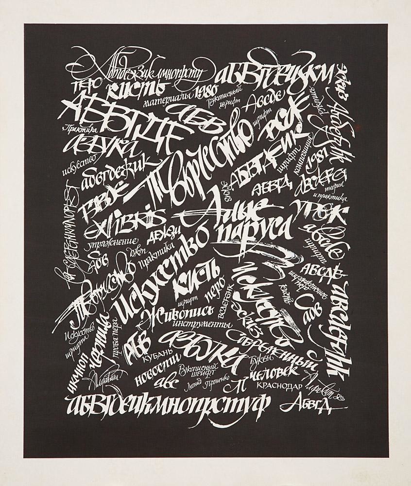
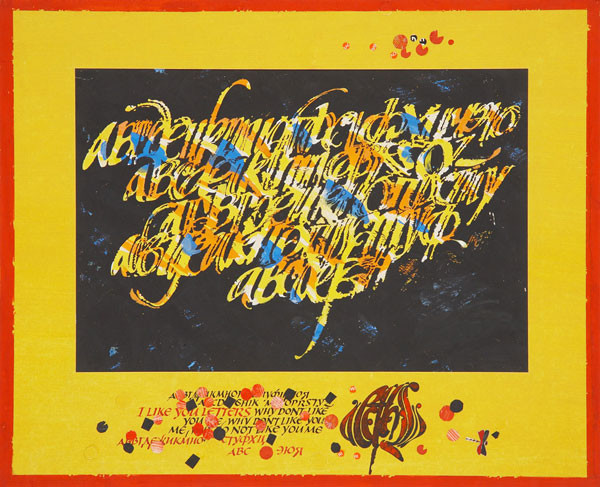
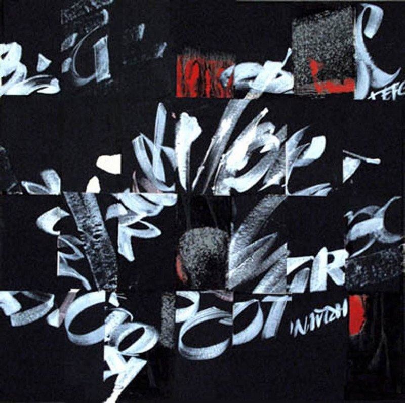
作者的作品