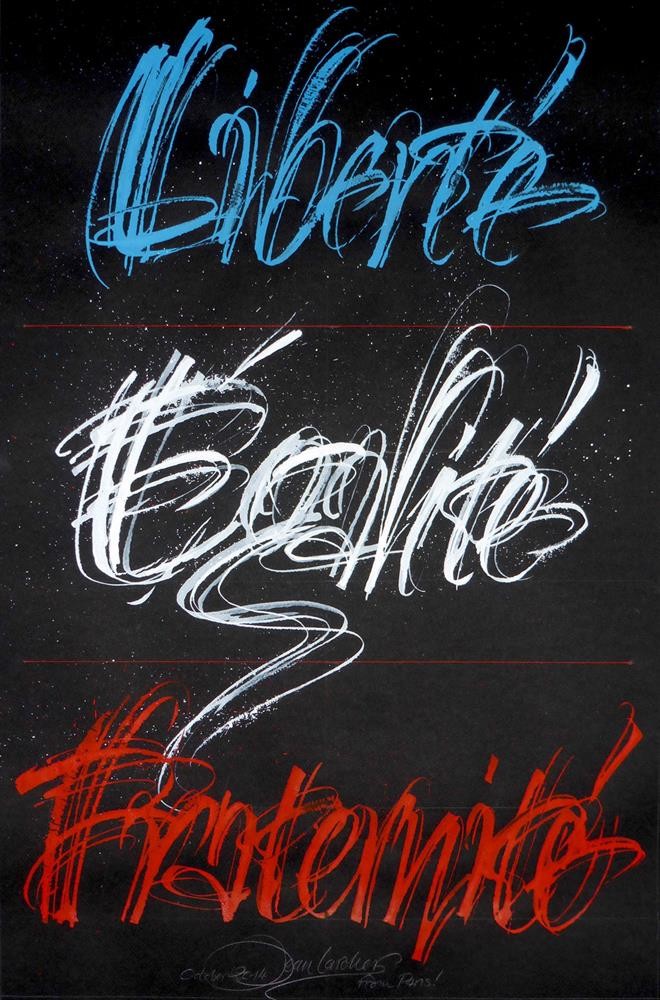
让•拉尔舍 1947-2015年

Lettering and Calligraphy in France
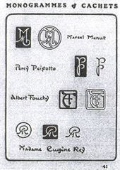
1924. A page from the third book of ‘monogrammes, cachets, marques et ex libris’, designed by the profilic lettering artist and typeface designer George Auriol. This artist, poet and teacher was very successful early in the twentieth century during the ‘Belle Époque’…
Now is probably a good time to look back critically at what happened in the world of typography in some Latin countries during the twentieth century as this will enable us to understand why the teaching of typography, and even more so, calligraphy, was so poor. When we use these two words, in either a professional or an everyday context, their meanings are interpreted very differently by amateur calligraphers at their Saturday workshops and by those working in advertising agencies who generally have only the very minimum knowledge of typography, and none at all of calligraphy. This has become very obvious to all of us in recent years and serious teachers, faced with this situation are worried and concerned. We ask how we can teach calligraphy in such a technological age, and wonder if it makes sense even to try.
Let us start then by giving an overview of typography in France — an industry which had always been based on the workings and the rules of the hot metal type foundries. It was very badly affected by the two world wars which ravaged, in particular, the European continent. Two type foundries dominated the post-war market in France — Deberny & Peignot in Paris and the Fonderie Olive in Marseille; a third, the Fonderie Typographique Francaise — also based in Paris — found it very difficult to compete. After the Second World War the type designers sought to outdo each other in meeting the needs of the publishing houses and of the advertising agencies whose customers were now looking for new typefaces. At this time typography in France very much held the upper hand as calligraphy did not exist as a profession and was not taught. If a client wanted something really original a few letterers (who remained anonymous) would carry out the commission. In one or two graphic arts schools in Paris lettering was taught — but often by reference to printers` catalogues. The ruler, the compass and the set square were the answer to all problems. The courses were often taught by rule of thumb, without any reference to history or to international influences, and the majority of those teaching either painted their letter-forms, or were decorative artists, industrial designers or even engravers (as was certainly the case at the École Estienne). In all of these schools students worked from nineteenth century models and the result was that generation after generation of students simply copied such examples. The teachings of Edward Johnston, Rudolf Koch, Rudolf von Larish and, later, Hermann Zapf thus had no influence in France in any book or professional school during this period. At a major public exhibition entitled `The Art of Writing` in 1965 at UNESCO in Paris the idea of western calligraphy was totally ignored. The catalogue traced the beginnings and the subsequent history of writing throughout the whole world and gave examples of many exotic scripts. It spoke of ‘Writing in the Fine Arts’ and illustrated this with the works of several contemporary abstract painters, but there was nothing — absolutely nothing — on western calligraphy; it was passed over in complete silence and ignored by the organizers (although the catalogue itself was published in French, English and German). It is easy to see that the result of this attitude, both on the public at large and in those schools where fine arts or graphic design were taught, was that the teaching of lettering was held in very low esteem.
1911. Original metal fount called Naudin, after the famous Deberny & Peignot catalogue printed in Paris in 1934. Note the astonishing Italic designed by Bernard Naudin and cut in lead in the foundry after World War II.
However, we should remember that at the beginning of the twentieth century there were in France several leaders in the field of letter-form. In the Art Nouveau period (1895-1910) the Style Nouille meant that some artists of the Belle Epoque were able to capture the spirit of the era. The painter Alphonse Mucha, for example, and the architect Hector Guimard — to name but two — have their permanent memorials in their posters and the lettering on the Paris Metro respectively.
For a number of years the postcard industry was the vehicle for the `turn of the century` style, with letter-forms and collections of alphabets which were typical of the Art Nouveau movement. One artist, George Auriol (1863-1938), created a whole range of fonts which were introduced between 1901 and 1904 by Peignot & Fils.These new metal faces, Francaise légère, Auriol, Robur and Clair de lune were drawn, cut and cast in a variety of weights and versions, and through the work of advertisers, jobbing printers and publishing houses many have left their mark on this period. Many other European foundries were also influenced by the Art Nouveau movement or the Jugendstil and were producing similar type faces. Other French artists were working with the same foundry at that time; in 1899 Eugene Grasset (1841-1917) designed the Grasset, and others included Bellery-Desfontaines, Alfred Giraldon, Robert Girard, Bernard Naudin, who produced a noteworthy Italic — the Naudin, designed in 1911 and cut in 1923 — Georges Peignot, who gave us the Nicolas Cochin in 1913, and many others. The result of this activity was that things looked very promising at the start of the twentieth century. The designers at this time had no alternative but to rely on that foundry to have their creations cut, produced and marketed, and it is worth remembering that it sometimes took years before the fruits of their labour were actually made available to the print shops, and thence to their customers. Other successful typefaces such as Sphinx (1924), Astree (1920) and the famous Deberny et Peignot Garamond (1920) were cast and sold at that time too. There was a second creative wave in France in the inter-war period. In 1936 Marcel Jacno (1904—1989), who was to be a very well-known designer throughout his whole life, first suggested, and then designed, Scribe a typeface which resembled handwriting and which was cut and cast at Deberny & Peignot. He repeated this in. 1948 at the same foundry with another typographic handwriting style — Jacno. Generally speaking though, he spent his career working on alphabets for posters, such as Chaillot — which was published by Deberny & Peignot in 1954 — and Moliere (1970). He was one of the rare Frenchmen to theorise about the letter, and in 1978 published a book entided ‘Anatomy of the Letter’ which he returned to some years later in a thesis at the Sorbonne. The exhibition entitled ‘Arts Decoratifs’ confirmed the triumph of modernism in France and this brings us right into the Art Déco period. At this time a major artist –A M Cassandre (1901-1968) — came to the fore and, thanks to his stunning posters, his reputation spread beyond the frontiers of France. He created for Deberny & Peignot the short-lived Bifur in 1929 and then in 1937 he designed a very controversial typeface, the Peignot, in which the minuscules were really capitals — thus re-introducing the idea of the Uncial, but in a lead font, and right in the middle of the Art Deco period…
1936. Original script fount, Scribe, designed by Marcel Jacho and cut in metal for the foundry Deberny & Peignot based in Paris.
Just before he had drawn the successful typeface Film, a true Art Déco type for advertising.
In 1937 Charles Peignot (1897-1983) manufacturer, businessman, inventor and visionary, together with Jean Mallon, an academic and an eminent palaeographer, produced a film entitled ‘La Lettre’ which was shown for a number of years in many schools. This film is unique in France and was an attempt to make the general public and students of art and design aware of the history and the evolution of writing.
At the beginning of the 1950s we entered a new era in type creation; the market was ready for it and Charles Peignot was, from 1954 onwards, actively engaged in the development of photocomposition. He foresaw the disappearance of metal type and the advent of a new type of industry — phototypesetting. (Lumitype 1954, first photosetting machine.)
In 1952 he made the inspired decision to take on a young Swiss apprentice typographer by the name of Adrian Frutiger (who was to stay in France for almost forty years). Frutiger was not self-taught, nor was he Latin, and he had had as his teacher in Zurich the eminent calli-grapher Walter Kaech. Frutiger s collaboration with Deberny-Peignot was to help to change the climate of typography in France…
This is not the place to list all the great successes that Frutiger had throughout his life with his publications etc, but mention must be made of a purely calligraphic typeface which he designed in 1954 and called Ondine. This third creative effort at the foundry was an echo of what he had done at the end of his time as a student. I refer to seventeen engraved wood plates entitled ‘The Development of Western Type Carved in Wood Plates’, a staggering piece of work for a student at that time. Later, throughout his career, Frutiger continued to develop calligraphic typefaces — Icone (1980), Herculanum (1990), Pompeijana and Rusticana in 1992—3, all of which have now been digitised. Frutiger, like Hermann Zapf, succeeded in meeting all the challenges involved in adapting his creations to the different technologies that the typographic industry has had to meet in the last fifty years during its journey from lead metal to digitisation. Frutiger wrote several books about his work. Now let us go back to the nineteen-fifties and to this third wave of type designers and concentrate on the second foundry, the `Olive foundry` which was based in Marseille. Here the design director created typefaces which, according to many of the foreign tourists who visited our country at that time, had a certain ‘local colour’ about them. This well known designer, Roger Excoffon (1910-1983), started a small revolution in the profession. In 1951 he designed the Banco, in 1953 the Mistral (probably the best of his hot metal scripts), in 1955 the Choc and in 1956 the Diane — an imitation Copperplate but one which was nevertheless well accepted by jobbing printers and their clients. Later Excoffon was responsible for other designs, but these fonts had a considerable effect throughout the French countryside over several generations, as many signwriters copied them for a number of years and they live on in the French collective subconscious even today; they are still full of life and can be seen in many towns in our country.
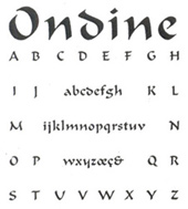
1953. The third typeface designed and drawn by Adria Frutiger for the Deberny & Peignot foundry. The calligraphic type, cut in originally, was not really successful at the time. Today it has a new lease of life, being digitally well marketed and accepted worldwide.
We might wonder what influence the contemporary style of Dutch typography might have had (the output of Jan van Krimpen for example) of some of the Georg Trumps work such as the Delphin (1951) or the Codex (1955). If we carry this line of thought further we might wonder what influence F H Ernst Schneidler`s Legend (1937) might have had on French taste. Because of this lack of education in typography and calligraphy, the French have never been able to lay claim to such good hot metal calligraphic typefaces. We should not forget that by the time Excoffon — for whom I generally have a profound admiration, particularly for his posters — designed his Banco in 1951, Hermann Zapf had already given us his Palatino in 1948 and his Michelangelo in 1950.Thus we see two countries, very close physically but far apart in matters of historical and typographical culture. The differences can be summmarised as teaching, schools, teachers and a general feeling for the graphic arts; together they have always been France’s Achilles` heel.
Also about this time the Fonderie Typographique Francaise (FTF) had to struggle very hard to bring any new designs on to the market in France. Rene Ponot (1917-2003) designed and had Psitt cut in 1954 and this had a certain success in a limited market. The Catalan Enric Crous-Vidal (1908-1987), exiled in France after 1939, designed several fonts for the FTF; among these were Paris and Flash in 1953, and his famous Fugues d`Arabesques, which were unusual typographic ornamentations. Others followed during the 1960s, but with less success. Crous-Vidal saw himself as the upholder of a certain ‘Latin Graphic Idea’ in which he was supported by Maximillien Vox — creator of the famous type classification which bears his name and which was adopted in 1962 by the Association Typographique Internationale (ATypI). This movement had been foreshadowed, principally in Spain, and notably by Guillermo de Mendoza у Almeida (1895—1944) with his unfinished project entitled Projct Espana, a suite of eighteen alphabets and vignettes designed between 1929 and 1943. This was exhibited in a Parisian gallery during the war but, sadly, was never published in either Spain or France. However, although this Paris based movement purported to be the true defender of the ‘graphie latine’, it had certain other aims and these were more commercial than intellectual — they had to compete commercially with the excellent creations of the very powerful German foundries which were flooding the market after the wax.
Originally cut in metal for the Olive Foundry in Marseilles, since 1951 the Banco, Diane, Choc and Mistral printing types have probably represented the special ‘French touch’ through advertising and it use in printing for years. Mistral type continues to be successful today throughout the world as it has been digitized.
About this time two small books by Rene H Munsch, intended for students, were published in Paris. They were ‘Physionomie de la Lettre’ in 1958, and before that ‘L`Ecriture et Son Dessin’, in 1951. Munsch was a teacher of graphic art at the greatly esteemed Ecole Estienne in Paris. In thumbing through these two works we see that the name of Edward Johnston appears just once. Rudolf Koch is slightly more fortunate and there are a few other German names. No other international calligrapher is quoted, there is no bibliography, nothing! That was the scope of French publishing at that time and generations and generations of students have paid the price. Only one Frenchman of that era was able to write erudite articles on lettering and on calligraphy in the printing magazines (`La France Graphique` 1954); he was Jean Mutville, a calligrapher who is largely forgotten today.
Towards the end of the 1950s another designer of great talent appears on the scene; he was a man of independent mind and of great attention to detail whose name was Jose Mendoza у Almeida. He claimed to be self-taught and after having been the assistant to Roger Excoffon at the Fonderie Olive set up on his own account; in 1959 he had his only hot metal text typeface produced at the Amsterdam Foundry. This was a glyphic typeface called Pascal. That a great new designer had arrived was to be borne out by future events. He spent long years working on Photina (1966—1985) for Monotype in London and then in 1970 came another calligraphic design — for phototype display — for Hollenstein in Paris, Yerma. For Mecanorma in Paris he designed the very calligraphic transfer letter script Fidelio in 1980. While many others in France claimed to be artists Mendoza said he was above all a craftsman of the letter and his splendid greetings cards which he himself engraved, printed and published over a period of more than twenty years remain as proof. Because of his expertise, his great sensitivity for lettering, and his defence of a ‘Latinate’ feeling for typography, this creator of great talent — Jose Mendoza, who was still teaching in the 1980s — is for some in France both a model and a master. He is without doubt among the great type designers of the twentieth century.
Two other designers cut their teeth at Deberny & Peignot where they were working with Adrian Frutiger; having worked on the Univers font they started their long careers at about this time. Ladislas Mandel, who today has to his name an impressive list of typographic creations both in France and abroad, has among his numerous works, created for photocomposition a calligraphic hand La Cancellaresca (1965).Then in 1985 he created and designed Messidor for the Imprimerie Nationale in Paris; this was in the same vein of humanist inspiration, but adapted to our era. Most recently (1999) he created and designed Solinus and Laura — two text typefaces which were inspired by humanist book hands, and which were digitised by some of Mandels pupils. Mandel himself has said that his most recent creations are the fruits of considerable reflection which has led to the original designs being ‘written’ and ‘humanised’ as a result of mental calligraphic exercise. He has also written books about the history of lettering.
1969. Françous Boltana designed and drew for phototype display at Hollenstein Studio, based in Paris. He called these unusual Roman Capitals Genèvive. At the time he had just left the Scriptorium of Toulouse in the south of France.
Albert Boton has also been very prolific and has spent almost his whole life as a salaried employee, rather than being self-employed. He started his career creating alphabets for a photocomposition studio (Hollenstein) between 1958 and 1966 and has created house styles for companies, advertising agencies and publishers; he has also worked for different digital foundries. His first widely known creation, designed between 195 7 and 1961, was Eras which, was created in France for Albert Hollenstein, one of a number of Swiss graphic artists in Paris; then in 1976 Boton adapted it in five weights for ITC in New York. The international success of this font was based on Boton s personal interpretation of Roman stone cut letters. He had attended calligraphy courses given by Frutiger between 1952 and 1955, but his own designs do not appear to have been unduly influenced by them — despite the appearance of some beautiful classic designs such as Tibere (1986) and Pompei (1993). In 2000 he designed and digitised Praxitel Page — inspired by the cancelleresca hands of the 16th century.
Many things have changed in the world of typography since the 1960s. In France metal typography slowly disappears and transfer letters appear in the advertising agencies and in printing companies from 1962. Phototype display catalogues are widespread in the industry from 1968 and letter designers disappear from all the agencies. In 1972 Studio Hollenstein has a certain amount of success with the launch of its famous Hollenstein Collection of exclusive and fantasy typefaces, the work of Albert Boton, Jose Mendoza, Francois Boltana, Jean Alessandrini, Jean Larcher et al and, for the first time in France, a number of type faces are imported from the US and Switzerland. In the 1970s this was something completely new; it was a considerable shot in the arm and has continued through the years. A young designer distinguished himself by his repeated calligraphic creations; he was Francois Boltana (1954 –1999) who had studied at the Toulouse Scriptorium towards the end of the 1960s. He designed some really beautiful fonts for phototype display — Genevieve (1969), and Lineameca (1970); then, at the beginning of the 1990s, he used technology to create the first computerised calligraphy — Champion (1990), Messager (1991) and a computerised Copperplate, L`Aurore (1993); finally there was humanist typeface, Rabelais in 1997; Francois Boltana certainly made good use of what he had learned at die Scriptorium at Toulouse under the tutelage of Bernard Arin.
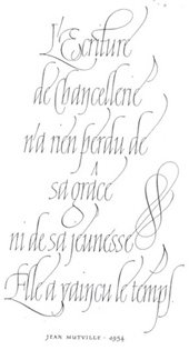
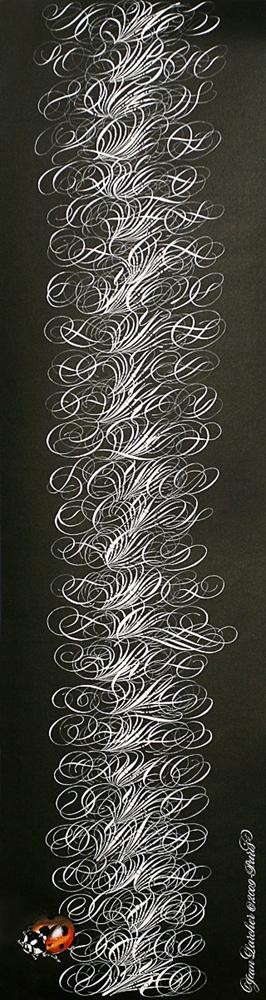
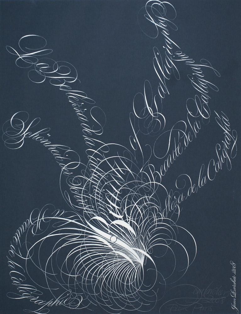
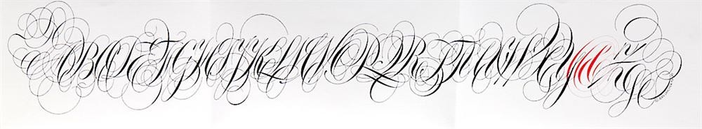
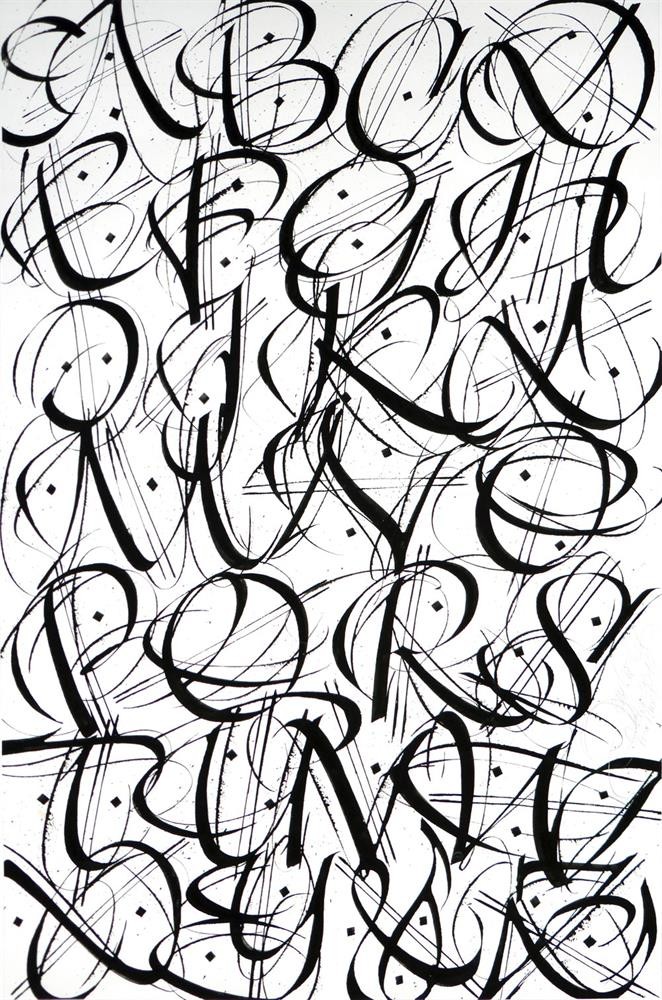
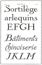
1992. Calligraphy by Jean Larcher. Chancery cursive has always fascinated the author; at the same time it is homage to Jean Mutville, a singular scribe in the 1950s, but today totally forgotten.
Another student of the Scriptorium caught everyone`s attention with an alphabet which achieved international success in 1972. It was the creation and publishing in Letraset of the calligraphic typeface Le Griffe which, at the time, became an international best seller. It was designed by Michel Lubac and is his only creation to date. For phototype display and for transfer lettering Claude Mediavilla published Mediavilla(1976), Palazzo (1984), Galba (1987) etc. A generation later Franck Jalleau, also a student at the Scriptorium, designed Arin in 1990, as well as a number of other classic typefaces for the state owned Imprimerie Nationale. Since then there have been several other calligraphic types such as Oxalis (1996), Scripto (1997) and Virgile in 1995 (this last was a very contemporary Rustic which was digitised by Agfatype), Frank Jalleau has been teaching type design for a number of years at the ‘Ecole Superieur Estienne’. He was a pupil of Ladislas Mandel and Jose Mendoza at the A N С Т in Paris from 1985 to 1987 and then taught type design there himself from 1987 to 1990- assisted latterly by the calligrapher Michel Derre.
Since the beginning of the nineties many French graphistes have used computers to help them in their designs and more and more of them who are producing original fonts attempt to sell them direct to customers. A very few designers of this most recent, and totally digital, generation have succeeded, some of the better known among these specialists are; Jean-Francois Porchez, Jean-Renaud Cuaz, Rodolph Guiglardo, Thierry Puyfoulhoux, etc. The products of all of these people are really intended for industry and the advertising agencies and have no real link with pure calligraphy.
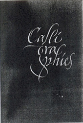
In 1993 an important publishing event raised hopes for a few months that things were, at last, going to change for the better in France. That was the appearance of an important doorstop of a book – ‘Calligraphic’ — written by Claude Mediavilla and published by the Imprimerie Nationale in Paris — which created a great stir at the time. Mediavilla had been a student at the Scriptorium at Toulouse. This had been established in 1968 by Andre Vernette, assisted by Bernard Arin, and had become a non-state establishment in 1988. It was responsible for a body of work and research which was totally unique in the publishing/teaching field in France. Mediavilla is now a painter, having forsaken his previous career as a calligrapher and logotype specialist.
When this learned work, which was completely new in content and was eagerly awaited by professionals, finally arrived it was too late; it came right in the middle of the technological revolution at a time when computers were already being used by designers throughout France. We also have to bear in mind that schools in France had long since given up teaching lettering, and none had ever taught calligraphy — except in Toulouse, Lyon — where Jean-Claude Lamborot (1921-2004) led a group of engravers in stone — and in the south of the country.
1993. A poster/invitation card/leaflet designed and calligraphed by Michel Derre for an exhibition about contemporary calligraphy in France at that time which was organized by Josè Mendoza in the town of Sèvres, a suburb of Paris. The exhibition was unique in France and many people came to see it.
The publication of this book therefore was something of a rearguard action. However Mediavilla’s very dogmatic and controversial manner ruffled the feathers of many of his fellow calligraphers and — subsequently — the public at large in his chapter on ‘Calligraphy and Abstract Painting’. Many teachers and calligraphers remained unconvinced by the overbold and highly personal theories which he advanced. Moreover, for the first edition of his book, he did not have the courtesy to mention any other French calligraphers at all, wanting the public to believe that he was the sole calligrapher in France. Despite this the book was useful and remains so today as it is a reference point. But ten years on and what has changed in France? Nothing, or almost nothing, and that is the problem.
A few calligraphic societies have been started in Paris and the provinces but the sad truth is that the general level of understanding and appreciation has not improved in France. Unfortunately, courses and workshops are generally of a very low level, with the majority of participants expecting to master a topic in a few hours. French publishing houses have tried to make up for lost time by printing manuals and books to satisfy the wants of the general public but nothing of substance, alas, has been published since 1993. Some magazines have produced articles on calligraphy since the early 1990s, but they do not have an international perspective; France remains very nationalistic.
In the bookshops western calligraphy has been relegated to the shelves marked ‘craftsmanship and decoration’ which in France can mean all sorts of things. Calligraphy is not considered as an art form; at best it is just thought of as a new hobby. On the other hand recent decades have seen the appearance of many luxuriously printed books on Far Eastern, Arabic or Persian calligraphy. Our bookshops are full of them and the average French reader does not understand a word of them. All of this leaves a bitter taste in the mouth. To make matters worse the man in the street has had no interest in the subject for years.
In summary, then, France — as far as calligraphy and lettering in general goes — has missed the bus. These two disciplines have been neglected, scorned and badly taught for decade after decade and the few French creative people whom I have mentioned are the exceptions which prove the rule. The public authorities, universities and teachers, the Ministry of Culture, and the French publishing industry — taken together — are to blame for this terrible state of affairs. To be a calligrapher in France today is to be an outcast. It is not even considered as a profession, it is simply a high risk gamble. The few French professional calligraphers are well aware of this.
At one time — several centuries ago — calligraphy was very well respected in France, at a time when printers themselves were also well regarded. Even during the course of the nineteenth century calligraphy was considered as one of the `Beaux Arts`, and as an equal of painting and sculpture. That golden age is far behind us now in the era of ‘digi-everything’ Recently three beautiful catalogues were published and printed by the French National Library to accompany a major exhibition which took place in Paris in 1998 under the title of ‘The Adventure of Writing’. Contemporary western calligraphy was not included anywhere! This veritable ostracism has been rife in university and artistic circles in France for many decades. They ignore calligraphers and, worse still, do not recognise that western calligraphy even exists. That is the situation we have in France today…
Kindly translated for CLAS by Jim Linwood.
作者的作品