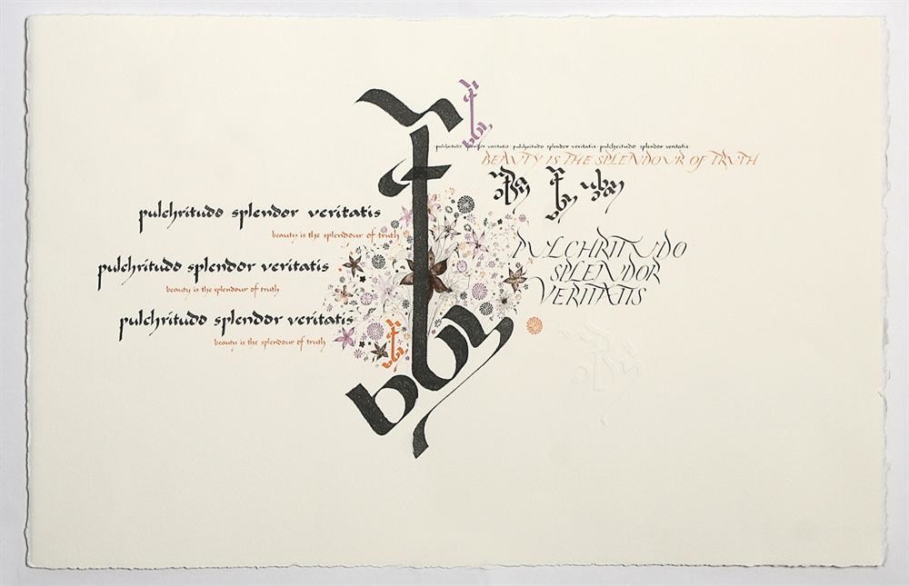
Beauty in Calligraphy and Lettering Art
Beauty: it is after all in the eye of the beholder. We are surrounded by beauty in all aspects of our lives, but our perception is influenced by our culture, life experiences and personal preferences. What is beautiful to one person may result in disinterest or even revulsion in another.
When we seek beauty in calligraphy, there are many factors that can influence our view of a piece of work. The general public are exposed to typefaces everyday. They see perfect lettering on their computers, in newspapers and magazines, and in signage etc. In their own use, type may be poorly spaced, consist of too many typefaces or include inexperienced page layout. To some extent, when exposed to calligraphy, the general public may not have any perception of good or poor form, but simply enjoy a piece for the quality of the overall design, or for the text [if it appeals or has some personal significance for the viewer]. This appeal alone would be sufficient for the piece to be seen as beautiful. Often it is surprising to see that the general public tends to prefer more naive letter forms - as if in direct rebellion against the perfection of typefaces in their daily lives. They are unable to see the shakiness of lines, the lack of sharpness in the ink quality etc as they are viewing the piece as a whole.
To calligraphers and lettering artists, our view of what is beautiful [calligraphically speaking] depends on many factors. When we begin, our eye is undeveloped - we cannot see the subtle nuances that are so important to the quality of beauty in individual strokes or letter forms. We are the product of our teaching and the forms we are taught. We are overjoyed to simply create a piece with lettering that looks something like the model we are trying to learn - although our ink may be put on the page with very little skill, we are proud of our achievements and are motivated to continue - we enjoy the feeling of ink making its mark and seeing letters take shape before our eyes. However, to the experienced eye, lettering at the beginning of the calligraphic journey can look dead, still, lifeless.
As a calligrapher’s journey continues, hand skills increase and the discernment of our eye should become more demanding. The more we are exposed to the instruction of skilled tutors, the more we learn and the higher our standards become. We may evaluate what we were taught and what tradition it is based on: Have we learnt forms born of British, European or American traditions? What style of work do we strive for? As a direct result, what was once considered beautiful may now be seen as something we would wish to hide; our calligraphy no longer meets the rigorous standards of beauty we hold up for ourselves as we strive to improve and refine what we love. Calligraphy is one of those ever extending artforms where you never stop learning - the breadth and depth of knowledge and skill is always expanding. Often our eye develops ahead of our hand and motor skills - making what we desire on the page frustratingly difficult to achieve. We hear what we are required to do, we can see the tutor doing it, but yet we cannot get our own hands to move in the way that would achieve the result. We may look upon our attempts with disappointment and fear that beauty [in that certain quality of line or form] is unattainable.
To my eye, some 14 years into my journey of writing, I now see beauty in the individual elements of letter forms. A beautifully executed line with lightness of touch and confident movement brings great delight. I now have a strong interest in European lettering and how it has been influenced by typefaces: calligraphy with that something extra that makes me look twice at the detail; a line executed with confidence which has light and shade and solid form and structure underneath it; sharpness of line and whisper thin hairlines can take my breath away. I see as much beauty in a line or mark that has been executed at full speed as one which has been slowly and carefully touched up by hand to look as if it came down to the page quickly and without thought - but it is the ‘appearance’ of speed together with the strength of form and the very finest of details which is infinitely appealing.
A mark which follows the natural movements of the fingers, hand, arm and body is beautiful - it has a quality which denies explanation. A mark can reflect the person making it: their state of mind, their emotions and their lives. But it can be breath taking - and a calligrapher with a developed eye may derive much pleasure from looking upon one such mark. And yet a mark is still not as beautiful unless it has some change to the line quality - a subtle change in the pressure, a mere hint of a curve in a straight line, a touch of waisting to a stem, a slight manipulation to a stroke or an ending or exit. These things all add finesse to the lettering and lift the marks to a higher level which is infinitely more visually interesting and lively. With increased experience, my eye for beauty is now incredibly demanding - it is satisfied by the work of only a few calligraphers whose work I could view for hours - my hope is that within a lifetime it is possible to achieve something close to this level of skill and beauty in my own calligraphic pursuits.