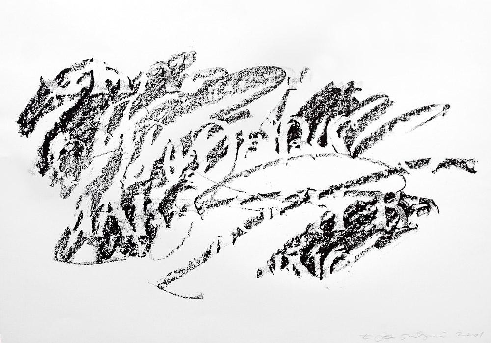
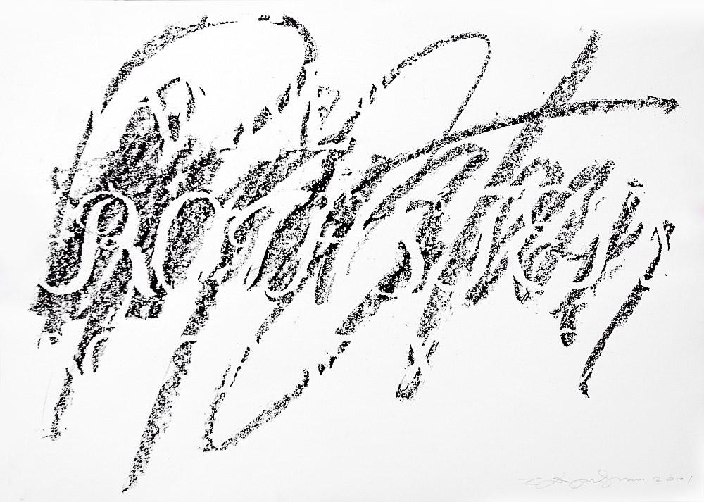
Observing the Letter
The International Calligraphy Exhibition project is to start in Russia. Its arranger, Sokolniki Exhibition and Convention Centre, implements original cultural initiatives, in addition to all sorts of commercial exhibitions. And now – a new undertaking: to revive the art of calligraphy in Russia. The best calligraphers from the entire post-Soviet space gathered there; guests from Japan, Israel and the U.S.A. were invited. From September 16th-21st, their work will be on display in St. Petersburg Academy of Art and then will be sent to travel across the country.
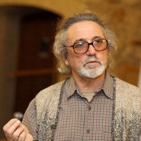
On the eve of this, The KP correspondent met with calligrapher artist Eugeny Dobrovinsky.
— Eugeny Maxovich, don’t you think that, in the era of total computerization, it is hardly possible to revive the art of calligraphy?
Eugeny Dobrovinsky:
— It is impossible to introduce fountain pens everywhere and a course of calligraphy in high schools. But it is quite feasible to remind individuals that calligraphy is high art. This position is close to me. Calligraphy for me is an artistic improvisation, rather than a utilitarian designer objective.
— It is somewhat unexpected to hear that from the person who was considered the leading specialist in fonts in the Soviet era.
Eugeny Dobrovinsky:
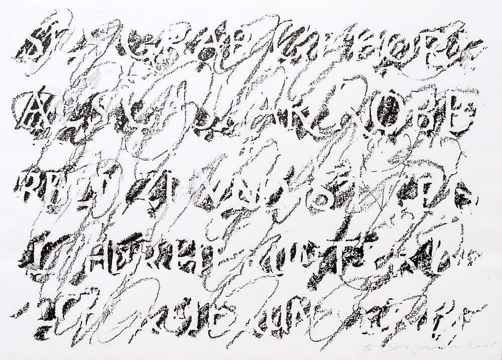
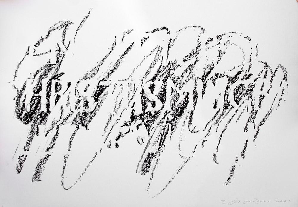
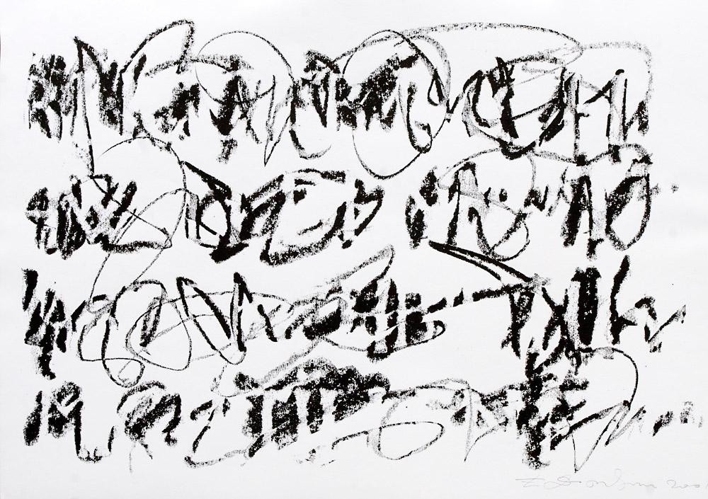
— I have always been independent, even though I worked in Promgraphika Artistic Board (the first artistic association in the USSR, which was engaged in trademark style) for almost 10 years. There are artists that design artificial scripts and those who write freely. I belong to the latter. Calligraphy is a version of easel art. It is directed inside a human being and expresses individuality.
— How did it happen that you started to deal with fonts?
Eugeny Dobrovinsky:
— I did poorly in academic drawing in the Polygraphic Institute. I drew sketchy, often distorted proportions – at the time when social realism was a quality criterion. My drawings did not conform to that. That’s why I engaged in font – I did not have to be loyal to social realism there.
— You grew to fame as early as in 1974, by winning at the International Poster Contest in Brno. You sent you works to the contest bypassing any organizations. How did you manage to do so?
Eugeny Dobrovinsky:
— I did not think I would win, so I sent it. It was my graduation work – a series of posters for the philharmonic department of musical theaters. The posters were fully based on fonts. I looked through Shostakovich’s manuscripts and made a cosmic structure out of it - notes turned into the Universe. I am not ashamed for these posters even now. Since then, I have been writing fonts by hand, it is the base of the font culture. It is by mastering it that one can do something original in the Cyrillic font. So far, the Cyrillic lags behind the Latin font.
— Why?
Eugeny Dobrovinsky:
— There is a great difference between them – the Latin font is absolutely perfect as a system. They did not intervene into it; it has developed from Ancient Greece (or even from Foenicians) to the 15th century, i.e. before book printing was invented. It is easy to write in Latin font, it is beautiful and logical. Cyril and Methodius introduced the Greek font in Russia, i.e. we imitated foreign originals from the very beginning. By the way, had they measured thousands of years to this system, we would have a font as good as the Latin one. But Peter I placed our entire culture in the wake of the West European culture. The Cyrillic font was adapted to the Latin font many times. And in the 1990s, when computer design was introduced, there was urgent need in new Cyrillic fonts. They could have been made quickly by taking Latin fonts and adding some specific Russian letters.
— How can we save the Cyrillic font?
Eugeny Dobrovinsky:
— I am not sure it should be saved. We should simply switch for the Latin font, adding some advantages of the Russian alphabet, e.g. the adequate correlation between sound and letter. I have even prepared a draft of shifting to the Latin font, taking into account Polish, Czech, Serbian and Croatian experience.
— Information on your calligraphic master classes is available in the Internet. Will you describe them in greater detail?
Eugeny Dobrovinsky:
— Students from designer high schools start designing fonts on the computer, without being able to draw. 95% of information that surrounds us – advertising, mass media, labels, packages – is of very low quality, it was made by craftsmen. The secret is that all plastic arts, including advertising, book and font graphic, are based on the ability to draw. I teach people to draw, including font, so that they will understand that a letter is a historic artifact that has been created for ages. And a designer should pass this way even briefly, if he treats his profession as art. I cannot say my standpoint is shared by other calligraphers, I am in the minority, or altogether in solitude. But I have devoted pupils who promote my work and training method.
— What is the specific feature of your method?
Eugeny Dobrovinsky:
— I never show finished work on the screen. As I am at home in calligraphy (from medieval to Chinese), I place a sheet pile on the easel and draw while telling about a letter – and spectators see it coming into being. My classes last a week, we spend 8-10 hours a day together, we draw and discuss our work. It is a very emotional process.
— Are these creative inoculations helpful for routine work, as you say, in craft?
Eugeny Dobrovinsky:
— It is the purpose of master classes. Artists have wide options now, which make selection even more complicated, whereas in the Soviet era they offered three font sets to us – literary, cut for magazines and ordinary. We resented how horrible it was. We have 300 fonts now. You start looking for a suitable one – and you cannot find it. They often ask me: based on what principle fonts should be chosen. You can answer this question if you learn to draw letters, if you understand their structure. A font should be suitable by the rhythm, the feeling from the page, legibility. There are many peculiarities in typographics.
The article was published in the appendix to The Vedomosti newspaper, How to Spend (No.61 of June 16, 2008)