彼得罗夫斯基•德米特里•伊里奇
彼得罗夫斯基•德米特里•伊里奇
俄罗斯 圣彼得堡
字体和书法教师、诗人、图形设计师/摄影师
Cognitive calligraphy
The curriculum of the Calligraphy course taught to students in three St.Petersburg-based artistic high schools where I teach is largely intended for graphic designers and has a clear-cut cognitive and culturological direction. Development of hand movements, more acute perception of a line and type form proper are the natural components of the educational process that represents intensive training during the two semesters allocated by the curriculum. However, the main objective of this course is not just upbringing of a practicing calligrapher but rather analysis, with a fountain pen in hand, of the historical class of Cyrillic and West European writing that we usually call scripts in our type literature (which is not quite correct terminologically because a font in the narrow sense is a set of replicated letters and other signs). As the course if built in, as an integral part, into the program, as part of which students get familiar with general font graphic laws, the font art aesthetic, and classification of modern artificial scripts, in accordance with their historical and morphological peculiarities, a comparative analysis of likenesses and differences in the forming of Latin and Cyrillic signs seems very important.
And now – a brief introduction to the landmarks of the course that can be interesting and useful to everybody who is interested in the basics of human culture. (Here we quote a part of the course devoted to West European writing). It is no secret that in the environment of overall machine and computer domination, any notion of classical historical calligraphy became a predestination of the few ones, even though there are plenty of materials on this subject on the WorldWideWeb. But you should want to find, process and, as with everything on the Internet, filter it. The currently fashionable, creative “other” calligraphy of free self-expression must have been based on the initial classical basis, but this is the fate of the chosen ones who are taught this in the appropriate schools. But schools were largely flooded by the enormous desire for freedom here and now, and at any price. And the price is the loss of cultural roots.
The first alphabet appeared in Phoenicia around 1200 B.C. In the 8th century B.C. it was adapted by the Greeks for rendering letters of the Greek language and, with certain changes and additions, made up the Greek archaic alphabet. Through the Greeks, the Phoenician alphabet signs passed to the Etruscans and, finally, to the Romans. All of the subsequent Western fonts evolved from Roman originals. The history of West European hand-writing that preceded the graphic art era and that partially co-existed with it can be grouped into 6 categories:
- Roman and late Roman fonts
- Local fonts of the era of the barbarian kingdoms, in particular, the so-called Meroving, West Goth, Lombard and Island fonts
- Carolingian and early Gothic fonts
- Gothic fonts
- Humanistic fonts
- Post-Renaissance fonts (baroque, classicist, modern fonts)
We and our students strictly follow the principle combining theory and practice, so we get equipped with elementary tools for practical calligraphy, so that, with the fountain pen in hand, to track the forming of the fundamental principles of Cyrillic and West European script. We will need the following:
— A4 millimeter paper album, preferably printed in orange paint, to avoid psychedelic bright colors
— wide-end fountain pen, with a 2.5 – 3.5 mm wide section and a fountain pen holder that was in the old time simply called an insert; in principle, non-elastic poster fountain pens are good for Roman and medieval fonts
— black ink, preferably ordinary Gamma indelible ink or Czech/other special ink that recently appeared
— soft duster for cleaning the fountain pen; after each writing process, it is necessary to thoroughly wash the fountain pen with warm water
— all medieval writers wrote on easels; the Englishman Edward Johnston (1872/1944), the father of modern calligraphy and wide-end calligraphy calls for the same; the board slope angle ranges from 45 to 60 degrees; the angle allows the calligrapher to maintain constant comfortable position of the body, hands and the sight angle, and also helps the ink to slowly flow from the tip of the fountain pen, thus ensuring the quality of writing.
Before the start of the performance of the font proper, they normally recommend that a number of preparatory exercises be made, in the form of the drawing of lines at different angles, drawing of ornaments etc. Our experience suggests that all of this is useful but not necessary. The psychological aspect of our writing letters is often worth several hours of training.
Roman and late Roman fonts
The starting point of the history of West European font was the perception by Romans of the proto-Tyrrhenian and Etruscan alphabets. The Proto-Tyrrhenian consisted of 26 letters, and the Etruscan, of 21 letters. The most ancient language, Latin, also included 21 letters. In late Roman times, the Latin alphabet also comprised 23 letters – the two additional letters Y and Z were taken from the Greek language. All of these letters still exist, and letters J, U and W were added to them in the Middle Ages. By the first century B.C., Romans had developed several classes (“scripts”). One of them was a shorthand italic font (Roman italic font) used for correspondence, which was scratched on wax boards on using which they wrote by cane pen on papyrus. This handwriting, in its late Roman version, influenced the development of the minuscule or lower-case writing.
Another key font was rustica, which was used in manuscripts and wall inscriptions made with brush. The proportions and the outline of the letters, as compared with monumental font, which perpetuated official state inscriptions on stone or was used to sign grave-stones, have greatly changed under the influence of writing fluency and the use of wide-end cane pen with the straight section, which was posed under the angle of 45-90 degrees to the writing line or else the wide-end pen with left-sided section. When it was the textual font, from the 1st century to the 5th/6th century, rustica underwent almost double narrowing of most signs, while retaining its principal particularities – extremely narrow, almost hair-thin vertical strokes and wide horizontal strokes and serifs. Horizontal strokes and serifs, particularly lower ones, are slightly bent, resembling a tilde. The lower serifs are bent down, in particular in later rustica.
The best known Roman font, which appeared in the 1st century B.C. and is now known as Capitalis Monumentalis, was used both for inscriptions embossed in stone and for wall inscriptions made by a wide-end brush. More than two thousand years later, letters of this font formed the basis of modern capital letters. In the 4th century, Square Capitalis was used as a modification of luxurious book writing. Just 2 monuments that refer to the 5th century, or maybe to its 2nd half, have reached us. Square Capitalis largely follows the wide form of Capitalis Monumentalis. However, it represents an exquisitely complicated version of script, which is perfect by its impression and is subordinated to the particularities of cane pen that writes on parchment and is not a direct copy of the monumental font.
In everyday writing, literate Romans used wax tablets. The monuments made on them by the font slightly bent to the right and negligently written were found on wax tablets on the walls in Herculaneum, Pompeii, and Rome. This font is called a classical, or early Roman, italic. In the 2nd-4th centuries, the Roman uncial gradually took shape on the basis of its more rounded forms that are more convenient for writing, under the doubtless influence of Greek uncial that had already existed for several centuries, took shape. It was also majuscule, or capital, writing, which had all of the typical features of so-called initial minuscule, or low-case font. Gradual formation of low-case letters (that account for the bulk of any extended textual material), which lasted 500 years, started. It so happened that it is the uncial that became the first book font of Christian Western countries. During the 6th-7th centuries, the early version of the uncial evolved towards greater increase of the kern. In approx. the 6th century, the form of uncial with the vertical axis of oval elements and strong contrast of vertical and horizontal strokes appeared. This testifies to a change in the position of the writing tool that is situated in parallel to the line (this angle was equal to 20-30 degrees in the old font). The new uncial acquires serifs and turns into an exquisite calligraphic font. As early as in the 4th-5th centuries, a new Roman italic developed in everyday writing, which acquires the form of lower-case writing more and more. Letters, which are most often slightly bent to the right, start to distinctly resemble ordinary modern business shorthand. In calligraphy, in approx. the 5th-6th century, the Roman semi-uncial font appears. It appears as if a mixture of the uncial font with certain letter forms taken from the italic. Most letters of the semi-uncial font already resemble modern lower-case signs; however, it does not know the stable division into capital and lower-case letters.
Local fonts of the era of barbarian kingdoms. Tolkien
After the collapse of the Roman Empire, in the era of the Great Migration of Nations (4th-7th centuries), several young “barbarian” states emerge in the former outskirts of the Empire. Local, national types of writing, which are based on the Roman uncial, and even more, on the semi-uncial writing, appear in these states. The main varieties were the Meroving writing in France, the Irish/ Anglo-Saxon (Insular) writing, West Goth writing in Spain, and Lombard (Benevent, or Monte Kassin) writing in South Italy, on the territory of the so-called Benevent Principality.
It so happened that the new Roman italic proved to be almost unknown in the British Isles so both the Irish and Anglo-Saxon writing remained the semi-uncial one for a long time, and acquired absolutely original features, which enable us to single out these types of writing into the so-called Insular Writing. At present, this writing is closely connected with Tolkien’s fantasy. One of the computer fonts is also called like that.
Caroling Minuscule
The new heyday and the peak of might of the consolidated Western Europe are associated with the name of Carl the Great (742 – 814) who started to rule the Franks in 768. He managed to create an enormous state that almost coincides with the borders of the Western Roman Empire. The appearance of the direct predecessor of the modern Latin low-case writing, minuscule, which is called Caroling, in paleography, is connected with the names of Carl and his closest advisor, learned monk from York, Flakk Albin Alquin (approx. 735-804). The development of the new handwriting is often connected with the decree/admonition of 789 (Admonitio generalis), in which, on behalf of Carl, it was prescribed to the clergymen and monks to re-write sacred texts with the greatest attention and legibility in writing, to avoid any distortion. The early Caroling minuscule influenced the writing of other cloistral scriptories, and rather quickly, as early as in the beginning of the 9th century, the mature Caroling minuscule became the all-purpose form of book writing within the Caroling Empire. Over time, the Caroling minuscule acquired more and more narrow, compressed, elongated and angular forms, which testify to gradual transition to early Gothic. Such handwriting is called late Caroling minuscule or early Gothic font.
Gothic fonts
Approximately late in the 12th century, the system of so-called Gothic fonts was developed across Europe. In the most general form, these fonts are often divided into 2 groups:
— high quality, luxurious calligraphic writing (fonts), which were used in both religious and secular books
— italic, short-hand handwriting that were used for the writing of documents and, from the second half of the 13th century, for commonly used folk books
The square texture and its counterpart, prescisus (especially thorough) texture, which mostly differed by the lower close of vertical strokes — lozenge-shaped serif for the square font and horizontal section for its counterpart — were the most important calligraphic book fonts. The decorative version of the uncial, which is called the Lombard versal, was initially used for different groups of Gothic fonts as capital letters. By the 14th-15th centuries, each variety of Gothic fonts acquires its form of capital letters, even though Lombard versals continue to be used as initials during almost the entire period of Gothic domineering (late German Gothic uses capital letters within its font style, even though decorative fonts under Lombard motifs were possible in the 19th century, too).
Gothic Fonts in Italy
In Italy, the classical Gothic font in the form of texture, with its dark, somewhat heavy visual textual structure, failed to take a strong root. Italian fonts of the medieval era are called rotunda, or round Gothic style. Besides Italy, rotunda was also common in Spain. Rotunda becomes more rounded and lighter than its Gothic contemporaries. Just as texture, rotunda acquired its Gothic capitals in the 14th century (which are quite similar to capitals of the texture); however, so-called Lombard versals were most frequently used as capital letters and initials.
Bastard Fonts (Gothic Bastarda)
Gothic shorthand, or italic, fonts are known as bastards. They were used up to the 18th century, when they were replaced with English calligraphy of the acute-end fountain pen, which date back to copper engraving, i.e. 2 centuries after the disappearance of calligraphic versions of Gothic fonts. Bastard handwriting is hard to identify because they are different in different cities, for different writers. However, general typical differences enable to rather easily distinguish English, French, and German models. The exquisitely calligraphic Czech bastarda is rather clearly different from the proper German model.
Humanistic Writing
From the mid-14th century, early humanists developed interest in studying antique culture that was able to documentarily reach them in the form of manuscripts of the era of Caroling renaissance or the ruins of the antique civilization. The origin of monuments of the Alquin times was properly forgotten, and they must have been regarded as antique originals. The light and clear Caroling minuscule font, with Roman capitals as capital letters, perfectly met the new Renaissance notion of the beauty that was taking shape. The script that was virtually a revived version of Caroling minuscule is called by us the humanistic minuscule, and it is the main handwriting of the Renaissance time.
And the entire type set of the humanistic minuscule and antique capitals was called antiqua by its inventors, pointing to its antique, in their opinion, origin.
Customization of the humanistic antiqua to graphic art as a typographic font in the second half of the 15th century makes the form of its letters the most common one in Europe. Fonts of the Renaissance antiqua type are successfully applied even now. A version of humanistic minuscule, which is also widely used now, is the humanistic italic, or, as it is called abroad, Italic. Having appeared as the script in approx. 1420, it was adapted for typographic reproduction in 1500/1501.
Modern calligraphy
The Renaissance of modern calligraphy early in the 20th century is associated with the pioneer work by Edward Johnston, a great Englishman, who is respected by all calligraphers of the 20th century as the head of their teachers. In Germany, the renaissance of calligraphy is associated with the names of Rudolf von Larisch and Rudolf Koch. Since the 1950“s, the interest in calligraphy has been expressed in many countries, whose fonts are based on Latin, Cyrillic and other fonts. By the end of the 20th century, calligraphers have developed the most diversified and sophisticated forms of manuscript, which transformed calligraphy into a quite independent and high-level type of visual art. In the Soviet Union, the leading calligraphy school, in its European understanding, was developed in the Baltic republics, and in particular in Estonia. Its establishment in the Soviet era was associated with the names of Villu Toots, Felix Valdvere, Paul Lukhtain, Paul Reeveer, Sylvia Liyberg, Heino Kersn, Villu Yarmut, and many others. Even though such wonderful masters of writing as S.B. Telingater, E.I. Kogan, I.T. Bogdesco, I.A. Gusseva, P.A. Semchenko, L.I. Pronenko, P.P. Chobitko and many others used and continue to work in other cities of the former USSR.
Dmitry Petrovsky,
Assistant Professor, Graphic Art Chair, Northwestern Printing College, St. Petersburg State University of Technology and Design
(extracts from the author’s manuscript of the book from the VISIBLE WORD series, Part 3, From Perfection to Perfection).
作者的作品
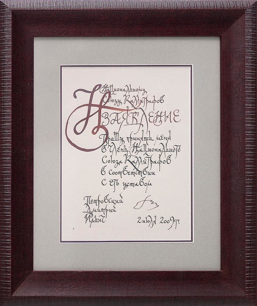
加入俄罗斯书法家联盟申请书
24.2х32.7 厘米 2009 年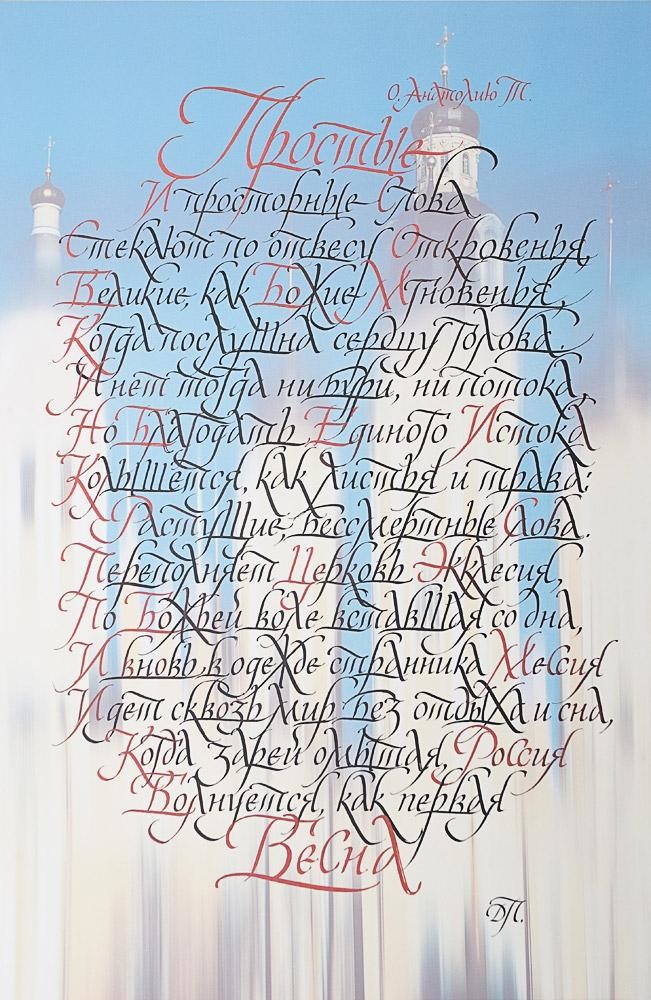
献给神父
照片配书法诗、喷墨照片打印在塑料上 54х84厘米2008年
书法符号«Л» 文艺复兴式斜体
4幅宣传画配2003年出版的《20世纪字母表》集中的作者原创诗歌成《书法象征》册原件:底漆硬质纤维板 120х62厘米
字母:黑色和彩色绘图墨水、画笔、照片
书法:宽头尖笔、绘图墨水、水胶颜料 2002-2004年
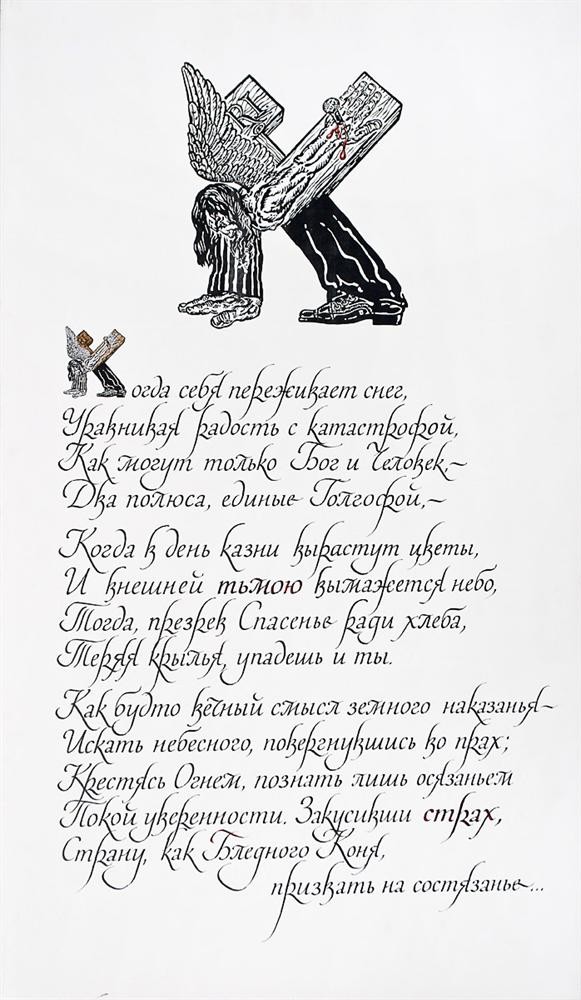
书法符号«К» 文艺复兴式斜体
4幅宣传画配2003年出版的《20世纪字母表》集中的作者原创诗歌成《书法象征》册原件:底漆硬质纤维板 120х62厘米
字母:黑色和彩色绘图墨水、画笔、照片
书法:宽头尖笔、绘图墨水、水胶颜料 2002-2004年
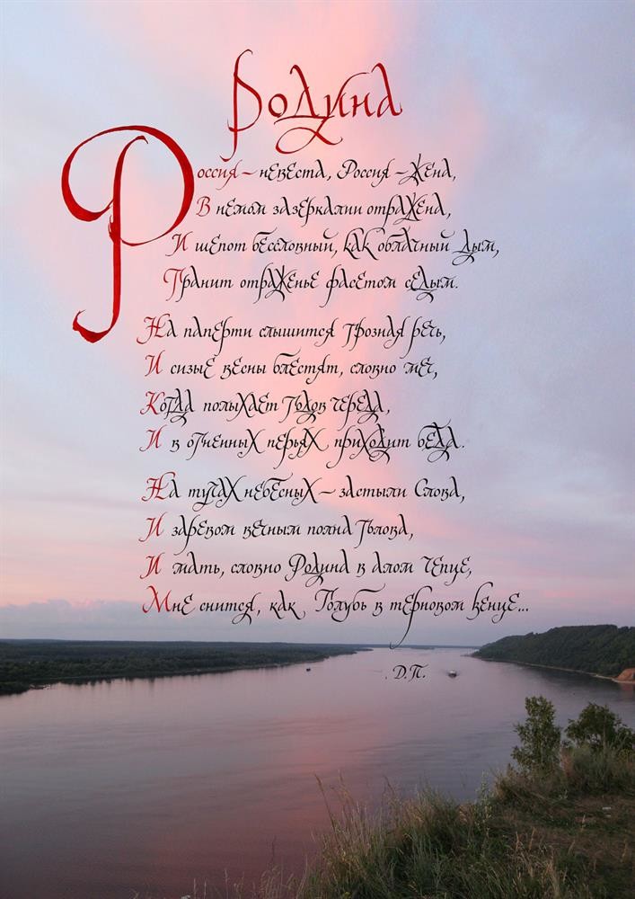
祖国
哑光照片纸作者自拍数码照片做底书法作品 46х65厘米 2014年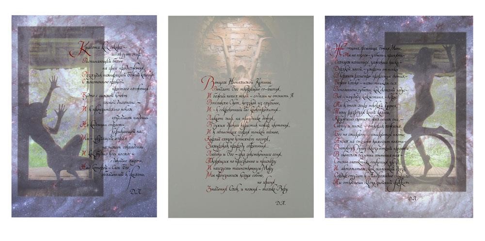
《宇宙》三联
三联 哑光照片纸作者自拍照片做底书法作品左:手掌 50х70厘米 中:信念48х70厘米 右:车轮50х70厘米
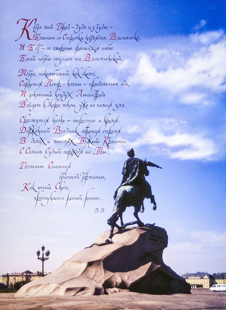
《强大的骑手》三联
230克哑光照片纸、Brauze宽头尖笔、Vinsor & Newton黑色绘图墨水、Koh-i-Noor红色绘图墨水作者自拍彩色照片做底书写作者原创诗歌书法作品
字体:文艺复兴式多角字体阐释——添加俄罗斯草书体元素 500 х 700毫米 2017年