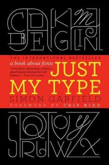
Just My Type. A Book About Fonts
 «Just My Type»: a book about fonts
Simon Garfield’s Just My Type, published in England by the same people who brought us Eats, Shoots & Leaves, hopes to do for type fonts what Lynne Truss’ surprise best-seller did for commas. For those of us who normally concentrate on the sense of words without paying much attention to the typeface in which they appear, it’s at once an eye-opening and eye-straining read.
For typomaniacs, on the other hand, who can’t rest until they’ve identified a font, Garfield’s engaging history of letter design will be eye candy. Helvetica? Frutiger? Univers? Is the bowl on that g elongated, and how wide is that o? Their passion helped fuel the cult success of Gary Hustwit’s film, Helvetica, about the font created in Switzerland in 1957 that has become the face of Bloomingdale’s, Gap, BMW, Verizon, American Airlines, and countless other corporate logos. When IKEA changed its typeface from Futura to Verdana, it provoked a «fontroversy.»
«Good type is instinct born of experience,» Garfield writes. He takes us back to Johannes Gutenberg’s 15th century innovation for casting reusable letters to produce cheaper books, but makes clear that Steve Jobs’ inclusion of a menu of fonts in his earliest Macintosh computers — thanks to a course in calligraphy he took at Reed College in the 1970s — was nearly as revolutionary.
Just My Type offers profiles of the eponymous (and often eccentric) graphic designers who created such classics as Baskerville, Gill Sans and Johnston Sans. It is also stuffed with fascinating bits of information. Who knew, for example, that the backward P printer’s mark that denotes a paragraph break is called a «pilcrow» or that the only letters formed in a clockwise direction are m, n, h, k, b, p and r? A single character combining a question mark and an exclamation — called an interrobang — didn’t catch on because it doesn’t read well in small sizes and never made it to standard keyboards, while, thanks to email addresses, the @, also known as an amphora, has become ubiquitous. Type designers show off their entire alphabets with pangrams, and the most famous, «The quick brown fox jumps over the lazy dog,» has spawned a video with more than 300,000 views on YouTube. What may be the worst typo of all time appeared in Christopher Barker’s Bible of 1631, which included the commandment, «Thou shalt not commit adultery.»
With more than 100,000 fonts in the world, the differences are often ridiculously subtle. Garfield’s lively, richly illustrated book, which showcases more than 200 of them, extols the most beautiful and excoriates the bloopers, including Comic Sans and the 2012 Olympics font, called 2012 Headline. We don’t learn until page 251 that the main text of Just My Type is set in Sabon, «one of the most readable of all book fonts,» designed in the 1960s.
Source:NPR


