科祖博夫•格奥尔基•伊万诺维奇 1939-2018
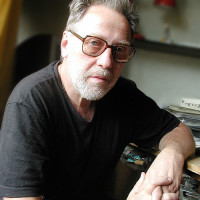
科祖博夫•格奥尔基•伊万诺维奇 1939-2018
莫斯科,俄罗斯
书法家,艺术学副博士,教授,俄罗斯美术家协会会员
Calligraphy today and tomorrow
As concerns font graphic art, it should be noted that, unlike all of the above-mentioned directions of fine arts, it is font graphic art that an artist visualizes THINGS that do not exist in the material world, yet a font is a virtual form as compared with, say, a landscape, a still life, a live or plaster model etc.
As there is no ready-made music in nature, even though there are ready-made sounds, there is no ready-made font in it, though there are thoughts in the mind of each person. Whereas other artists can draw inspiration from anything that is really seen in the world, one cannot find such ready-made analogies in font graphic art, from which we can use for inspiration. Everything is based on feelings and imagination here.
It is a fundamental aspect in understanding the difference of this type of fine art from all other types; this is the particular feature of the font graphic art that represents a difficulty and a special interest for creative work at once.
Calligraphy had passed a long way, measured by thousands of years of development, before it became an art. At first, there were primitive images having the nature of sign, then the initial signs of writing appeared and then, writing itself, by which we mean a sort of abstract set of conventional signs and some rules of their use. In the essence, it concerns the creation of a certain tool of graphic means that enable them to encode and decode speech in a visual form, i.e. to record / store it, reproduce and distribute in space and time. At this stage, forms of signs of writing did not have any obvious link with their sources from the material world. In this case, it concerns the time when the Ancient Greek and Etruscan alphabets took shape, assimilating certain signs of Phoenician writing. On this basis, proper Greek took shape later, from which Latin originated and, accordingly, the general European alphabet (9th-10th century B.C.).
Such is, in general, the intermediate stage of the many ages of evolution in the establishment of writing, even in a simplified form.
All of this happened not only in the background but under the determining influence of socio-economic and cultural factors of the establishment of the then community. The subsequent period that also lasted for many centuries, till the middle of the 15th century, can be righteously called the era of calligraphy, even though capital-type (monumental) writing existed. However, we will not consider the capital type fonts in this case. During this period that lasted more than a thousand years of hand-writing, a great number of different types of handwriting of local and general European significance took shape. In the latter case, one can already speak about the appearance of styles covering the entire of Europe. Such is the majuscule writing (rustica, untial, Irish versals etc.) in different options.
Then, in the Caroling era, minuscule writing developed from the majuscule writing. Grammar signs and writing rules were elaborated. The rules assigned independent functions to capital and small letters, determined their purpose, which we usually use now. It happened in 830-840, under Carl the Great.
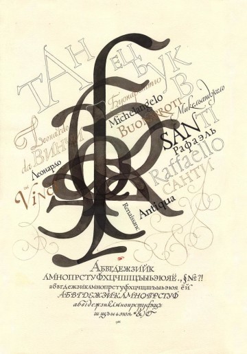
This period is called the Roman style, which was followed by several centuries of Gothic style, with broken fonts and, finally, in the 15th century, thanks to Petrarka’s work, the own Renaissance era occurred in the font art, when forms of fonts returned in their image to classical samples of pre-Gothic period, called antique by Petrarka.
Calligraphy, Its Role and Place in Font Genesis
When you look at beautiful forms of calligraphy, you have a familiar and clear feeling from the contact with the understandable, close and easily perceived art. These feelings are based on the graphic harmony that is similar in its essence to a musical melody, which naturally and simply finds emotional repercussions in us, where different components combine: a musical topic, composition, orchestration etc. Calligraphy, just as any art, can be demonstrably simple and understandable to everybody but can also be multidimensional and complicated, requiring special training.
The highest ideal of beauty for conventional classical calligraphy was a clear-cut, transparent composition that includes large and small scale forms perceived as accentuated reinforcement, plastic precision and accuracy of signs, purity of lines and outlines, uniformity of form, their repetition and variability in different parts of composition, acceleration and slowing down of forms etc., which was of critical significance for the pre-printing era of information perception, because it ensured adequacy of recognition and reading of these manuscript forms, with the preset quality of information intonation. Symmetry and regularity were the highest benefit because they, by their clear graphic consonance, ensured the unity of the utilitarian and the aesthetic features that give convenient and pleasant use to a reader. These aesthetics were elaborated in the period when any visual information was performed manually only (from Latin manus – hand). Perhaps, for this reason the beauty of regular form was the highest perfection and aesthetic ideal, which is difficult to achieve manually.
Later on, in connection with Gutenberg’s invention and, consequently, achievement of these aesthetic ideals of precision and regularity of forms by using artificial metal fonts, and even later, in connection with the invention and wide introduction of technical means of text capture, calligraphy had to adjust the object of its creative search and to get out of sight of aesthetics for some time.
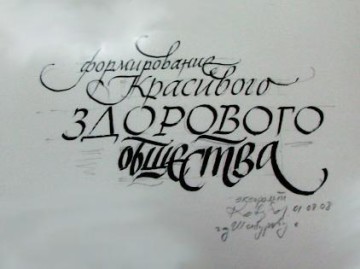
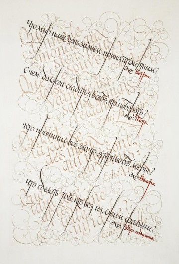
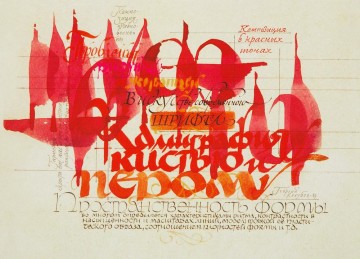
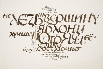
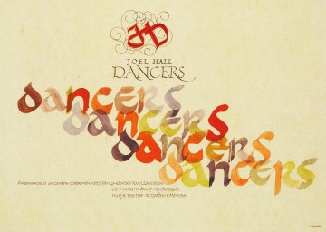
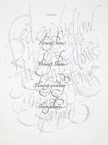
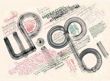
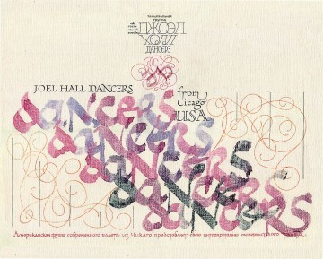
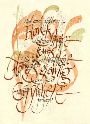
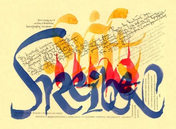
However, at present, in the age of new technologies, the former inaccessibility of a regular and clear-cut form is not only easily achievable but seems dull sometimes. Modern calligraphy displays, to say the least, a different, if not the opposite, beauty aesthetics. Now this calligraphy includes not only the textbook meaning of “beautiful writing”, in its traditional sense, but also such forming technologies, to which this notion of “writing” can be hardly applied. Modern calligraphy is, in essence, not an applicable form it used to be before, but a true easel art. These modern forms of calligraphy can be created by scraping, or pain injection from a syringe, a combination of “plastering” and engraving work methods etc. Everything may be done as if agley, the quality of strokes is expressively torn; there is no regularity and order in the composition as the case was in old work. At the same time, the same fundamental notions of harmony, rhythm, plastics, which in their new version create the beauty of modern forms, are present in this calligraphy, too. The notions and criteria of this beauty are universal. Different font forms can be almost equally artistically interesting to us, no matter to what nation they belong – Russian, Arabic, Italian or Chinese, though, of course, we distinguish their national affiliation.
Connoisseurs distinguish the quality of lines themselves. For instance, a machine-made line is dead; but a line drawn by a master’s hand is lively. This quality is lent to it by the pulse of the master’s life, thoughts and emotions and is reflected in the minutest modulations of a line thickness, in the elusive trembling of its outline, in the melodiously infinite and plastically soft movement of the curve. The same line created by a digital plotter lacks vividness, beauty and poesy; it is dry as a sketch and so looks dead. The objective explanation of this quality may be based on the fact that a curve created by a digital plotter is reproduced as a total of the minutest straight sections, whereas it is dragged by a master’s hand as an integral form, just as its infinite and united related movement, whereas the machine form is discreet in its essence.
This spirituality of a manual line, its size and total thickness determine the strength of its sounding, the tone and richness in overtones. To this should be added the composition of the build-up, different repetitions, layers, rhythmic intertwining, interaction of large and small scale of forms, use of surface finish, the nature of tempo, speed and movements of the form, continuity of author improvisation, including writing on the basis of individual ducts or non-stalling shorthand. All of these and many other artistic means can convey complicated emotional feelings in the graphic of form – from a lyrically sad melody made of a fine silvery ligature of fragile and delicate strokes to powerful brush accords of a symphony with polyphonic sound.
It is difficult to give an exhaustive description of modern calligraphy because this direction of graphic art has undergone accelerated development recently, providing us when increasingly new discoveries. Its rapid development occurs by a very wide front, where, on the one edge, we meet familiar, measured and prim, well-disposed calligraphy in the spirit of classical traditions, and on the other edge, we see samples of abstract calligraphy. Considerable space between the edges of this front is compactly saturated by different artistic forms, which are stylistically often associated with such directions of fine arts as primitivism, futurism, expressionism etc.
Modern art of calligraphy is described by aspiration to author expressiveness, both in the entire composition and in the details of form models, to preservation and rendering in work of a temporary factor, i.e. the time and process of form creation. Sophisticated connoisseurs like to feel the improvisation and uniqueness of creation in work, i.e. when the time of creation is felt in the form. It is achieved by different means, including by deliberate demonstration of pretended defects (unevenness of paint density, broken outlines, torn paint on the material surface finish etc.), which constitute as if a consequence of the master’s struggle with the material and overcoming by him of the material resistance. Thanks to visual following of the form movement (and management of this movement is the author′s objective), form movement is accelerated and slowed down in the composition, and hence, a sort of plot and the temporary factor appear. In this way, the author forces us not only to read what is written but to slowly reflect the composition, just as in an easel picture. In this aspect, calligraphy can be regarded as a temporary and spatial art simultaneously, because, by following the form with our eyes, we reverse the time and, reading the traces of the author’s struggle with the material, we experience almost the same state as the artist at the time of creation.
In these aspects of the form quality, we won’t be able to speak about the easel nature of calligraphy.
In this connection, the art of calligraphy should be as pure and error-free as performing musical art, in which an error cannot be corrected because it has already occurred, and the only way to prevent it is absolutely error-free master work based on constant training and experience. Probably, the more convincingly the master will manage to lend these properties of contingence and lightness to his work, the higher it will be appreciated aesthetically, and the greater will be the proof of his mastery. That’s why form improvisation becomes a specific feature of aesthetics of this genre of fine art.
In recent years, we come across the samples of good calligraphy at artistic exhibitions less and less frequently, especially in its applied forms (postcards, package of goods, books, magazines, advertising). In the modern environment of severe market competition, the improvement of the artistic quality of applied calligraphy seems of particular topicality. This problem can be resolved by developing exhibition business that displays the samples of easel composition calligraphy.
It also seems that with such understanding of calligraphy aesthetics it can be considered in addition to other genres as an independent easel form of fine arts.
If we try to assess the aesthetic essence of modern calligraphy, we should, first of all, note the desire of this graphic art to break free from the clamps of the unified and standard production forms, which took shape under the pressure of the aesthetics of typographic art. Modern calligraphy is a sort of protest against this pressure, or nostalgia of a free form that is individualized by its nature.
There seemed to be apprehensions of possible acute opposition of the calligraphy and graphic art concepts. However, in practice, we see that they can co-exist quite peacefully, and not only co-exist but are even simultaneously necessary because they supplement each other and produce a positive impact on the development of font art in general.
Georgy Ivanovich Kozubov, Candidate in Art Science
