Brody Neuenschwander

Brody Neuenschwander
Bruges, Belgium
Calligrapher, researcher, art historian
Can writing be beautiful?
There are two great calligraphic traditions in the world, the Chinese tradition (together with Japanese) and the Arabic tradition (which is also used to write Farsi and several other languages). The ancient grandeur of these traditions is beyond doubt. In their respective cultures, calligraphy is the central visual art. Chinese poetry and painting are unthinkable without calligraphy. The Koran is inconceivable without calligraphy. These two civilizations were formed by the brush and the pen.
Western writing is another matter altogether. By Western I mean all languages written with the Latin, Greek and Cyrillic alphabets. Writing has been no less important to the cultures of the West, of course. But is this tradition calligraphic? And is it beautiful?
These are difficult questions, and I believe that the calligraphy of the Near and Far East can help us to answer them.
Chinese calligraphy is written with a brush that allows each hair to reveal the movements of the hand and the thoughts of the writer. From earliest times in China, brushwork has been seen as a window into the soul of the writer. The quality of the line reveals the quality of the man. For this reason, calligraphy was the central subject of the imperial examinations by which the officers of the mandarin system were chosen. Beauty in Chinese calligraphy is not merely a question of writing the characters with precision. They must be written with feeling and must properly express the meaning of the language. In other words, Chinese calligraphy is an art of form, content and expression; and each character is a time capsule of Chinese history and culture.
As the Chinese say, Without calligraphy, there is no China.
Arabic calligraphy occupies just as central a place in Arabic and Islamic culture, but for very different reasons. God dictated the Koran to Mohammed, as we all know. It was therefore necessary to develop a script worthy to transcribe the divine voice. For this the earliest Islamic scribes developed the glorious Khufic script, in which each word has the monumental presence of abstract sculpture. Many fabulous scripts have been developed since, some for the administration of the ever-expanding Islamic empire, others for poetry, others for the divine word. Questions of personal expression are less important here than in China, to be sure. But in the Islamic world, as in China, calligraphy is the central visual art. Without it, Islamic culture is inconceivable.
Turning to the West, we encounter a very different situation. Latin and Greek developed from a merchant script and have remained merchant scripts to this day. Western script has never served as a window into the soul of the writer. Nor has it been used to adorn the towers of our cathedrals. The Bible, like the Jewish Torah, is an accurate but not particularly artistic record of the divine word.
These might seem hard criticisms, so let me explain what I mean. The origins of Western writing in early merchant scripts caused the reduction of the letters to a small set of very similar forms. The letters of the Latin are roughly the same size and can be constructed from just a few simple geometric shapes. This has proved a great advantage to printers. Chinese and Arabic are very different. Each script is so full of formal variety, size, scale and direction of line that the calligraphy can, as the Arabs say, move the pen in 360 degrees. These scripts have proven devilishly difficult to reduce to a grid. Arabic and Chinese have been nightmares for typographers.
I would go so far as to say: calligraphy and typography are opposites. Calligraphy requires great varieties of scale, direction, movement and density. Long strokes must play off short strokes. Verticals must contrast with horizontals and diagonals. Round shapes must enter into dialogue with square shapes. The calligrapher must have at his disposal all the visual richness that the painter demands.
These opportunities are present in Chinese and Arabic script. Occasionally, as in Russian icons and the ornamental scripts of the 17th century in Western Europe, we see Western scribes attempting to develop the line in full freedom. But these moments in our calligraphic history are rare.
Is the situation hopeless? Does the geometric and commercial basis of our writing condemn us to be typographers by hand?
I do not think so. In fact, I would say that the Western calligrapher now has unprecedented opportunities. Chinese and Arabic calligraphy are both very ancient, very illustrious, and (treading carefully here) very well-rooted traditions. Traditions with such deep roots are sometimes rather difficult to change. I have studied contemporary calligraphy in the Arab and Chinese worlds, and found many calligraphers attempting to modernize the traditions, but few who succeed in doing so.
In the West, artists are grappling with visual language in many ways. Artists such as Cy Twombly, Jessica Diamond, Bruce Nauman and Ed Ruscha have produced work that, in my opinion, can be classed as great modern calligraphy. Not everyone, and certainly not in calligraphy circles, would agree with this opinion. But let me defend it by using the example of Cy Twombly.
Twombly is a painter whose work is based on writing and drawing rather than on brushwork. His work makes use of writing, some of which is legible, much of which is not. The line is essential to his work, a line that is filled with a level of emotional expression that can be compared to Chinese calligraphy. Twombly often refers to the poetry of antiquity, just as a Chinese calligrapher would refer to the Chinese classics. And Twombly’s work is universally recognized in the art world (though not in the calligraphy world) as carrying profound meaning. In other words, Twombly writes his paintings and in so doing imbeds them in the great cultural traditions of the West.
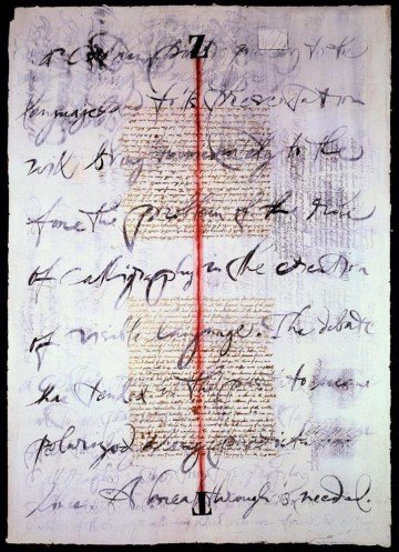
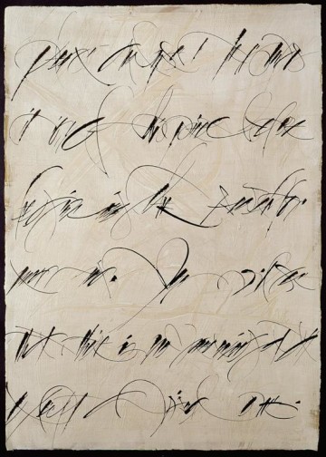
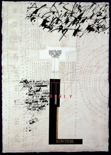
This is not yet true of the work of Western calligraphers. It is what makes Twombly’s work beautiful. If we have any ambition to create a Western art from called calligraphy, we will have to grapple with this problem. We will have to fill our merchant script with the deepest longings of our souls. We will have to make written images, icons in the true sense, that capture the fundamental questions of our times.
We will have to become poets of the line.
